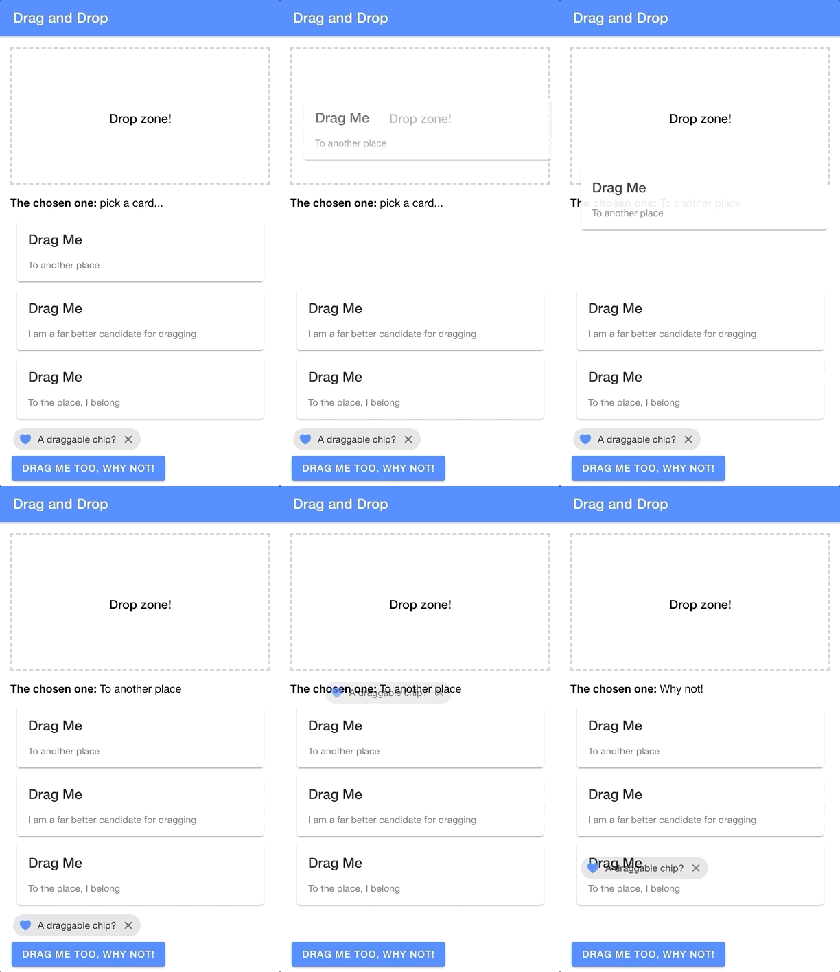
In this tutorial, we will be building out two custom components in Ionic that enable us to drag and drop elements on the screen. We will be able to mark elements as “draggable” to enable the dragging functionality, and we will be able to define a “droppable” target zone for where elements can be dropped. Here is a quick example I built using the end result:

You will find that there are plenty of libraries/packages available for implementing drag/drop functionality in Ionic, but we will be implementing our solution with just Ionic itself - no other external libraries/packages will be required.
Where practical, I prefer to implement my own solutions from scratch rather than relying on a 3rd party library to do the job. I don’t want this tutorial to focus on my opinions of the benefits of this approach, but to briefly explain my position:
- You don’t need to spend time researching options and compatibility
- You can build exactly the functionality you need (and only what you need)
- You will be better positioned to extend the functionality further if required
- You will be able to integrate the functionality better with other parts of your application
- You don’t need to worry about maintenance or long term support for the package
- You won’t end up with a mish-mash of various packages in your application that are kind of just sticky taped together
- You learn new stuff!
That doesn’t mean you shouldn’t ever use 3rd party packages, but growing your ability to build things yourself gives you much more freedom in determining whether a particular package provides enough benefits to outweigh the downsides in a particular situation. For some drag/drop scenarios I am sure existing libraries/packages will save a substantial amount of time and effort, but for our goals in this tutorial we can build it out ourselves easily enough.
In fact, enabling dragging of any element around the screen with Ionic Gestures is relatively simple (assuming you already have an understanding of Ionic Gestures, if not I would recommend reading: Create Custom Gestures (Simple Tinder Card Animation)). All we need is a single line of code inside of the onMove handler:
onMove:(ev)=>{
  style.transform =`translate(${ev.deltaX}px, ${ev.deltaY}px)`;}
We just need to set transform on the element we want to drag in response to the move events from the gesture. We translate the x and y values to match the deltaX and deltaY values from the gesture, which indicate the change in position since the beginning of the gesture (e.g. the user has dragged 10px to the right and 5px down since beginning the drag gesture).
This is a big part of the drag and drop functionality, but we have a few more things to consider as well. We would likely also want:
- Something useful to happen when the element is dropped
- The element to snap back to its original position after it is dropped (perhaps unless it is dropped within a certain zone)
- The ability to mark a particular area where the element is allowed to be dropped
This complicates things a little more, but it still doesn’t require overly complex code to implement. Our solution will involve creating an <app-draggable> component and an <app-droppable> component. We will be able to wrap existing elements with <app-draggable> like this:
<app-draggabledroppable={this.droppableArea}drop-data={{content:'some data'}}><some-element>Drag me!</some-element></app-draggable>and create a droppable zone by using <app-droppable> like this:
<app-droppableonElementDropped={(ev)=>this.handleDrop(ev.detail)}><h5>Drop zone!</h5></app-droppable>We will link the draggable elements to their designated drop zone using the droppable prop, and we can also supply some data that is passed on to the drop zone through the drop-data prop. Our drop zone emits an elementDropped custom event that will fire whenever an element is dropped within its bounds. The elementDropped event will contain the data passed through drop-data.
Before We Get Started
This example used in this application was creating using Ionic/StencilJS, but the methods being used (e.g. Ionic Gestures) are also available for Angular, React, Vue, etc. If you are following along with StencilJS, I will assume that you already have a reasonable understanding of how to use StencilJS. If you are following along with a framework like Angular, React, or Vue then you will need to adapt parts of this tutorial as we go.
If you would like a thorough introduction to building Ionic applications with StencilJS, you might be interested in checking out my book.
1. Creating the Droppable Component
First, let’s talk about how to create the droppable area. This component doesn’t actually do a whole lot, its main purpose is to receive an event from the draggable component detailing the position in which the the element being dragged was “dropped” (i.e. the coordinates of where the drag gesture ended). It will then determine if those coordinates intersect with its own “bounding client rectangle” on the screen (i.e. the space in which the droppable area occupies on the screen). If the coordinates are within the space that the droppable area occupies, then it will emit an event indicating that something was dropped and any data that was supplied along with it.
Let’s take a look at the code and then talk through it:
import{ Component, Element, Event, EventEmitter, Method, Host, h}from"@stencil/core";

@Component({
  tag:"app-droppable",
  styleUrl:"app-droppable.css",
  shadow:true,})exportclassAppDroppable{
  @Element() hostElement: HTMLElement;
  @Event() elementDropped: EventEmitter;

  @Method()asynccomplete(ev, data){if(this.isInsideDroppableArea(ev.currentX, ev.currentY)){this.elementDropped.emit(data);}}isInsideDroppableArea(x, y){const droppableArea =this.hostElement.getBoundingClientRect();if(x < droppableArea.left || x >= droppableArea.right){returnfalse;}if(y < droppableArea.top || y >= droppableArea.bottom){returnfalse;}returntrue;}render(){return(<Host><slot></slot></Host>);}}
This component has a publically exposed method called complete. This will allow us to grab a reference to the <app-droppable> element we are interested in, and then call its complete method. We will call this method from within our <app-draggable> gesture to indicate that the gesture has finished, and to supply <app-droppable> with the coordinates and data it needs to do its job.
As you can see, we have also created a method called isInsideDroppableArea that uses getBoundingClientRect to determine the space that the droppable area occupies, and then checks that against the supplied coordinates. This component has no template itself, it will just take on the shape of whatever is inside of the <app-droppable> tags - this allows you to define how you want your droppable area to look without having to modify the internals of this component.
2. Creating the Draggable Component
Now let’s take a look at our draggable component. Most of the work that we need to do within this component is just creating the gesture itself:
import{ Component, Element, Prop, Host, h, writeTask }from"@stencil/core";import{ createGesture, Gesture }from"@ionic/core";

@Component({
  tag:"app-draggable",
  styleUrl:"app-draggable.css",
  shadow:true,})exportclassAppDraggable{
  @Element() hostElement: HTMLElement;
  @Prop() droppable;
  @Prop() dropData;componentDidLoad(){const style =this.hostElement.style;const dragGesture: Gesture =createGesture({
      el:this.hostElement,
      gestureName:"draggable",
      threshold:0,onStart:()=>{writeTask(()=>{
          style.transition ="none";
          style.opacity ="0.7";});},onMove:(ev)=>{writeTask(()=>{
          style.transform =`translate(${ev.deltaX}px, ${ev.deltaY}px)`;});},onEnd:(ev)=>{writeTask(()=>{
          style.transition =".3s ease-out";
          style.transform =`translate(0, 0)`;
          style.zIndex ="inherit";
          style.opacity ="1";});this.droppable.complete(ev,this.dropData);},});

    dragGesture.enable();}render(){return(<Host><slot></slot></Host>);}}
We set up two props on this component: droppable for indicating which <app-droppable> component we want to drag to, and dropData to provide the data we want to pass to the <app-droppable> component when the element is dropped within the droppable zone.
The rest of this component deals with setting up the gesture. I won’t talk about creating gestures in general here, so again, if you are not already familiar with Ionic Gestures I would recommend watching: Create Custom Gestures (Simple Tinder Card Animation)).
An important distinction for this gesture is that we provide a threshold of 0 so that the gesture will work in all directions - by default, gestures will only work in the specified direction (horizontal or vertical). We’ve already discussed setting the transform value inside of the onMove handler, and the other important part here is that we call the complete method of the supplied <app-droppable> component reference when the gesture ends. We also set up some styles so that the element will snap back to its original position once released, and we also reduce the opacity a bit when it is being dragged.
It is important that we set the transition style to none when the gesture begins, because we don’t want to animate the translate changes inside of onMove. This value is updated every time the mouse/pointer moves and having a timed animation animating those changes would mess things up. We do, however, want the transition animation to apply when the element is being translated back to its original position inside of onEnd.
3. Implementing Drag and Drop Functionality
We have our generic drag/drop functionality implemented, now we just need to make use of it. To demonstrate using it, I created a simple example that would allow different types of elements to be dragged to a droppable zone and then render out data passed along from that element. You can see the result of that below:

and the code for this is as follows:
import{ Component, State, Element, h }from"@stencil/core";

@Component({
  tag:"app-home",
  styleUrl:"app-home.css",})exportclassAppHome{
  @Element() hostElement: HTMLElement;
  @State() droppableArea;
  @State() cards;
  @State() chosenOne: string ="pick a card...";componentWillLoad(){this.cards =[{ title:"Drag Me", content:"To another place"},{ title:"Drag Me", content:"I am a far better candidate for dragging"},{ title:"Drag Me", content:"To the place, I belong"},];}componentDidLoad(){this.droppableArea =this.hostElement.querySelector("app-droppable");}handleDrop(data){this.chosenOne = data.content;}render(){return[<ion-header><ion-toolbarcolor="primary"><ion-title>Drag and Drop</ion-title></ion-toolbar></ion-header>,<ion-contentclass="ion-padding"><app-droppableonElementDropped={(ev)=>this.handleDrop(ev.detail)}><divstyle={{
              border:`3px dashed #cecece`,
              width:`100%`,
              height:`200px`,
              display:`flex`,
              alignItems:`center`,
              justifyContent:`center`,}}><h5>Drop zone!</h5></div></app-droppable><p><strong>The chosen one:</strong>{this.chosenOne}</p>{this.cards.map((card)=>(<app-draggabledroppable={this.droppableArea}drop-data={card}><ion-card><ion-card-header><ion-card-title>{card.title}</ion-card-title></ion-card-header><ion-card-content>{card.content}</ion-card-content></ion-card></app-draggable>))}<app-draggabledroppable={this.droppableArea}drop-data={{ content:"Why not!"}}><ion-chip><ion-iconname="heart"color="primary"></ion-icon><ion-label>A draggable chip?</ion-label><ion-iconname="close"></ion-icon></ion-chip></app-draggable><app-draggabledroppable={this.droppableArea}drop-data={{ content:"A button???"}}><ion-button>Drag me too, why not!</ion-button></app-draggable></ion-content>,];}}
This isn’t a particularly practical example, of course, but it does demonstrate how the components can be used currently.
Summary
Depending on what it is you want to do exactly, you would need to modify the example in this tutorial a little further and perhaps even make some changes to the underlying components themselves.
For example, all we are doing is passing some data along which might suit some circumstances, but perhaps you also want to change the position of elements after they are released. In that case, you would need to modify the onEnd of the gesture to perform some check and implement a different type of behaviour to achieve the result you want (e.g. moving the element to its new position on the screen). Maybe you want the element to disappear completely when it is dropped, and reappear in text form somewhere else (this could also be achieved by changing the onEnd behaviour). Maybe you even want to create something similar to Ionic’s <ion-reorder-group> component that has elements shuffling around on the screen as another element is dragged over it - in that case, you would need to add some extra logic inside of the onMove handler.
I’ll reiterate that in some cases, you might be better served by just using an existing 3rd party solution. But, if it is practical enough to build out the solution you need yourself, I think the benefits are often worth it.