Quantcast
Channel: RSS Feed
Viewing all 391 articles
Browse latest View live

Common Issues with Poor Performance in Ionic Applications

$
0
0

One of the services I often perform is to spend a few hours doing a high-level code review of an Ionic codebase, and then writing up any advice or recommendations I have based on what I see. Most of the time, the request comes from people who have built an Ionic application but the performance isn’t where they want it to be.

I have written and talked quite a bit about Ionic performance in the past, and to get a general sense of my view on Ionic’s performance I would recommend reading: Ionic Framework Is Fast (But Your Code Might Not Be). The key point is that for most cases, Ionic is more than enough to build a high performance application with smooth interactions.

The “problem” is that it is relatively easy to build applications with Ionic, but a high level of skill and knowledge of the underlying technologies is required to do it well, and so it is common to see poor-performing applications built with Ionic. Ionic has a low barrier to entry, but expertise is still required to build good applications. That’s not to say that the opportunity for poor performance is exclusive to Ionic and other hybrid approaches, there are plenty of poor-performing native applications.

The reason that I am writing this article, is because I have done quite a few of these code reviews now, and there are some common issues that seem to pop up in a lot of the codebases I review.

The Problem

The key issue I think that a lot of the codebases I review face are that some of the fundamentals of a well designed Ionic application are missing, and that either creates or masks the underlying issues contributing to poor performance.

The analogy I use is that of a messy room that smells bad. The main motivation might be to get rid of the smell, but that is difficult to do whilst the room is a mess. The mess in the room might not be contributing to the smell at all, but it will make finding the source of the smell difficult. Or perhaps there is no main source of the smell, maybe all the mess in the room just smells a little bit, and all of it together is creating a big stink.

Until the codebase itself is improved from an architectural/organisational/maintainability perspective, trying to diagnose and fix performance issues is likely either going to be a difficult or futile excercise. Finding a mouldy sandwich in an otherwise clean room is much easier.

Recommendations

In the remainder of this article, I am going to list some recommendations to address the common issues that I see. These issues are not always necessarily contributors to poor performance themselves, but can end up creating that “messy room” scenario.

The points I will be listing also aren’t all-encompassing of the best practices for building Ionic applications, rather, these are specifically to address the things that I see happening most commonly.

Keep pages light

The “page” components in our applications are those that we are using to display a “view” like the home page, or a login page, or a profile page. There is a tendency for people to add all of the functionality required to make that page function into the page component itself. This can lead to bloated page components that are hard to follow and perform work that should be performed more modularly.

Instead of putting all of the code into the page itself, the page should only handle basic functionality like handling event bindings in the template (e.g. when the user clicks this button, trigger this function). Any complex “work” that needs to be done should generally be separated out into its own provider/service and then the page can interact with that. This keeps the pages light, and it will also help prevent needlessly implementing the same functionality in multiple places.

Take a login page as an example. I’m just going to make up a silly example here, but hopefully it gets the point across. You might want to add everything you need to handle the authentication process on the login page, and what ends up being creating is something that looks like this:

BAD:

public username;public password;private authToken;private apiKey;private isLoggedIn;private loggingIn;private jwt;private rememberMe;// even more class member variables go herelogin(){}checkPassword(){}storeToken(){}someOtherMethod(){}yetAnotherMethod(){}// even more methods go here

Instead of doing all of this in the login page, you should instead move all of this authentication “work” into its own provider/service/singleton. You can then just make a simple call to that service from the login page, e.g:

GOOD:

public username: string;public password: string;login(){this.authService.authenticate(this.username,this.password).subscribe((res)=>{// do something})}

Not only does this clean up the login page a great deal, but it also means that any of our pages that need to make use of any of the “authentication” functionality can do so through a single service. That means a bunch of other pages might also now be much lighter, and if there is an issue with authentication we can focus on debugging just one file rather than trying to trace what is happening through multiple different pages.

Prioritise simplicity

A lot of the time I will see code that is overly complex. Again, it might not be an issue in itself that is contributing to poor performance, but it increases the complexity of the code overall. If complex code is used all of the time where something simpler would suffice, it can lead to huge files that are hard to follow and work with.

Being able to read through some code and build a mental model of it helps a great deal when trying to understand/optimise your code. If you have methods spanning across 800 lines of code, it is going to be much harder to work with. If you just use if/else statements and for loops you can probably achieve most of what you need to do, but it is going to lead to uglier code.

For example, let’s say we are trying to remove all posts from an array that don’t have josh as the author. We could do something like this:

for(let i=0; i <this.posts.length; i++){if(this.posts[i].author !=="josh"){this.posts.splice(i,1);}}

or you could do something that looks much simpler and cleaner like this:

this.posts.filter((post)=>{return post.author ==="josh";});

This particular example doesn’t result in a massive saving in terms of lines of code, but it is much easier to understand. With the second example, it is easier to see at a glance what we are doing. The first example isn’t too bad, but if you start piling a bunch of solutions like that together things can start to get really messy - especially when we start dealing with loops within loops.

I also see similar issues in complexity in templates where there is complicated structures of grids and lots of manual positioning, where perhaps some simple CSS flexbox layout could achieve the same results in far less code. In the case of your template, this might even lead to actual performance improvements. A complicated DOM structure (e.g. lots of nodes, lots of nesting) can be a bottleneck for performance in web applications.

Making the code simpler is going to require the knowledge of how to make it simpler, and that is just something that is going to come with experience. But, if you find yourself writing code that seems complicated, see if you can start finding ways to simplify it. I find that I rarely run into situations with Ionic where I need to write code that is large/ugly/complex, even for advanced functionality.

Do it right from the beginning

It is so much easier to keep things clean in the first place than it is to tidy it up afterward. That is probably true of most things, but it is definitely true for code.

A poorly designed and messy codebase will likely just breed more poor design and code. A structured, clean, and well thought out codebase is much more likely to remain that way. Avoid the temptation to rush through just building out the “prototype” as quickly as you can, because often that prototype ends up being iterated upon and becoming your final product. At that point, the rushed and poorly designed code is so baked in that “fixing” it is usually a bigger task than just starting from scratch.

Understand how the browser works

Keeping in line with the idea of doing things right from the beginning, I think perhaps the most important things to keep in mind as you are building is the browser rendering process and the event loop.

This is something that might take a bit to understand (and it is not necessary to understand it completely), but it is so fundamental to creating well-performing web applications that it should be something you keep in mind for every bit of code that you are writing. There are ways to do the exact same thing in JavaScript, except coding it one way will result in smooth 60fps performance, and the other will slow your interface to a janky mess.

For an example of this, take a look at this video: https://www.youtube.com/watch?v=t_mo0QCbRG4.

Never use hacky solutions

Another common issue with problematic code bases is that often “hacky” solutions will be used - either because of a lack of knowledge on how to implement the solution properly or to cut corners/save time.

This creates a snowball effect that will really come back to bite you later. If you solve one thing with a hack, then any behaviour arising from that is probably going to be solved with a similar hacky solution. Eventually, you have hacks upon hacks upon hacks - you don’t even know how the codebase works anymore, and it will break for reasons that are almost impossible to debug.

This means you probably shouldn’t be manually just nudging things a few pixels around to deal with layout issues, e.g:

position: relative;right: 3px;top: 2px;

and you should be really careful whenever you think you need to use setTimeout:

// Give everything a bit of time to loadsetTimeout(()=>{// now do the thing that wasn't working},3000);

There are legitimate uses for setTimeout, but if you find yourself reaching to setTimeout to “fix” a little issue you are having, think about it five times first and then probably don’t do it. It can probably be solved with a better understanding of asynchronous code.

If you ever find yourself thinking you will just fix something quickly now with this little work around and you’ll come back to it later to implement a “real fix”, just do it correctly right away. If you don’t know how to do it correctly, then spend time researching it. Chances are that the solution you implement now will be the one that stays in the application.

Use types

If you are building Ionic applications, then you probably have TypeScript and types at your disposal. I won’t go into how types work and the benefits in this article, but for a bit of an introduction to why you might want to use them with Ionic you can take a look at this video: Using Interfaces in Ionic.

Types required just a little bit of extra effort to add to your code once you understand them, and they help a great deal in increasing code quality and preventing bugs/issues before they happen.

Use automated tests

I think that creating automated tests, and especially using a methodology like Test Driven Development (TDD), is one of the ultimate ways to create a well-designed/well-structured/stable/maintainable codebase. Not only do tests provide confidence that your code is working as expect, but using a rigorous methodology like Test Driven Development will kind of force you to write good code. It is much easier to test good code, so if your code is structured poorly you are probably going to run into a lot of difficulty creating tests until the code is designed better.

When using a TDD approach, it also forces you to slow down and consider what you are building and how you are building it. It can be difficult to learn to write tests, it is going to take longer to build applications this way, but the end result is a much more stable product that will save you more time in the long run. Even if you aren’t creating particularly good tests, even the act of trying to do it will likely result in better overall code.

For an introduction to basic testing concepts, you can take a look at this article: The Basics of Unit Testing.

Summary

As I mentioned before, this is not meant to be an exhaustive list of how you should build your Ionic applications. These are just recommendations to issues that I regularly see when reviewing Ionic codebases.

A lot of the advice I am giving relies on the developer knowing how to do things “better”, and if you don’t have that level of experience yet it is going to be hard to know what to do. Hopefully, this can serve to at least identify some things to be thinking about, and highlight what you might need to learn more about.


Creating a Shared Element Transition Animation in Ionic (StencilJS)

$
0
0

Although you may or may not recognise the term shared element transition, you will likely have seen this pattern applied in many applications that you have used. It is typically applied in a master/detail type of situation, where we would select a particular element to reveal more information. The basic idea is that instead of just transitioning normally to a new page, or launching a modal, the selected element “morphs” into its position on the next page.

It will look something like this:

In this tutorial, we will be walking through how to implement this in an Ionic and StencilJS application.

Animations like this are nice because they add a bit of interest and intrigue to the application, but it also serves a purpose. This particular animation helps to reinforce the concept that what is being displayed on this new page is related to the element that was selected on the previous page. Although there is a bit of smoke and mirrors going on here, it appears that we are following the element on its journey to the new page, rather than there being a distinct “switching” of pages.

How exactly you might implement this pattern in your own application will depend a lot on the context, but this tutorial will provide an example and walk through the general concepts. I have written a tutorial previously on how to create a shared element transition for an Ionic/Angular application, so although I will still cover the basic concepts here, if you would like more context I would recommend reading that tutorial as well.

The Basic Concept

There are different ways you could go about implementing this, but the approach we will be taking is actually reasonably simple. The general idea goes like this:

  1. Fade in the detail page on top of the master page
  2. Have the “shared” element be positioned in the same spot on the detail page as it was on the master page
  3. As the detail page is fading in, animate the position of the shared element to its normal position for the detail page

Here is the exact same transition that we looked at above, but slowed down 10x:

It still might be a little difficult to tell what is going on here, so let’s break it down:

  1. The user clicks one of the cards
  2. The detail page starts fading in on top of the master page (nothing on the master page changes at all)
  3. Information containing the position of the image on the master page is passed to the detail page
  4. The header image on the detail page is initially set to appear in the same position as the image from the master page
  5. Once the detail page begins displaying, the header image starts to animate into its “normal” position on the detail page

For us to implement this process in an Ionic and StencilJS application we will need to:

  1. Launch a modal with a custom animation so that it fades in
  2. Use componentProps to pass the image position to the detail modal
  3. Using the componentDidLoad hook, set the initial position of the header image to match the position of the passed in data
  4. Animate the header image back to its regular position

Let’s start stepping through how to do that now.

1. Set up the Modal Controller

First, we will need to make sure that we have the <ion-modal-controller> web component set up in our application. We will just be adding this to the app-root component. If you are not familiar with this concept already, I would recommend watching Using Ionic Controllers with Web Components. This video also covers interacting with the modal controller and modal elements, which we will be doing later on in this tutorial.

Modify src/components/app-root/app-root.tsx to include the <ion-modal-controller>:

import{ Component, h }from"@stencil/core";

@Component({
  tag:"app-root",
  styleUrl:"app-root.css"})exportclassAppRoot{render(){return(<ion-app><ion-routeruseHash={false}><ion-routeurl="/"component="app-home"/></ion-router><ion-modal-controller/><ion-nav/></ion-app>);}}

2. Create a Custom Modal Transition Animation

A key part of the shared element transition is having the detail page fade in on top of the master page. As I mentioned, we will be using a modal to overlay our detail page over the master page, but the default modal animation doesn’t use a “fade in” effect where the opacity is gradually animated from 0 to 1. Therefore, we are going to create our own custom modal animation so that we can make it do whatever we like.

We will define a custom animation in a separate file, and then pass that into the enterAnimation property for our modal. If you are not familiar with this and would like some additional context, I have another tutorial that explores this concept of creating custom animations in more depth: Create a Custom Modal Page Transition Animation in Ionic

Create a file at src/animations/fade-in.ts and add the following:

import{ Animation }from"@ionic/core";exportfunctionmyFadeInAnimation(AnimationC: Animation, baseEl: HTMLElement): Promise<Animation>{const baseAnimation =newAnimationC();const backdropAnimation =newAnimationC();
  backdropAnimation.addElement(baseEl.querySelector("ion-backdrop"));const wrapperAnimation =newAnimationC();
  wrapperAnimation.addElement(baseEl.querySelector(".modal-wrapper"));

  wrapperAnimation.beforeStyles({ opacity:1}).fromTo("translateX","0%","0%");

  backdropAnimation.fromTo("opacity",0.01,0.4);return Promise.resolve(
    baseAnimation
      .addElement(baseEl).easing("cubic-bezier(0.36,0.66,0.04,1)").duration(500).beforeAddClass("show-modal").add(backdropAnimation).add(wrapperAnimation));}

3. Create the Modal and Pass the Position Information

Now we are going to define our “master” page. We are just going to use some dummy data to create a list of cards with images. What we need to happen is that when one of these images is clicked, we will launch a modal with our custom animation, and we will also pass some additional information regarding the position of the clicked image to the modal.

Modify src/components/app-home/app-home.tsx to reflect the following:

import{ Component, State, h }from"@stencil/core";import{ myFadeInAnimation }from"../../animations/fade-in";

@Component({
  tag:"app-home",
  styleUrl:"app-home.css"})exportclassAppHome{
  @State() cards =[1,2,3,4,5];asynclaunchDetail(event){const modalCtrl = document.querySelector("ion-modal-controller");let modal =await modalCtrl.create({
      component:"app-detail",
      enterAnimation: myFadeInAnimation,
      componentProps:{
        coords:{
          x: event.target.x,
          y: event.target.y
        }}});

    modal.present();}render(){return[<ion-header><ion-toolbarcolor="light"><ion-title>Products</ion-title></ion-toolbar></ion-header>,<ion-contentclass="ion-padding">{this.cards.map(()=>(<ion-cardbuttononClick={event =>this.launchDetail(event)}><imgsrc="/assets/grateful.jpg"/></ion-card>))}</ion-content>];}}

You can see in the code above that we are importing and using our myFadeInAnimation that we created, and we also pass in the x and y position of the clicked image as componentProps. We won’t actually need to make use of the x position in this tutorial, but depending on your circumstances, you may need to.

4. Animate the Element into Position

The next step is to define our “detail” page and to set the initial position of the image to the passed in y value. We will then need to animate the image from that initial position to its “normal” position.

To achieve the animation, we will be using the Web Animations API. Ionic is actually currently working on releasing their own animations API which will closely resemble the Web Animations API, but it will be a more stable option and optimised to work with Ionic. This will work for now, but I intend to swap it out later. There is no specific way that you need to perform this animation anyway, you can do it however you like (keeping performance in mind, of course).

Modify src/components/app-detail/app-detail.tsx to reflect the following:

import{ Component, Element, h }from"@stencil/core";

@Component({
  tag:"app-detail",
  styleUrl:"app-detail.css"})exportclassAppDetail{
  @Element() el: HTMLElement;private modalElement: HTMLIonModalElement;componentDidLoad(){this.modalElement =this.el.closest("ion-modal");const y =this.modalElement.componentProps.coords.y;this.el
      .querySelector(".header-image").animate([{ transform:`translate3d(0, ${y -56}px, 0) scale3d(0.9, 0.9, 1)`},{ transform:`translate3d(0, 0, 0) scale3d(1, 1, 1)`}],{
          duration:500,
          easing:"ease-in-out"});}close(){this.modalElement.dismiss();}render(){return[<ion-header><ion-toolbarcolor="light"><ion-title>Detail</ion-title><ion-buttonsslot="end"><ion-buttononClick={()=>this.close()}><ion-iconslot="icon-only"name="close"/></ion-button></ion-buttons></ion-toolbar></ion-header>,<ion-content><imgclass="header-image"src="/assets/grateful.jpg"/><divstyle={{ padding:`20px`}}class="container"><h2>Really cool...</h2><p>
            Lorem Ipsum is simply dummy text of the printing and typesetting industry. Lorem Ipsum
            has been the industry's standard dummy text ever since the 1500s, when an unknown
            printer took a galley of type and scrambled it to make a type specimen book.
          </p><p>
            Lorem Ipsum is simply dummy text of the printing and typesetting industry. Lorem Ipsum
            has been the industry's standard dummy text ever since the 1500s, when an unknown
            printer took a galley of type and scrambled it to make a type specimen book.
          </p></div></ion-content>];}}

We get the position information from the modal inside of the componentDidLoad hook, and then we use that when defining the animation on the element with the header-image class.

We animate from these properties:

{ transform:`translate3d(0, ${y -56}px, 0) scale3d(0.9, 0.9, 1)`},

which will move the header image down into a y position that matches the passed in y value (the 56px here accounts for the header), and we also shrink it in size a bit by scaling. Then we animate it to these properties:

{ transform:`translate3d(0, 0, 0) scale3d(1, 1, 1)`}

which are just the defaults, so it will go back to its normal position at the top of the page.

Summary

Although there is a bit of set up work involved here, this animation is rather effective and it certainly makes the application look more impressive. Since we are just using the transform and scale properties, this also means that the animation should perform well.

As I mentioned, the exact implementation is going to depend on how you want your application to look and where the images need to move from and to, but this tutorial should serve well to explain the basic concepts, and you can modify it to suit your needs.

Native/Web Facebook Authentication with Firebase in Ionic

$
0
0

The Firebase JavaScript SDK - which we will be using in this tutorial - provides a really simple web-based method for authenticating your users in an Ionic application by using Facebook. If we are intending to launch the application as a PWA then this method will work fantastically.

However, if we are using Capacitor (or Cordova) to create native builds for the iOS/Android platforms, this web-based authentication flow becomes a little bit more awkward.

If you are using Facebook for authentication, then you are probably expecting that your users will have the native Facebook application installed on their iOS/Android device. If we make use of that native Facebook application (which the user is probably already logged into) we can provide a really smooth log-in experience, where the user will just need to click to allow access to your application.

The downside of using a web-based authentication flow is that we won’t be able to utilise the native Facebook application in the login flow, it would have to be done through the browser instead, which would likely require the user to manually enter in their username and password. This isn’t ideal, and doesn’t provide a good user experience (in fact, this is likely something that would cause users to quit the app right away).

But do not despair! In the wise words of everybody’s favourite commercial taco meme: Por qué no los dos?:

Why don't we have both?

Fortunately, Capacitor (and Cordova if you prefer) will allow us to quite simply use both of these authentication methods. When our code is running on the web we will use the web-based authentication flow, and when the application is running natively we will use the native authentication flow.

Before We Get Started

Last updated for Ionic/Angular 4.7.1

This is an advanced tutorial, and I will be assuming that you already have a reasonably good understanding of how to use both Ionic and Angular, and also how to set up and configure native platforms with Capacitor. Although I won’t be explaining the more basic concepts in this tutorial, I will try to link out to additional resources where possible for those of you who might not be as familiar.

This tutorial will be specifically for Ionic/Angular, but it should be quite adaptable to other frameworks. For example, I have previously covered a similar process for an Ionic/StencilJS application that used Anonymous authentication instead of Facebook: Firebase: Anonymous Authentication. It would require a bit of tweaking, but you could implement most of the concepts we will be discussing in this tutorial in an Ionic/StencilJS application as well.

We will not be building the application from scratch in this tutorial, I will just be using a Login page and a Home page as an example which you could then integrate into however your application is set up. If you don’t already have an application to work with, just create a new blank Ionic/Angular application:

ionic start ionic-facebook-login blank --type=angular

create a Login page:

ionic g page Login

and set up your routes in src/app/app-routing.module.ts as follows:

import{ NgModule }from"@angular/core";import{ PreloadAllModules, RouterModule, Routes }from"@angular/router";const routes: Routes =[{ path:"", redirectTo:"login", pathMatch:"full"},{ path:"home", loadChildren:()=>import("./home/home.module").then(m => m.HomePageModule)},{ path:"login", loadChildren:"./login/login.module#LoginPageModule"}];

@NgModule({
  imports:[RouterModule.forRoot(routes,{ preloadingStrategy: PreloadAllModules })],
  exports:[RouterModule]})exportclassAppRoutingModule{}

The general idea is that we want the Login page to be the default page, and then we will go through our authentication process before proceeding to the Home page. On future visits to the application, this process should happen automatically (unless the user manually logs out).

1. Set up Facebook

First, we are going to set up everything that is required to interact with Facebook. This will involve quite a few different steps including:

  • Creating an application through the Facebook developer portal
  • Installing plugins/packages in our application
  • Creating a key hash (if you are building for Android)
  • Configuring for the native platforms

Each of these steps individually are quite straight-forward, but there is a bit to get through.

1.1 Configure the App with Facebook

First, we will register our application through the Facebook developer portal. To do that, follow these steps:

  1. Go to developers.facebook.com and create an account if necessary
  2. Go to My Apps and click Create App
  3. Add a Display Name and click Create App ID
  4. Under Add a Product click Set Up on Facebook Login
  5. Select Settings from the left side menu (we don’t want to use the “Quickstart” we are presented with initially)
  6. Select Basic
  7. From here, you will be able to see your App ID and App Secret - make a note of both of these for later
  8. Scroll to the bottom and click + Add Platform
  9. Select iOS (if you are building for iOS) and add the Bundle ID of your application (e.g. com.yourcompany.yourapp)
  10. Select + Add Platform again and then select Android (if you are building for Android) and add your Bundle ID to the Google Play Package Name
  11. Click Save Changes

If you are building for Android you will also need to create a key hash of your keystore file that will be used to sign your Android application. You will need to provide a key hash for the keystore file you use for the production version of your application, but throughout development, you can just provide a key hash of the default debug.keystore file used by Android Studio.

If you are using a Mac, you can use the following command:

keytool -exportcert -alias androiddebugkey -keystore ~/.android/debug.keystore | openssl sha1 -binary | openssl base64

or if you are using Windows you can use the following command (this will require OpenSSL):

keytool -exportcert -alias androiddebugkey -keystore %HOMEPATH%\.android\debug.keystore | openssl sha1 -binary | openssl
base64

You will need to enter the password: android. Once you do this, your key hash will be displayed on the screen and you can add it to the Key Hashes field in the Facebook devleoper portal. Remember that you will need to update this key hash later (or add an additional one) to reflect the keystore file that is used to sign the production version of your application.

NOTE: If you do not already have a JDK installed you may be asked to do so when performing this step. Typically, this isn’t required because Android Studio comes bundled with its own JDK. However, attempting to use this command from your terminal to generate the key hash will require the JDK to be installed separately from Android Studio. If you are on a Mac, you can get around this requirement by using the keytool command in the context of Android Studio like this:

/Applications/Android\ Studio.app/Contents/jre/jdk/Contents/Home/bin/keytool -exportcert -alias androiddebugkey -keystore ~/.android/debug.keystore | openssl sha1 -binary | openssl base64

1.2 Install the Required Dependencies

In order to interact with the Facebook API, we will be installing the cordova-plugin-facebook4 plugin, as well as the matching Ionic Native package for using this plugin. You can install both of these by running the following commands:

npm install cordova-plugin-facebook4 --save
npm install --save @ionic-native/facebook

Since we are using Ionic Native, we will also need to add this plugin into the app.module.ts file as a provider.

Modify src/app/app.module.ts to include the Facebook plugin:

import{ NgModule }from"@angular/core";import{ BrowserModule }from"@angular/platform-browser";import{ RouteReuseStrategy }from"@angular/router";import{ IonicModule, IonicRouteStrategy }from"@ionic/angular";import{ AppComponent }from"./app.component";import{ AppRoutingModule }from"./app-routing.module";import{ Facebook }from"@ionic-native/facebook/ngx";

@NgModule({
  declarations:[AppComponent],
  entryComponents:[],
  imports:[BrowserModule, IonicModule.forRoot(), AppRoutingModule],
  providers:[
    Facebook,{ provide: RouteReuseStrategy, useClass: IonicRouteStrategy }],
  bootstrap:[AppComponent]})exportclassAppModule{}

1.3 Configure the Native Platforms

There is just one more step we need to complete now. In order for the Cordova plugin to work, we need to configure our applications APP_ID and APP_NAME with the native iOS/Android platforms. We can not use “install variables” when using Capacitor, so we will just need to add these values directly to the native projects.

NOTE: This section assumes that you already have Capacitor installed and have added the iOS/Android platforms. If you need more information on installing Capacitor and adding native platforms, you can read more here: Using Capacitor with Ionic.

Run the following command to open your project in Android Studio:

ionic cap open android

Once the project is open, you will need to open the following file:

android > app > src > main > res > values > strings.xml

Inside of this file, you will need to add the following entries inside of the <resources> tag:

<stringname="fb_app_id">YOUR APP ID</string><stringname="fb_app_name">YOUR APP NAME</string>

Make sure to replace YOUR APP ID with your Facebook App ID and YOUR APP NAME with your Facebook App Name. Now we need to do something similar for iOS. Open the iOS project with:

ionic cap open ios

Once the project is open, you should:

  1. Click App from the left menu (above Pods, select it don’t expand it)
  2. In the right panel, click the Info tab
  3. Under Custom iOS Target Properties hover over any of the existing Keys and click the little + icon to add a new key
  4. Create a new entry for FacebookDisplayName, set it to String, and add your Facebook App Name
  5. Crete a new entry for FacebookAppID, set it to String, and add your Facebook App ID as the value
  6. Crete a new entry for FacebookAutoLogAppEventsEnabled, set it to Boolean, and set the value to NO
  7. Crete a new entry for FacebookAdvertiserIDCollectionEnabled, set it to Boolean, and set the value to NO
  8. You will need to add an array of values under the LSApplicationQueriesSchemes key, add the key and set it to Array, and then add the following items under that array (by first clicking to expand the key - the arrow should point down - and then right click > Add Row):
LSApplicationQueriesSchemes array for Facebook

The items in the image above are:

  • Item 0 - String - fbshareextension
  • Item 1 - String - fb-messenger-api
  • Item 2 - String - fbapi
  • Item 3 - String - fbauth2

You will also need to add a new URL Scheme that reflects your Facebook App ID prefixed with fb, like this:

URL scheme for Facebook in Xcode

Just scroll down to URL Types and click the + button to add a new URL scheme. You will need to put the fbxxxxx value in the URL Schemes field. If you do not do this, you will get an error complaining about not having the URL scheme registered:

Terminating app due to uncaught exception 'InvalidOperationException', reason: 'fb123456789 is not registered as a URL scheme.

You will also need to update your capacitor.config.json file to include the cordovaLinkerFlags property under ios:

{"appId":"io.ionic.starter","appName":"ionic-angular-firebase-facebook","bundledWebRuntime":false,"npmClient":"npm","webDir":"www","ios":{"cordovaLinkerFlags":["-ObjC"]}}

2. Set up Firebase

We will also need to set up a few things in order to use Firebase in our application, this is quite a bit simpler than the Facebook steps. First, we need to install the firebase package:

Run the following command to install Firebase:

npm install firebase --save

If you would like a little more context/explanation for getting Firebase set up and installed in your application, I would recommend watching the video I linked to earlier: Firebase: Anonymous Authentication. This walks through setting up everything required on screen (except for a StencilJS application). I will just outline the basic steps you need to follow below.

  1. Go to console.firebase.google.com and click Add Project (assuming you have an account)
  2. Once you have created the project and are taken to the Dashboard, click the web icon </> above where it says Add an app to get started
  3. After this step, you will be given your configuration code. We will not be using that code as is in our application, but we will need the details in the config object. Make note of this for later (or you can just come back to the dashboard again to get the configuration code).

You will also need to enable Facebook Authentication inside of Firebase, to do this follow these steps:

  1. Click on Authentication from the menu on the left side of the screen
  2. Enable Facebook as a Sign-in method and add your App ID and App secret from the Facebook application you created in the previous step
  3. Copy the OAuth redirect URI and add it to Products > Facebook Login > Settings under Valid OAuth Redirect URIs in your application in the Facebook developer portal
  4. Click Save

NOTE: Keep in mind that there is also a package available called @angular/fire that you can use to help integrate an Angular application with the various features Firebase offers. Our requirements for this example are quite simple, but depending on what you are trying to do, you might consider using this package.

3. Create the Auth Service

With all of the configuration out of the way, we can finally get to implementing the functionlaity in our application. We are going to create an Auth service that will handle everything for us in an easy to use way. The basic idea is that we will simply call login() or logout() through the service, and it will handle everything for us and figure out the best authentication flow (web or native) for the platform the application is running on.

To create this Auth service, you can run the following command (or you might prefer to add this functionality to one of your own services):

ionic g service services/Auth

We are going to implement the entire code for this at once, and then talk through it.

Modify src/services/auth.service.ts to reflect the following:

import{ Injectable, NgZone }from"@angular/core";import{ Platform }from"@ionic/angular";import{ Facebook }from"@ionic-native/facebook/ngx";import{ BehaviorSubject }from"rxjs";import firebase from"@firebase/app";import"@firebase/auth";

@Injectable({
  providedIn:"root"})exportclassAuthService{public loggedIn: BehaviorSubject<boolean>=newBehaviorSubject<boolean>(false);constructor(private platform: Platform,private zone: NgZone,private facebook: Facebook){}init():void{// Your web app's Firebase configurationconst firebaseConfig ={
      apiKey:"YOUR-API-KEY",
      authDomain:"YOUR-DOMAIN.firebaseapp.com",
      databaseURL:"YOUR-URL",
      projectId:"YOUR-PROJECT-ID",
      storageBucket:"",
      messagingSenderId:"********",
      appId:"*******"};// Initialize Firebase
    firebase.initializeApp(firebaseConfig);// Emit logged in status whenever auth state changes
    firebase.auth().onAuthStateChanged(firebaseUser =>{this.zone.run(()=>{
        firebaseUser ?this.loggedIn.next(true):this.loggedIn.next(false);});});}login():void{if(this.platform.is("capacitor")){this.nativeFacebookAuth();}else{this.browserFacebookAuth();}}asynclogout(): Promise<void>{if(this.platform.is("capacitor")){try{awaitthis.facebook.logout();// Unauth with Facebookawait firebase.auth().signOut();// Unauth with Firebase}catch(err){
        console.log(err);}}else{try{await firebase.auth().signOut();}catch(err){
        console.log(err);}}}asyncnativeFacebookAuth(): Promise<void>{try{const response =awaitthis.facebook.login(["public_profile","email"]);

      console.log(response);if(response.authResponse){// User is signed-in Facebook.const unsubscribe = firebase.auth().onAuthStateChanged(firebaseUser =>{unsubscribe();// Check if we are already signed-in Firebase with the correct user.if(!this.isUserEqual(response.authResponse, firebaseUser)){// Build Firebase credential with the Facebook auth token.const credential = firebase.auth.FacebookAuthProvider.credential(
              response.authResponse.accessToken
            );// Sign in with the credential from the Facebook user.
            firebase
              .auth().signInWithCredential(credential).catch(error =>{
                console.log(error);});}else{// User is already signed-in Firebase with the correct user.
            console.log("already signed in");}});}else{// User is signed-out of Facebook.
        firebase.auth().signOut();}}catch(err){
      console.log(err);}}asyncbrowserFacebookAuth(): Promise<void>{const provider =newfirebase.auth.FacebookAuthProvider();try{const result =await firebase.auth().signInWithPopup(provider);
      console.log(result);}catch(err){
      console.log(err);}}isUserEqual(facebookAuthResponse, firebaseUser): boolean {if(firebaseUser){const providerData = firebaseUser.providerData;

      providerData.forEach(data =>{if(
          data.providerId === firebase.auth.FacebookAuthProvider.PROVIDER_ID&&
          data.uid === facebookAuthResponse.userID
        ){// We don't need to re-auth the Firebase connection.returntrue;}});}returnfalse;}}

First of all, notice that we are using a BehaviorSubject:

public loggedIn: BehaviorSubject<boolean>=newBehaviorSubject<boolean>(false);

We are providing this loggedIn observable that we will be able to subscribe to elsewhere, and it will emit data whenever the user logs in or out. We are going to utlise this to trigger our page navigations when necessary. You might wish to implement this in a different way for your own purposes.

Next, we have our init() function that handles configuring Firebase - you will need to make sure to replace the values here with your own config that was provided to you in the Firebase dashboard earlier. As well as configuring Firebase, we also do this:

firebase.auth().onAuthStateChanged(firebaseUser =>{this.zone.run(()=>{
    firebaseUser ?this.loggedIn.next(true):this.loggedIn.next(false);});});

We set up a listener for onAuthStateChanged which will trigger every time the user logs in or out. When this happens, we want to trigger that loggedIn observable that we created. If there is a firebaseUser it means the user is logged in and so we trigger the observable with true, otherwise we trigger it with false.

Notice that we run this code inside of the run method of NgZone. Since these auth state changes are originating from the Firebase SDK, it is occurring outside of Angular’s “zone”, and so we might run into trouble with Angular’s change detection not triggering as a result of this. To solve this, we just force the code to run inside of Angular’s zone by using NgZone.

Our login() function is quite simple, but it is responsible for the “cleverness” of our service. It just detects whether the application is running natively (i.e. on the capacitor platform) or if it is running through the web. We trigger two different authentication functions depending on the platform.

In both cases, we are just using the authentication code that is provided by Firebase (with some slight modifications). In the case of our “native” authentication, we are manually retrieving the authResponse from Facebook by using the Facebook plugin that we installed - this will allow us to grab the required information for Firebase from the native Facebook application installed on the device. In the case of a “browser” environment, we just run the regular Firebase signInWithPopup method.

We have also defined a logout method that will sign the user out of both Facebook and Firebase. If the application is not running natively, we skip the native Facebook log out.

Before we move on, there is one more thing we need to do, and that is to trigger the init method of our Auth service at some point. A good place to do this is in the root component.

Call init inside of src/app/app.component.ts:

import{ Component }from"@angular/core";import{ Platform }from"@ionic/angular";import{ SplashScreen }from"@ionic-native/splash-screen/ngx";import{ StatusBar }from"@ionic-native/status-bar/ngx";import{ AuthService }from"./services/auth.service";

@Component({
  selector:"app-root",
  templateUrl:"app.component.html",
  styleUrls:["app.component.scss"]})exportclassAppComponent{constructor(private platform: Platform,private splashScreen: SplashScreen,private statusBar: StatusBar,private authService: AuthService
  ){this.initializeApp();}initializeApp(){this.authService.init();this.platform.ready().then(()=>{this.statusBar.styleDefault();this.splashScreen.hide();});}}

4. Use the Auth Service

Finally, we just need to make use of our Auth service. To do that, you might implement some logic on your Login page that looks like this:

import{ Component, OnInit }from"@angular/core";import{ NavController, LoadingController }from"@ionic/angular";import{ AuthService }from"../services/auth.service";

@Component({
  selector:"app-login",
  templateUrl:"./login.page.html",
  styleUrls:["./login.page.scss"]})exportclassLoginPageimplementsOnInit{private loading;constructor(public authService: AuthService,private navCtrl: NavController,private loadingCtrl: LoadingController
  ){}asyncngOnInit(){awaitthis.showLoading();this.authService.loggedIn.subscribe(status =>{this.loading.dismiss();if(status){this.navCtrl.navigateForward("/home");}});}asynclogin(){awaitthis.showLoading();this.authService.login();}asyncshowLoading(){this.loading =awaitthis.loadingCtrl.create({
      message:"Authenticating..."});this.loading.present();}}

The key part here is that we subscribe to that loggedIn observable, and then trigger the navigation if we receive a true value from that. All we need to do is call the login method at some point to kick off the process (e.g. when the user clicks the login button). We have also added in a loading overlay here so that something is displayed whilst the authentication with Facebook is happening.

We can also do something like the following on the Home page to log the user out:

import{ Component, OnInit }from"@angular/core";import{ NavController }from"@ionic/angular";import{ AuthService }from"../services/auth.service";

@Component({
  selector:"app-home",
  templateUrl:"home.page.html",
  styleUrls:["home.page.scss"]})exportclassHomePageimplementsOnInit{constructor(public authService: AuthService,private navCtrl: NavController){}ngOnInit(){this.authService.loggedIn.subscribe(status =>{if(!status){this.navCtrl.navigateBack("/login");}});}}

Summary

The result of the work we have done above is a seamless login experience with Facebook, regardless of whether the application is running as a PWA or natively on iOS or Android. There is quite a lot of set up work involved to get the native Facebook authentication working, but it is well worth it for the improved experience that it provides.

We have covered a lot in this tutorial, and I didn’t want to bloat it with even more stuff. However, it would also be a good idea to combine this functionality with an “auth guard” to “protect” specific routes from being accessed by users that are not authenticated. I have another tutorial available on doing that which you can check out here: Prevent Access to Pages in Ionic with Angular Route Guards.

HTTP Requests in StencilJS with the Fetch API

$
0
0

When building applications with Ionic, we will often need to fetch some data over the network - whether that is locally to pull in data from a JSON file, or through the Internet to load data supplied by some API.

If you’ve been around for a while you might recall using an XMLHttpRequest() to perform HTTP requests with JavaScript - this wasn’t/isn’t a particularly nice way to perform requests, and many people would use additional libraries to help simplify the process of sending HTTP requests.

Browser APIs have come a long way over the years, and now we have the Fetch API that is built in to modern browsers by default available to us. This API makes it much simpler to execute HTTP requests without the use of an external library. It performs a similar role to the standard XMLHttpRequest, but it uses Promises and is much simpler to use. A simple request using the Fetch API might look something like this:

let response =awaitfetch("https://someapi.com/data");let json =await response.json();

We can run the code above in our Ionic applications with no need to install any 3rd party libraries. In this tutorial, we are going to walk through the basics of using the Fetch API.

This tutorial has an intended audience of Ionic/StencilJS developers, since using the Fetch API could be considered the default method for running HTTP requests in that context. If you are using Ionic/Angular, for example, you would be more likely to use Angular’s HttpClient. However, the Fetch API is just a generic browser API that can be used anywhere.

NOTE: If you are interested in using Redux in your Ionic/StencilJS applications, I already have a much more advanced tutorial for loading data with the Fetch API and Redux here: State Management with Redux in Ionic & StencilJS: Loading Data.

GET Requests

We are going to discuss some basic examples of using the Fetch API. Keep in mind that we are just going to display the basic request here, but error handling is also an important topic that we will cover in the last section of this tutorial.

To execute a GET request with the Fetch API, we would do the following:

let response =awaitfetch("https://someapi.com/data");let json =await response.json();

We supply the URL that we want to fetch the data from to the fetch method. This will return a Promise with the result, so we await it (if you prefer, you could also use the standard Promise syntax with .then()). Once the Promise resolves, we can then access the data returned through the json() method.

POST Requests

Running GET requests are usually a bit easier than POST requests, because we typically need to send a bit of extra information with a POST request. We need to send the data itself, as well as any additional headers that might need to be set.

This example is a little bit more complex, but still quite manageable:

let data ={
    comment:'hello',
    author:'josh'};let response =awaitfetch("https://someapi.com/comments",{
    method:'POST',
    body:JSON.stringify(data),
    headers:{'Content-Type':'application/json'}});let json =await response.json();

We have defined some data that we want to send along to someapi.com. Now instead of just supplying the URL to fetch, we supply an Object as a second parameter. This object contains all of the extra information we need.

We use this object to set the method to POST, we add the data we want to send to body as a JSON string, and then we set the appropriate Content-Type header (which is usually going to be application/json). Aside from that, the rest is the same. We just await the fetch and the json() method.

Handling Errors

One perhaps awkward aspect of the Fetch API is that it will not cause a Promise to reject in the case of an HTTP error. This means that even if there is some kind of server error like a 500 - Internal Server Error the request will still be considered to have executed successfully. A request was made to the server, and a response was received back from the server - technically, you could consider that a “success” even if the response was an error.

That means that if we were simply to wrap our code in a try/catch block (as we might usually do to handle errors), it won’t trigger the catch block under all circumstances:

try{let response =awaitfetch("https://someapi.com/data");let json =await response.json();}catch(err){
  console.log(err);}

What will happen is that we will receive the response back successfully through the resolved Promise, but the ok status will be false if a server error occurred. In the context of our application, we would probably consider a server error to be undesirable behaviour and we would want to trigger some kind of error handling. To handle this situation, we will just need to add a little more logic to our request:

try{let response =awaitfetch("https://someapi.com/data");if(!response.ok){thrownewError(response.statusText);}let json =await response.json();}catch(err){
    console.log(err);}

Now we check the response for the ok status, and if it is not true we throw an error. Since this is inside of the try block, if we throw an error it will cause it to fail and trigger the catch, which will result in the error being logged out in this case.

Rather than manually writing this code for every request, you might prefer to set up a little helper function to help handle errors, e.g:

try{let response =awaitfetch("https://someapi.com/data");handleErrors(response);let json =await response.json();}catch(err){
    console.log(err);}

In this case, we can just pass the response to a handleErrors method that we have defined, and then throw an error in that method if necessary.

Summary

There are many approaches we can take to performing HTTP requests in our Ionic applications, and using an additional library to handle those requests is absolutely fine. In the case of Ionic/Angular, it even makes more sense to use the default HttpClient that is included since. However, it is nice that we now have a default browser API that is simple enough to use out of the box to perform HTTP requests without requiring any additional libraries.

If you are building Ionic/StencilJS applications, then you might also be interested in combining this concept of using the Fetch API with a service to handle performing those requests for you. If you are interested in a more advanced data loading implementation with Redux, remember to check out State Management with Redux in Ionic & StencilJS: Loading Data.

Using the Camera API in a PWA with Capacitor

$
0
0

One of the key ideas behind the Capacitor project which was created by the Ionic team, is to provide access to browser/native features through a single API no matter what platform the application is running on. This philosophy makes the one codebase/multiple platforms approach to building applications much more feasible.

Geolocation is a good example of where this can simplify things a great deal for us. How we implement Geolocation may depend on what platform we are running on, e.g: iOS, Android, or the web. However, we don’t need to write a bunch of conditions into our application and run different code based on the platform (or perhaps build slightly different versions of our application for each platform), we can just make a single call to Capacitor’s Geolocation API:

Geolocation.getCurrentPosition();

It isn’t always so simple. Naturally, the web and native applications have accesss to a different set of functionality, and not all native functionality is going to be able to run on the web. If a particular Capacitor API does not have a web implementation, then you won’t be able to use it.

If you try to use the Camera API, for example, you are going to find that it won’t work:

Uncaught (in promise) TypeError: cameraModal.componentOnReady is not a function
    at CameraPluginWeb.<anonymous> (app-home.entry.js?s-hmr=225807175348:648)

There is good news though, we can actually get the Camera API to work on the web as well - as long as the user has some kind of web camera we will be able to take a photo using that camera.

The Ionic team have another library called PWA Elements. This library provides web-based implementations for some of Capacitor’s APIs. Where it is possible for the functionality to be implemented through the web, the PWA Elements library can provide the interface elements required to provide a sleek experience on the web as well. The Camera API is one example of this. If we install the @ionic/pwa-elements package, we can launch a camera modal that will allow the user to take a photo on the web.

Camera API on the web with Capacitor

In this tutorial, we will be walking through exactly how to do this. We will be using an Ionic/StencilJS application as an example, but the same general concept will apply no matter what kind of framework/application you have Capacitor set up in.

Before We Get Started

This tutorial will assume that you already have Capacitor installed in your project, and that you are already comfortable with creating applications in the framework of your choice.

If you are not familiar with Capacitor you can find more information about getting started in the documentation.

1. Installing PWA Elements

We will first need to install the PWA Elements package. To do that, just run the following command in your project:

npm install @ionic/pwa-elements

You will also need to set up pwa-elements in your code, but this will vary depending on what framework/approach you are using. I am using Ionic/StencilJS for this example, and all you will need to do to set up PWA Elements in this environment is to add the following import to the src/global/app.ts file:

import"@ionic/pwa-elements";

If you are using Angular or React or some other framework (or none at all), the steps for loading PWA Elements can be found here: Installation Instructions for PWA Elements.

2. Trigger the Camera API

Next, we will need to implement the code for capturing a photo. The Capacitor Camera API makes this simple enough, we will just need to implement a function like the following:

import{ Component, h }from"@stencil/core";import{ Plugins, CameraResultType }from"@capacitor/core";const{ Camera }= Plugins;

@Component({
  tag:"app-home",
  styleUrl:"app-home.css"})exportclassAppHome{asynctakePicture(){const image =await Camera.getPhoto({
      resultType: CameraResultType.Uri
    });
    console.log(image);}render(){return[<ion-header><ion-toolbarcolor="primary"><ion-title>Home</ion-title></ion-toolbar></ion-header>,<ion-contentclass="ion-padding"><ion-buttononClick={()=>this.takePicture()}>Take photo</ion-button></ion-content>];}}

Again, this will look a little different depending on the framework you are using, but the same basic concept is the same. Once you serve your application in the browser and trigger that takePicture method the Ionic/Capacitor Camera API will ask for permission to use the camera. Once you grant permission it will display a camera preview overlay that looks like this:

Camera API on the web with Capacitor

This will stream video into the application from the computers web camera, and you will be able to see this live feed as you move around. When you click the circle button a photo will be captured and the photo will be resolved as the result of the getPhoto call to the Camera API based on the resultType that is being used.

In the example above, we are using Uri which will store the resulting photo as a BLOB locally. If you were to go to this address in your browser, for example (using your own result from the getPhoto method and in an Ionic/StencilJS application):

blob:http://localhost:3333/7888d45e-4e65-4d19-a157-e06dc5d147ff

You would be able to view the photo. You could also instead set the resultType to Base64 or DataUrl to return the photo data in those formats instead, e.g:

{dataUrl: "data:image/jpeg;base64,/9j/4AAQSkZJRgABAQEASABIAAD…8Nj80tM5paCR1FNzRmgBwpaaKWmAuaUGm0oNMQpNFJRTA/9k=", format: "jpeg"}

If you are attempting to create a solution that works on both the web and native iOS/Android, you may need to take a different approach to what you actually do with the resulting photo based on the platform. For example, on iOS/Android you might want to implement a solution like the one discussed in this tutorial: Using the Capacitor Filesystem API to Store Photos. That tutorial describes a process for permanently storing photos natively, but you can’t use that same approach for the web version, so you would need to implement slightly different solutions depending on what it is exactly that you want to do - you might want to try some sort of local storage solution, or perhaps it is more appropriate for you to store the images on some kind of server.

Summary

The PWA Elements package provides a really sleek way to implement the Camera API in a web environment, whilst also making it possible to utilise the standard native camera functionality when the application is running in that environment. This goes a long way to helping us get to that dream of writing code that just works on all platforms, but for now at least, there are still going to at least be some differences that need to be catered for which might result in a few extra if/else conditions if we want to run on all platforms.

Create a Circle Progress Web Component with Conic Gradients in StencilJS

$
0
0

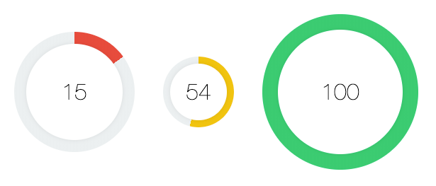
You know what’s way cooler than horizontal progress bars? Circle progress bars! Well, for some contexts at least. Circles are a little bit more difficult to work with in CSS that squares/rectangles where we can just define a simple width/height for the shape, but with some effort we can create something that looks like this:

Circle progress bars with Conic Gradients in StencilJS

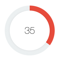
There are different ways to go about implementing a circle component like this, but I am going to walk through a rather simple method for achieving the effect with conic gradients. The basic idea is that we can use the conic-gradient that CSS provides to create a radial gradient that looks something like this:

CSS Conic Gradient that looks like pie chart

If we then overlay another circle shape ontop of the gradient, we can achieve the circular progress bar effect quite easily:

CSS Conic Gradient with additional circle element overlayed

The best part of this approach is how lightweight the solution is, with the key aspect being this CSS property:

background:conic-gradient(green 34%, 0, grey 66%);

This will create a gradient similar to the example that you can see above with a circular bar 34% of the way around the full circle. To make this into a more dynamic component, we will need to implement a way to configure both the colour values and the percentages for that CSS property.

NOTE: The conic-gradient value is not currently fully supported by all browsers. It is supported on Chrome/Safari (both desktop and iOS/Android), but Internet Explorer/Firefox and others do not support conic-gradient yet. If you do require support for these browsers, and want to use this component, there is a polyfill available.

Before We Get Started

We are going to create this component as a standalone web component using StencilJS. Although we will be focusing specifically on StencilJS, you could still follow this tutorial to apply the same concept elsewhere. For example, you could build this directly into an Ionic/StencilJS application (rather than creating a standalone component), or as an Angular component, or use the same concepts in your React application. We are just working with standard web stuff here.

This tutorial was written with Ionic developers in mind, but there also isn’t anything specific to Ionic or mobile applications here. If you are following along with StencilJS, I will assume that you already have a basic understanding of creating custom web components with StencilJS

1. Create the Component

We will be creating a component called my-circle-progress but you can rename this to whatever you prefer. Just make sure that you create a my-circle-progress.css and my-circle-progress.tsx file inside of the components folder in your StencilJS project.

The basic outline of the component will look like this:

import{ Component, Prop, h }from"@stencil/core";

@Component({
  tag:"my-circle-progress",
  styleUrl:"my-circle-progress.css",
  shadow:true})exportclassMyCircleProgress{
  @Prop() progressAmount: string ="0";
  @Prop() progressColor: string ="#2ecc71";render(){return(<div><div><span>
            75%
          </span></div></div>);}}

We will use two props that can be used to pass in values to this component. The progressAmount will be used to determine how much of the circle should be filled (and it will default to 0 if no value is supplied), and the progressColor will be used to determine the colour of the progress wheel (which defaults to a nice green colour).

Our template has a <div> for the element that will hold our conic-gradient background, and another <div> for the overlay that will sit on top of the gradient and contain the percentage number. We are going to define the styles directly on the elements - the CSS is quite short and it makes the tutorial easier to follow - but if you prefer, you could add classes to these divs and add your styles to the my-circle-progress.css file instead.

2. Implement the Conic Gradient

First, let’s take a look at how we can create the gradient required for our circle.

Modify the template to reflect the following:

render(){return(<divstyle={{
          width:`100%`,
          height:`100%`,
          display:`flex`,
          alignItems:`center`,
          justifyContent:`center`,
          background:`conic-gradient(${this.progressColor}${this.progressAmount}%, 0, #ecf0f1 ${(100-parseInt(this.progressAmount)).toString()}%)`,
          borderRadius:`50%`}}><div><span>{this.progressAmount}</span></div></div>);}

Creating a circle in CSS is simple enough - we just use a border-radius of 50%. The tricky part here is setting up the gradient. As we discussed earlier, we can add a conic-gradient like this:

background:conic-gradient(green 34%, 0, grey 66%);

Which would fill our circle with 34% green and 66% grey in a clock-wise manner. We need to make this dynamic. Ideally, we want to be able to pass in a number (e.g. 67) and then have the circle fill up with our main colour 67% of the way. All we need to do to achieve this is supply the desired number as the first percent value, and then 100 - (the number) as the second percentage value. We do this by passing in our progressAmount prop that we defined on the component.

We also pass in the progressColor prop to dynamically set the colour. We use a default grey for the background of #ecf0f1 but you could make this dynamic too if you wanted to (by using another prop, setting up a CSS variable, or turning off Shadow DOM on the component).

We have also added some other styles aside from the borderRadius and background. We want the circle to fill up all the available space, and we will also need the overlay (the <div> inside of the one we are currently working on) to be centered both vertically and horizontally - so, we use a flex layout with alignItems and justifyContent to achieve this.

At this point, our circles should look like a pie chart:

CSS Conic Gradient that looks like pie chart

3. Add the Overlay

To make our circles look less like a pie chart and more like a progress wheel, we need to add another circle overlay on top. This will give the appearance of cutting out the middle section of the circle, and will create the effect of a bar rotating around a circle.

Modify the template to reflect the following:

render(){return(<divstyle={{
          width:`100%`,
          height:`100%`,
          display:`flex`,
          alignItems:`center`,
          justifyContent:`center`,
          background:`conic-gradient(${this.progressColor}${this.progressAmount}%, 0, #ecf0f1 ${(100-parseInt(this.progressAmount)).toString()}%)`,
          borderRadius:`50%`}}><divstyle={{
            display:`flex`,
            alignItems:`center`,
            justifyContent:`center`,
            backgroundColor:`#fff`,
            height:`80%`,
            width:`80%`,
            borderRadius:`50%`,
            boxShadow:`0px 0px 7px 0px rgba(0, 0, 0, 0.1)`}}><spanstyle={{
              fontFamily:`"Helvetica Neue", Helvetica, Arial, Verdana, sans-serif`,
              fontSize:`2em`,
              fontWeight:`lighter`}}>{this.progressAmount}</span></div></div>);}

This overlay is a more simple circle. To make sure that we can still see the gradient behind the circle, we give this circle a width/height of 80% - this will leave the edges of the gradient behind it visible. We also add a box-shadow but this is not required, it just creates a nice little effect to give the component some depth.

Once again, we use a flex layout because we will also need to center the number that will be displayed on top of the circle, and we also add a bit of styling to our text.

4. Use the Component

The component is completed now! If you have been building this with StencilJS you can add the component to your index.html file to see a preview of what it looks like:

<body><divstyle="display: flex;align-items: center;flex-direction: column"><divstyle="width: 170px;height: 170px;margin: 20px;"><my-circle-progressprogress-color="#e74c3c"progress-amount="15"></my-circle-progress></div><divstyle="width: 100px;height: 100px;margin: 20px;"><my-circle-progressprogress-color="#f1c40f"progress-amount="54"></my-circle-progress></div><divstyle="width: 220px;height: 220px;margin: 20px;"><my-circle-progressprogress-color="#2ecc71"progress-amount="100"></my-circle-progress></div></div></body>

You can have a play around and use whatever colours/progress amounts you like.

Circle progress bars with Conic Gradients in StencilJS

Summary

We now have a resuable component that can be easily used anywhere - if you built this with StencilJS you will also be able to use it anywhere that supports web components. You will just need to publish the component in some manner.

If you enjoyed this tutorial, let me know in the comments or on Twitter. If there is interest in this component I’d like to take it a bit further, perhaps by extending it to function as an animated timer or event an input mechanism.

Tips for Animating in Ionic Applications

$
0
0

Animations are one of those little extra touches in an application that can transform an average looking application into something truly impressive. When done well, we can create animations that perform well, look great, and improve the user experience of our application.

There is a lot of talk around the performance of web-based or hybrid mobile applications, but it is often irrelevant as web tech is capable of smoothly running most (but not all) types of mobile applications. However, animations are one of those legitimate areas of concern for performance when using a web-based approach. Animations, in some cases, will need to make use of the extra computing power that is available to native applications that aren’t making use of the browser to render the user interface.

There will be more limitations for animations when using a web-based approach, but that does not mean that we can not do animations effectively with Ionic. It is just important that we understand a few concepts and how best to approach designing the animations - simple changes in the approach to an animation can transform it from being extremely laggy/janky to smooth and performant.

The more complex the animations become, the more they will need to be optimised, and some types of animations might not be feasible for Ionic applications. A big factor to consider is the types of devices you intend for your application to run on, as older devices may have a harder time running animations that may perform smoothly on more modern devices.

However, we can actually achieve quite a lot in terms of animation with very little impact on performance - probably a lot more than some people might think. As an example, take a look at this custom page transition animation that I created in one of my recent UI Challenge videos:

It looks quite cool and complex - it appears as if the button is expanding and morphing into the new page that is being displayed. Aside from looking cool, this animation also achieves something in terms of user experience. Rather than just transitioning directly to a new page, it makes the connection between the cart button and the cart button much more obvious, as one transitions smoothly into the other.

Despite how complex the animation may look, it actually uses very simple techniques that are easy for the browser to perform. I’ll let you watch the video if you are interested in the full implementation but the basic idea is using a CSS transition to animate the transform property on the button to:

transform:scale3d(35,35,1)

which makes it big enough (35 times its original size in this case) to fill the whole screen, and then using a custom page transition animation that Ionic supports to fade in a modal rather than using the default transition animation.

The combination of these two simple techniques leads to an effect that is impressive, easy to implement, and also cheap in terms of performance. That is what the rest of this article is going to be about: how to identify and use simple techniques that can lead to impressive and efficient animations. The point of this article is not to cover all of the impressive things you could do with animations in Ionic, but rather how you can get a lot of value from just understanding a few reasonably simple concepts and techniques.

1. Understand browser rendering

Aside from wanting our animations to be cool/relevant/interesting the key goal is to get them to feel fluid and smooth. The most impressive animation is going to detract from the application if it feels jumpy or janky or laggy.

The basic idea behind creating an experience that feels smooth is that our application continues to render at around, at least, 60fps (frames per second) and is able to deliver “instantaneous” feedback to the user - if the user interacts with the application (e.g. by swiping or clicking a button) it should respond with some kind of feedback within about 80ms which will make the interaction feel instant to the user.

This means that we need to make our applications efficient enough that the browser can render visual changes to the screen at least 60 times per second. This will mean the user perceives everything as happening smoothly/fluidly like a movie, rather than as a series of individual images being displayed to them (which will feel “janky”). A movie is still just a series of still images, but when those still images are displayed quickly enough our brains kind of fill in the blanks and don’t perceive the gaps in-between. We also need to make sure the browser can respond to interactions within about 80ms.

The more work we ask the browser to do (e.g. through inefficient animations or other complex operations) the less likely it is that it will be able to achieve these results. It is therefore important to understand how the browser does its work, so that you can integrate your animations into that process as efficiently as possible.

One of the key aspects of optimising for performance is avoiding causing too many “layouts” which is where the browser calculates the position/size of everything on the screen. For example, if we were to animate the height of a particular element on the page in response to scroll events coming from an <ion-content> component, this would cause a bit of a disaster. If we animate the height of one element, it is going to affect the position of other elements on the page, which means the browser needs to calculate the position of everything again (e.g. it will cause a “layout” or “reflow”). Not only are we causing layouts, but we are also triggering these layouts in quick succession since scroll events are fired off very rapidly. This is a scenario which might be referred to as layout thrashing where we are basically bombarding the browser rendering process with expensive work.

We are going to talk about some aspects of this throughout this article, but it is a good idea to have a general understanding of the browser rendering process. Having a better understanding of the browser rendering process will also help you design more performant applications in general, as well as helping you create performant animations.

2. Use CSS Transitions

Now we are going to get into the actual animation tips - remember that the point of these tips is focusing on the simple things we can do that can create impressive effects with little to no performance cost. Animations can seem complex and difficult to create, but you can create suprisingly impressive animations with very little work.

One of the easiest ways you can create animations in your applications is to use the CSS transition property. You can quite simply do this:

.some-element{transition: 1s linear;}

Now any time that an animatable property changes on the element that has the transition property, it will animate the change instead of just instantly changing. If the opacity property were to change from 0 to 1, the element would smoothly fade in over 1 second rather than instantly appearing. If you get creative, you can create some impressive animations with this simple concept - it is generally what I use to create most of the animations I add to my Ionic applications.

You can apply a generic transition property that will target any property changes, or you can target properties specifically:

.some-element{transition: opacity 1s linear;}

Now only opacity changes would be animated. You can also play around with the easing functions which control how the animation plays. Above we have used a “linear” easing function which will play the animation evenly over the 1 second, but you can use different timings that will cause the animation to play faster/slower at certain points of the animation. This can help add a bit of “character” to the animation, making it feel more sleek/smooth or perhaps fun/bouncy. Animations can drastically affect the mood of your application.

IMPORTANT: When it comes to animating CSS properties, not all properties are created equal in terms of performance. Although we can achieve lots of interesting things by animating the many different CSS properties that are animatable, we should generally try to only use a few of them which we will discuss now.

3. Use Transforms

The transform property is something that I rely on a lot to create animations. We can supply different values to the CSS transform property to do things like rotate, scale, and translate elements on the page. A rotate transform will rotate the element to the degree value you specify, a scale transform will make an element smaller or larger, and a translate transform will change the position of the element.

This is a concept I have made use of if both of my UI Challenge videos to scale the cart button as we saw above:

and to translate the position of the content area (so that it moves up when the user scrolls down):

The fantastic thing about transforms is that they don’t affect the position of other elements on the page, which means it is cheap for the browser to perform. If we changed the width/height of an element to make it bigger it would be a big drain on performance, however if we scale it to make it bigger it will perform very well. That means that we have the ability to spin things, move things, or shrink/grow them (maybe all at the same time) all without having much of an impact on performance.

4. Use Opacity

Another thing that is easy for the browser to animate that can create some interesting effects is opacity. This can be used to create animations as simple as something appearing on the screen, but it can also be used to create more complex effects like the screen transition animation above, as well as this shared element transition effect:

5. Avoid everything else

The properties we have discussed above are things that we can animate without having to worry too much about wrecking performance. That doesn’t mean that we can’t also animate other properties as well, but you should be much more careful and check how much it is impacting performance by using the browser performance profiling tools. Animating things like margin and height is going to be a lot more costly than transforms and opacity - especially if the animation is happening in response to something like scroll events that are triggered fast and often.

6. Add/Remove a Class

Now we are going to get more into how to actually apply the animations - again, focusing on keeping things reasonably simple. With CSS transitions, all we need to happen is for the CSS property to change (e.g. changing the opacity property on an element from 1 to 0). One way we can do this is by applying or removing a CSS class on an element. Once the class is added or removed, the animation will play (assuming that the element has the transition property added to it).

7. Manually modify a style to apply an animation

As well as using classes to change the value of a CSS property, we can also just modify it directly. For example, we could just do something like this:

const fab =this.el.querySelector("ion-fab");
fab.style.transform ="scale3d(35,35,1)";

Exactly how you go about modifying styles through JavaScript might depend on the framework that you are using (in Angular for example you would want to use the Renderer), but this is the code I used in my Ionic/StencilJS example for the expanding button page transition. Since the button had the transition property applied to it, the animation could be triggered within the JavaScript code by directly modifying the style property.

Modifying styles as part of some kind of complex application logic can lead to some much more interesting animations.

8. Use CSS Keyframes

If it isn’t enough to just simply change a property and have that change animate, you can also use CSS keyframes to define an animation. This will allow you to easily define multiple properties and what they should change from and to - you can even define what certain properties should be at a certain percentage of the way through an animation. For example, let’s suppose you were animating a translate transform. Rather than just shifting the element 100px to the left and animating back to its normal position, maybe you want the element to fly past its final resting position halfway through the animation and then settle back into the final position to create a bit more motion. This can be achieved with keyframes.

9. Use SVGs

Scalable Vector Graphics (SVG) are an animation super power for the web. If you are unfamiliar with vector graphics, it is an image that is defined mathematically such that it can be scaled without losing quality. However, an SVG brings much more to the table than the ability to scale. An SVG has its own DOM structure (you can literally copy and paste the code for an SVG directly into your application if you want), and that DOM can be manipulated and animated just like the rest of your application. There is a lot to learn about how to create and use SVGs, but the possibilities are endless. The entire SVG is defined in that DOM structure, and we can manipulate/animate whatever we like within that DOM.

Keeping the same performance concepts in mind, we can create many impressive animations in Ionic applications with the help of SVGs. Here is one example from a tutorial I wrote a little while ago:

SVG animation of changing weather background

It uses SVGs to animate the background to reflect the current weather conditions. You can check out the full tutorial here: Animating a Dynamic Background with an SVG in Ionic.

10. Use what the framework provides

Finally, make sure you aren’t missing something obvious. Ionic provides us with a lot out of the box, so before you start building out your own custom solution make sure to check if there are any Ionic components or APIs that suit your needs. The <ion-modal> component allows you to supply a custom enterAnimation and leaveAnimation, and the <ion-nav> component can also be configured with custom animations. There are the <ion-spinner> and <ion-progress-bar> components both of which serve as animated progress indicators. We have the <ion-skeleton-text> which can also be configured as an animated placeholder for content.

Constantly improving the user interface of Ionic applications seems to be a goal of the Ionic team, so always keep an eye out for further improvements and innovations are animations in Ionic applications.

Summary

There is a lot more that can be achieved with animations, and many more ways we can do it. We haven’t even discussed the Web Animations API or any of the many different libraries out there that can help with animations, but the main point of this article was to cover some simple tips for how you can relatively easily create impressive animations without negatively affecting the performance of your application.

Create Tinder Style Swipe Cards with Ionic Gestures

$
0
0

I’ve been with my wife since around the time Tinder was created, so I’ve never had the experience of swiping left or right myself. For whatever reason, swiping caught on in a big way. The Tinder animated swipe card UI seems to have become extremely popular and something people want to implement in their own applications. Without looking too much into why this provides an effective user experience, it does seem to be a great format for prominently displaying relevant information and then having the user commit to making an instantaneous decision on what has been presented.

Creating this style of animation/gesture has always been possible in Ionic applications - you could use one of many libraries to help you, or you could have also implemented it from scratch yourself. However, now that Ionic is exposing their underlying gesture system for use by Ionic developers, it makes things significantly simpler. We have everything we need out of the box, without having to write complicated gesture tracking ourselves.

I recently released an overview of the new Gesture Controller in Ionic 5 which you can check out below:

If you are not already familiar with the way Ionic handles gestures within their components, I would recommend giving that video a watch before you complete this tutorial as it will give you a basic overview. In the video, we implement a kind of Tinder “style” gesture, but it is at a very basic level. This tutorial will aim to flesh that out a bit more, and create a more fully implemented Tinder swipe card component.

Example of Tinder style swipe cards implemented with Ionic

We will be using StencilJS to create this component, which means that it will be able to be exported and used as a web component with whatever framework you prefer (or if you are using StencilJS to build your Ionic application you could just build this component directly into your Ionic/StencilJS application). Although this tutorial will be written for StencilJS specifically, it should be reasonably straightforward to adapt it to other frameworks if you would prefer to build this directly in Angular, React, etc. Most of the underlying concepts will be the same, and I will try to explain the StencilJS specific stuff as we go.

NOTE: This tutorial was built using Ionic 5 which, at the time of writing this, is currently in beta. If you are reading this before Ionic 5 has been fully released, you will need to make sure to install the @next version of @ionic/core or whatever framework specific Ionic package you are using, e.g. npm install @ionic/core@next or npm install @ionic/angular@next.

Before We Get Started

If you are following along with StencilJS, I will assume that you already have a basic understanding of how to use StencilJS. If you are following along with a framework like Angular, React, or Vue then you will need to adapt parts of this tutorial as we go.

If you would like a thorough introduction to building Ionic applications with StencilJS, you might be interested in checking out my book.

A Brief Introduction to Ionic Gestures

As I mentioned above, it would be a good idea to watch the introduction video I did about Ionic Gesture, but I will give you a quick rundown here as well. If we are using @ionic/core we can make the following imports:

import{ Gesture, GestureConfig, createGesture }from'@ionic/core';

This provides us with the types for the Gesture we create, and the GestureConfig configuration options we will use to define the gesture, but most important is the createGesture method which we can call to create our “gesture”. In StencilJS we use this directly, but if you are using Angular for example, you would instead use the GestureController from the @ionic/angular package which is basically just a light wrapper around the createGesture method.

In short, the “gesture” we create with this method is basically mouse/touch movements and how we want to respond to them. In our case, we want the user to perform a swiping gesture. As the user swipes, we want the card to follow their swipe, and if they swipe far enough we want the card to fly off screen. To capture that behaviour and respond to it appropriately, we would define a gesture like this:

const options: GestureConfig ={
      el:this.hostElement,
      gestureName:'tinder-swipe',
      onStart:()=>{// do something as the gesture begins},
      onMove:(ev)=>{// do something in response to movement},
      onEnd:(ev)=>{// do something when the gesture ends}};const gesture: Gesture =awaitcreateGesture(options);

    gesture.enable();

This is a bare-bones example of creating a gesture (there are additional configuration options that can be supplied). We pass the element we want to attach the gesture to through the el property - this should be a reference to the native DOM node (e.g. something you would usually grab with a querySelector or with @ViewChild in Angular). In our case, we would pass in a reference to the card element that we want to attach this gesture to.

Then we have our three methods onStart, onMove, and onEnd. The onStart method will be triggered as soon as the user starts a gesture, the onMove method will trigger every time there is a change (e.g. the user is dragging around on the screen), and the onEnd method will trigger once the user releases the gesture (e.g. they let go of the mouse, or lift their finger off the screen). The data that is supplied to us through ev can be used to determine a lot, like how far the user has moved from the origin point of the gesture, how fast they are moving, in what direction, and much more.

This allows us to capture the behaviour we want, and then we can run whatever logic we want in response to that. Once we have created the gesture, we just need to call gesture.enable which will enable the gesture and start listening for interactions on the element it is associated with.

With this idea in mind, we are going to implement the following gesture/animation in Ionic:

Example of Tinder style swipe cards implemented with Ionic

1. Create the Component

You will need to create a new component, which you can do inside of a StencilJS application by running:

npm run generate

You may name the component however you wish, but I have called mine app-tinder-card. The main thing to keep in mind is that component names must be hyphenated and generally you should prefix it with some unique identifier as Ionic does with all of their components, e.g. <ion-some-component>.

2. Create the Card

We can apply the gesture we will create to any element, it doesn’t need to be a card or sorts. However, we are trying to replicate the Tinder style swipe card, so we will need to create some kind of card element. You could, if you wanted to, use the existing <ion-card> element that Ionic provides. To make it so that this component is not dependent on Ionic, I will just create a basic card implementation that we will use.

Modify src/components/tinder-card/tinder-card.tsx to reflect the following:

import{ Component, Host, Element, Event, EventEmitter, h }from'@stencil/core';import{ Gesture, GestureConfig, createGesture }from'@ionic/core';

@Component({
  tag:'app-tinder-card',
  styleUrl:'tinder-card.css'})exportclassTinderCard{render(){return(<Host><divclass="header"><imgclass="avatar"src="https://avatars.io/twitter/joshuamorony"/></div><divclass="detail"><h2>Josh Morony</h2><p>Animator of the DOM</p></div></Host>);}}

We have added a basic template for the card to our render() method. For this tutorial, we will just be using non-customisable cards with the static content you see above. You may want to extend the functionality of this component to use slots or props so that you can inject dynamic/custom content into the card (e.g. have other names and images besides “Josh Morony”).

It is also worth noting that we have set up all of the imports we will be making use of:

import{ Component, Host, Element, Event, EventEmitter, h }from'@stencil/core';import{ Gesture, GestureConfig, createGesture }from'@ionic/core';

We have our gesture imports, but as well as that we are importing Element to allow us to get a reference to the host element (which we want to attach our gesture to). We are also importing Event and EventEmitter so that we can emit an event that can be listened for when the user swipes right or left. This would allow us to use our component in this manner:

<app-tinder-cardonMatch={(ev)=>{this.handleMatch(ev)}}/>

So that our cards don’t look completely ugly, we are going to add a few styles as well.

Modify src/components/tinder-card/tinder-card.css to reflect the following:

app-tinder-card{display: block;width: 100%;min-height: 400px;border-radius: 10px;display: flex;flex-direction: column;box-shadow: 0 0 3px 0px #cecece;}.header{background-color: #36b3e7;border: 4px solid #fbfbfb;border-radius: 10px 10px 0 0;display: flex;justify-content: center;align-items: center;flex: 2;}.avatar{width: 200px;height: auto;}.detail{background-color: #fbfbfb;padding-left: 20px;border-radius: 0 0 10px 10px;flex: 1;}

3. Define the Gesture

Now we are getting into the core of what we are building. We will define our gesture and the behaviour that we want to trigger when that gesture happens. We will first add the code as a whole, and then we will focus on the interesting parts in detail.

Modify src/components/tinder-card/tinder-card.tsx to reflect the following:

import{ Component, Host, Element, Event, EventEmitter, h }from'@stencil/core';import{ Gesture, GestureConfig, createGesture }from'@ionic/core';

@Component({
  tag:'app-tinder-card',
  styleUrl:'tinder-card.css'})exportclassTinderCard{

  @Element() hostElement: HTMLElement;
  @Event() match: EventEmitter;connectedCallback(){this.initGesture();}asyncinitGesture(){const style =this.hostElement.style;const windowWidth = window.innerWidth;const options: GestureConfig ={
      el:this.hostElement,
      gestureName:'tinder-swipe',
      onStart:()=>{
        style.transition ="none";},
      onMove:(ev)=>{
        style.transform =`translateX(${ev.deltaX}px) rotate(${ev.deltaX/20}deg)`},
      onEnd:(ev)=>{

        style.transition ="0.3s ease-out";if(ev.deltaX > windowWidth/2){
          style.transform =`translateX(${windowWidth *1.5}px)`;this.match.emit(true);}elseif(ev.deltaX <-windowWidth/2){
          style.transform =`translateX(-${windowWidth *1.5}px)`;this.match.emit(false);}else{
          style.transform =''}}};const gesture: Gesture =awaitcreateGesture(options);

    gesture.enable();}render(){return(<Host><divclass="header"><imgclass="avatar"src="https://avatars.io/twitter/joshuamorony"/></div><divclass="detail"><h2>Josh Morony</h2><p>Animator of the DOM</p></div></Host>);}}

At the beginning of this class, we have set up the following code:

  @Element() hostElement: HTMLElement;
  @Event() match: EventEmitter;connectedCallback(){this.initGesture();}

The @Element() decorator will provide us with a reference to the host element of this component. We also set up a match event emitter using the @Event() decorator which will allow us to listen for the onMatch event to determine which direction a user swiped.

We have set up the connectedCallback lifecycle hook to automatically trigger our initGesture method which is what handles actually setting up the gesture. We have already discussed the basics of defining a gesture, so let’s focus on our specific implementation of the onStart, onMove, and onEnd methods:

      onStart:()=>{
        style.transition ="none";},
      onMove:(ev)=>{
        style.transform =`translateX(${ev.deltaX}px) rotate(${ev.deltaX/20}deg)`},
      onEnd:(ev)=>{

        style.transition ="0.3s ease-out";if(ev.deltaX > windowWidth/2){
          style.transform =`translateX(${windowWidth *1.5}px)`;this.match.emit(true);}elseif(ev.deltaX <-windowWidth/2){
          style.transform =`translateX(-${windowWidth *1.5}px)`;this.match.emit(false);}else{
          style.transform =''}}

Let’s being with the onMove method. When the user swipes on the card, we want the card to follow the movement of that swipe. We could just detect the swipe and animate the card after the swipe has been detected, but this isn’t as interactive and won’t look as nice/smooth/intuitive. So, what we do is modify the transform property of the elements style to modify the translateX to match the deltaX of the movement. The deltaX is the distance the gesture has moved from the initial start point in the horizontal direction. The translateX will move an element in a horizontal direction by the number of pixels we supply. If we set this translateX to the deltaX it will mean that the element will follow our finger, or mouse, or whatever we are using for input along the screen.

We also set the rotate transform so that the card rotates in relation to a ratio of the horizontal movement - the further you get to the edge of the screen, the more the card will rotate. This is divided by 20 just to lessen the effect of the rotation - try setting this to a smaller number like 5 or even just use ev.deltaX directly and you will see how ridiculous it looks.

The above gives us our basic swiping gesture, but we don’t want the card to just follow our input - we need it to do something after we let go. If the card isn’t near enough the edge of the screen it should snap back to its original position. If the card has been swiped far enough in one direction, it should fly off the screen in the direction it was swiped.

First, we set the transition property to 0.3s ease-out so that when we reset the cards position back to translateX(0) (if the card was no swiped far enough) it doesn’t just instantly pop back into place - instead, it will animate back smoothly. We also want the cards to animate off screen nicely, we don’t want them to just pop out of existence when the user lets go.

To determine what is “far enough”, we just check if the deltaX is greater than half the window width, or less than half of the negative window width. If either of those conditions are satisfied, we set the appropriate translateX such that the card goes off the screen. We also trigger the emit method on our EventListener so that we can detect the successful swipe when using our component. If the swipe was not “far enough” then we just reset the transform property.

One more important thing we do is set style.transition = "none"; in the onStart method. The reason for this is that we only want the translateX property to transition between values when the gesture has ended. There is no need to transition between values onMove because these values are already very close together, and attempting to animate/transition between them with a static amount of time like 0.3s will create weird effects.

4. Use the Component

Our component is complete! Now we just need to use it, which is reasonably straight-forward with one caveat which I will get to in a moment. Using the component directly in your StencilJS application would look something like this:

import{ Component, h }from'@stencil/core';

@Component({
  tag:'app-home',
  styleUrl:'app-home.css'})exportclassAppHome{handleMatch(ev){if(ev.detail){
      console.log("It's a match!")}else{
      console.log("Maybe next time");}}render(){return[<ion-header><ion-toolbarcolor="primary"><ion-title>Ionic Tinder Cards</ion-title></ion-toolbar></ion-header>,<ion-contentclass="ion-padding"><divclass="tinder-container"><app-tinder-cardonMatch={(ev)=>{this.handleMatch(ev)}}/><app-tinder-cardonMatch={(ev)=>{this.handleMatch(ev)}}/><app-tinder-cardonMatch={(ev)=>{this.handleMatch(ev)}}/></div></ion-content>];}}

We can mostly just drop our app-tinder-card right in there, and then just hook up the onMatch event to some handler function as we have done with the handleMatch method above.

One thing we have not covered in this tutorial is handling a “stack” of cards, as these Tinder cards would usually be used in. What would likely be the nicer option is to create an additional <app-tinder-card-stack> component, such that it could be used like this:

<app-tinder-card-stack><app-tinder-card/><app-tinder-card/><app-tinder-card/></app-tinder-card-stack>

and the styling for positioning the cards on top of one another would be handled automatically. However, for now, I have just added some manual styling directly in the page to position the cards directly:

.tinder-container{position: relative;}app-tinder-card{position: absolute;top: 0;left: 0;}

Which will give us something like this:

Example of Tinder style swipe cards implemented with Ionic

Summary

It’s pretty fantastic to be able to build what is a reasonably cool/complex looking animated gesture, all with what we are given out of the box with Ionic. The opportunities here are effectively endless, you could create any number of cool gestures/animations using the basic concept of listening for the start, movement, and end events of gestures. This is also using just the bare-bones features of Ionic’s gesture system as well, there are more advanced concepts you could make use of (like conditions in which a gesture is allowed to start).

I wanted to focus mainly on the gestures and animation aspect of this functionality, but if there is interest in covering the concept of a <app-tinder-card-stack> component to work in conjunction with the <app-tinder-card> component let me know in the comments.


Creating a Gmail Style Swipe to Archive with the Ionic Animations API

$
0
0

In my recent tutorials, I have been explaining how to build more complex UI/UX patterns into Ionic applications with the Ionic Animations API and the improved gesture support in Ionic 5. I often keep a look out for impressive gestures or animations whether they are in traditional “native” mobile applications, or just a designers concept, and see if I can implement something the same or similar in Ionic.

My goal is to help dispel the perception that interesting interactions and animations are for the realm of native mobile applications that use native UI controls, as opposed to Ionic applications which use a web view to power the UI (which I think is actually one of Ionic’s greatest advantages). With a bit of knowledge about how to go about designing complex gestures and animations in a web environment, we can often create results that are indistinguishable from a native user interface.

That is why I decided to tackle building the Swipe to Archive feature that the Gmail mobile application uses in Ionic. The basic idea is that you can swipe any of the emails in your inbox, and if you swipe far enough the email will be archived. As you swipe, and icon is revealed underneath that implies the result of the gesture. If you do not swipe far enough, then the email will slide back into it’s normal resting place. It looks like this:

Building this in Ionic is similar in concept to the Tinder Swipe Cards I created recently, but there are some interesting differences. For the Tinder cards, we rely entirely on Ionic’s Gesture system, but in this tutorial we will be making use of both the Gestures system and the Ionic Animations API.

Some interesting challenges that we will solve in this tutorial include:

  • Creating an entirely self contained component to perform the functionality
  • Making an element follow a gesture on the screen
  • Detecting an archive/don’t-archive threshold from the gesture
  • Chaining animations such that one animation plays only after another has finished
  • Creating a complex delete animation which gives an element time to “animate away” before physically being deleted
  • Using CSS grid to place elements on top of one another

We will be building this as a StencilJS component inside of an Ionic/StencilJS application, but this tutorial could also be used to build the same functionality into Angular, React, or Vue with a few tweaks. I will do my best to highlight the StencilJS specific concepts as we go.

The end result will look like this:

Example of Gmail style swipe-to-archive feature implemented with Ionic

NOTE: This tutorial was built using Ionic 5 which, at the time of writing this, is currently in its release candidate stage. If you are reading this before Ionic 5 has been fully released, you will need to make sure to install the @next version of @ionic/core or whatever framework specific Ionic package you are using, e.g. npm install @ionic/core@next or npm install @ionic/angular@next.

Before We Get Started

If you are following along with StencilJS, I will assume that you already have a basic understanding of how to use StencilJS. If you are following along with a framework like Angular, React, or Vue then you will need to adapt parts of this tutorial as we go.

If you would like a thorough introduction to building Ionic applications with StencilJS, you might be interested in checking out my book.

If you do not already have a basic understanding of the Ionic Animations API or Gestures I would recommend familiarising yourself with the following resources first:

1. The Basic Component Structure and Layout

You will need to first create a new component for whatever you are using to build your application, but if you are using StencilJS as I am in this tutorial you can run the following command to help create it:

npm run generate

I named my component app-swipe-delete but you can use whatever you like. Let’s get the basic structure of the component implemented first, and then we will add on the gesture and animation functionality.

Modify the component to reflect the following:

import{ Component, Host, Element, Event, EventEmitter, h }from'@stencil/core';import{ Gesture, GestureConfig, createGesture, createAnimation }from"@ionic/core";

@Component({
  tag:'app-swipe-delete',
  styleUrl:'swipe-delete.css'})exportclassSwipeDelete{

  @Element() hostElement: HTMLElement;
  @Event() deleted: EventEmitter;private gesture: Gesture;asynccomponentDidLoad(){const innerItem =this.hostElement.querySelector('ion-item');const style = innerItem.style;const windowWidth = window.innerWidth;}disconnectedCallback(){if(this.gesture){this.gesture.destroy();this.gesture =undefined;}}render(){return(<Hoststyle={{display:`grid`, backgroundColor:`#2ecc71`}}><divstyle={{gridColumn:`1`, gridRow:`1`, display:`grid`, alignItems:`center`}}><ion-iconname="archive"style={{marginLeft:`20px`, color:`#fff`}}></ion-icon></div><ion-itemstyle={{gridColumn:`1`, gridRow:`1`}}><slot></slot></ion-item></Host>);}}

We have set up all of the imports that we need for this component, which includes what is required for creating gestures and using the Ionic Animations API. If you are using Angular, keep in mind that you can import the GestureController from @ionic/angular and use that instead of createAnimation.

We use @Element() to grab a reference to the node that represents the element we are creating in the DOM - if you are not using StencilJS you would need to grab a reference to the DOM element in some other way. We also use @Event() to set up a deleted event which is another StencilJS specific concept, but is also achievable in other ways frameworks like Angular and React. Basically, we want to at some point indicate that the element has been deleted, and we will listen for that event outside of the component to determine when to remove its data from the application (e.g. when to remove the corresponding item from the array that contains everything in our list).

In the componentDidLoad lifecycle hook which runs automatically when the component has loaded, we set up some more references to values we will need to define the gesture and animations. We will be animating the items to the right side of the screen, but an important thing to keep in mind is that we don’t want to move the entire component. The component will be comprised of two blocks sitting on top of each other - the block behind will remain in place (and will display a little “archive” icon) and the block on top will slide to the right. To achieve this, we grab a reference to the <ion-item> that will live inside of this component so that we can manipulate it later. We also grab a reference to the width of the screen so that we know how far to the right we need to animate the <ion-item> when it is being deleted.

The disconnectedCallback just runs some clean up code for when the component is destroyed. Then we have the template itself. Inside of our component we have an <ion-item> and a generic <div>. We want the <div> to display the background colour and the icon, and we want the <ion-item> to sit on top of that to display the regular content. To get these two elements sitting on top of one another we need to start getting a little tricky. We could achieve this with some absolute positioning, but that will make some other things like positioning the archive icon the way we want awkward. Instead, we are using a little CSS Grid trick to position the elements on top of each other. We use display: grid to make use of CSS Grid, and then we tell both elements to occupy the same grid-column and grid-row. Then in our <div> we can just use align-items: center to get our <ion-icon> to be vertically aligned.

The only other thing we are doing here is using a <slot> inside of the <ion-item>. The basic idea of a slot is that it will project content supplied to the component inside of the component itself (if you are familiar with Angular’s <ng-content> it is pretty much the same thing). What this means is that if we use the component like this:

<app-swipe-delete>
	Hello there
</app-swipe-delete>

That content would be projected inside of our component like this:

<divstyle={{gridColumn:`1`, gridRow:`1`, display:`grid`, alignItems:`center`}}><ion-iconname="archive"style={{marginLeft:`20px`, color:`#fff`}}></ion-icon></div><ion-itemstyle={{gridColumn:`1`, gridRow:`1`}}>
  Hello there
</ion-item>

If you would like to read more about how slots work, you can take a look at the following article:

NOTE: We are using an <ion-item> here to make use of the default Ionic styling, but you could just as easily build this with another generic <div> instead of <ion-item> if you didn’t want this component to be dependent on Ionic.

2. Setting up the Gesture

Now let’s work on the gesture. What we want to do is be able to swipe the list item elements and have the element follow our finger. If the element is swiped/dragged far enough, then it will perform a delete animation.

Modify the load lifecycle hook to reflect the following:

asynccomponentDidLoad(){const innerItem =this.hostElement.querySelector('ion-item');const style = innerItem.style;const windowWidth = window.innerWidth;const options: GestureConfig ={
      el:this.hostElement,
      gestureName:'swipe-delete',onStart:()=>{
        style.transition ="";},onMove:(ev)=>{if(ev.deltaX >0){
          style.transform =`translate3d(${ev.deltaX}px, 0, 0)`;}},onEnd:(ev)=>{
        style.transition ="0.2s ease-out";if(ev.deltaX >150){
          style.transform =`translate3d(${windowWidth}px, 0, 0)`;}else{
          style.transform =''}}}this.gesture =awaitcreateGesture(options);this.gesture.enable();}

This gesture is almost identical to the one we created in the Tinder card tutorial, so if you would like some more elaboration I would recommend giving that tutorial a read. The basic idea is that we translate the element in the X direction for whatever the deltaX value of the gesture is. The deltaX value represents how far in the horizontal direction the users finger/mouse/whatever has moved from the origin point of the gesture. If we use transform: translate to move our element the same amount as the deltaX then it will follow the users input on the screen. We also use the onEnd method once the gesture has been completed to determine if the gesture was swiped far enough to trigger a delete/archive (i.e. was the final deltaX value above 150?). If it was swiped far enough, then we automatically animate the item all of the way off of the screen by setting the translate value on the X-axis to the windowWidth value.

An important difference with this gesture, as opposed to the Tinder cards, is that we are listening for the gesture on the host element of the component but we are actually animating one of the inner items of the component - the <ion-item> that is inside of the component. As I mentioned, we don’t want to move the entire component over as we need part of it to stay in place to display the background colour and the archive icon.

3. Implementing the Leave Animation

We have already created our gesture and have the item animating off screen if the item was swiped far enough, but there are still a couple more things that we need to do. Once the item has animated off screen, we don’t want the green block sitting behind that item and displaying the archive icon to just sit there indefinitely, we will want that to animate away as well. On top of that, once is has finished animating away we want to trigger the delete event so that we know we can now delete that element for real (rather that just hiding it away through animations).

It is important that we wait until the animation has finished before triggering that delete event, otherwise our animation will get cut off. The Ionic Animations API provides an easy was to do this, as we can use the onFinish method to trigger some code once an animation has completed.

Modify the load lifecycle hook to reflect the following:

asynccomponentDidLoad(){const innerItem =this.hostElement.querySelector('ion-item');const style = innerItem.style;const windowWidth = window.innerWidth;const hostDeleteAnimation =createAnimation().addElement(this.hostElement).duration(200).easing('ease-out').fromTo('height','48px','0');const options: GestureConfig ={
      el:this.hostElement,
      gestureName:'swipe-delete',onStart:()=>{
        style.transition ="";},onMove:(ev)=>{if(ev.deltaX >0){
          style.transform =`translate3d(${ev.deltaX}px, 0, 0)`;}},onEnd:(ev)=>{
        style.transition ="0.2s ease-out";if(ev.deltaX >150){
          style.transform =`translate3d(${windowWidth}px, 0, 0)`;

          hostDeleteAnimation.play()

          hostDeleteAnimation.onFinish(()=>{this.deleted.emit(true);})}else{
          style.transform =''}}}this.gesture =awaitcreateGesture(options);this.gesture.enable();}

Now we have defined a hostDelete animation that will animate the height of the entire component from 48px to 0, which means it will shrink away just as the Gmail delete animation does. It is important to note that animating a property like height can be expensive for performance (basically you should only animate transform and opacity wherever possible to achieve your animations). Depending on the context, you might want to profile the performance of this animation to make sure it suits your needs. A higher performance version of this animation could be achieved by animating the opacity to hide the host element rather than height but it wouldn’t be quite as nice. Another limitation of this animation is that it requires a fixed/known height to animate from.

Then all we do is trigger this animation with the play() method inside of our onEnd method if appropriate. The cool part here is that we then also add an onFinish callback for that animation, so that when it is finished it will trigger this.delete.emit(true).

4. Using the Component

Now that we have our component created, let’s take a look at how to use it and how to listen for that deleted event so that we can remove the items data from the list at the appropriate time. Again, this example will be for StencilJS but the same basic principles will apply elsewhere.

import{ Component, State, h }from'@stencil/core';

@Component({
  tag:'app-home',
  styleUrl:'app-home.css'})exportclassAppHome{

  @State() items =[];componentWillLoad(){this.items =[{uid:1, subject:'hello', message:'hello'},{uid:2, subject:'hello', message:'hello'},{uid:3, subject:'hello', message:'hello'},{uid:4, subject:'hello', message:'hello'},{uid:5, subject:'hello', message:'hello'},{uid:6, subject:'hello', message:'hello'},{uid:7, subject:'hello', message:'hello'},{uid:8, subject:'hello', message:'hello'},{uid:9, subject:'hello', message:'hello'},{uid:10, subject:'hello', message:'hello'}]}render(){return[<ion-header><ion-toolbarcolor="primary"><ion-title>Home</ion-title></ion-toolbar></ion-header>,<ion-content><ion-list>{this.items.map((item)=>(<app-swipe-deletekey={item.uid}onDeleted={()=>this.handleDelete(item.uid)}>{item.subject}</app-swipe-delete>))}</ion-list></ion-content>];}handleDelete(uid){this.items =this.items.filter((item)=>{return item.uid !== uid;});this.items =[...this.items];}}

All we need to do now to make use of this component is to loop over an array of data and use our <app-swipe-delete> component for each element. We can supply it with whatever content we want to display inside of the item, and we can also listen for the deleted event to handle removing the item from the list when necessary. To do that in StencilJS we use onDeleted, but this might look slightly different depending on what you are using.

The end result should look something like this:

Example of Gmail style swipe-to-archive feature implemented with Ionic

Summary

What we have created is a reasonably advanced interaction/animation, but with the use of Ionic’s gesture system and the Ionic Animations API it is actually reasonably smooth to create with relatively little code. There is a lot you could do and create with reasonably minor variations on the general concepts we have made use of in this tutorial.

Creating a Staggered Animation for an Ionic Infinite List (without SASS)

$
0
0

There are many instances in which we can use a staggered animation in our applications, but it is perhaps most commonly used with lists or thumbnails/galleries. The idea is that we apply an animation (usually the same animation) to multiple elements, but we execute those animations with an increasing amount of delay for each element.

The result is an appearance that these individual animations are linked together, creating a kind of “flow” of elements animating on to the screen (or some other kind of animation). I recently published a video that walks through creating this effect in Ionic if you would like to see an example of what I am talking about:

There can be a practical purpose to this style of animation - in that it could be used to give a sense of direction (e.g. the list flows downwards and there is more content to discover below) or even as a mechanism to create “perceived performance” whilst loading - but for the most part, it just generally looks/feels nice (as long as the animation isn’t too slow).

The basic concept is simple enough, we create an animation:

@keyframes popIn{0%{opacity: 0;transform:scale(0.6)translateY(-8px);}100%{opacity: 1;transform: none;}}

and then apply that animation to each element in our list:

ion-item{animation: popIn 0.2s both ease-in;}

The trick is to add an animation-delay so that the animations don’t all trigger at once, e.g:

ion-item{animation: popIn 0.2s 70ms both ease-in;}

The animation now has a delay of 70ms which means the browser will wait 70ms before starting the animation. However, this will apply the same delay to every item in the list, which is not what we want. We want the first ion-item to have no delay, the second to have 70ms of delay, the third to have 140ms of delay and so on.

Instead, we can do something like this:

ion-item:nth-child(1){animation-delay: 70ms
}ion-item:nth-child(2){animation-delay: 140ms
}ion-item:nth-child(3){animation-delay: 210ms
}

This will achieve what we want, but you can see how this would quickly become tiresome to write and maintain, even for small lists. To make the process of writing out each of these rules above easier, it is common to use SASS which is a preprocessor for CSS that will allow us to write loops to create rules like the above automatically (e.g. we could create 50 nth-child rules with one loop in SASS).

This works, but there are some downsides. It is still a bit tricky to write out the loop, if you don’t know how many items will be in your list then SASS might create a bunch of unnecessary rules for items that don’t exist, or maybe you just don’t know how to use SASS or you don’t want to use it.

Staggered Animations without SASS

SASS was the way I would typically achieve staggered animations, but I started searching around for solutions that wouldn’t require any additional dependencies. As it turns out, it is possible to achieve this style of animation entirely with CSS.

In my research, I came across the following article by Daniel Benmore: Different Approaches for Creating a Staggered Animation. Daniel was searching for the same thing I was, and he came to a solution which I think is genius in its simplicity. We can do everything we need just with CSS Variables.

I’ve written a lot on the subject of CSS variables and Ionic before, so if you need a bit of background information you might be interested in the following articles:

The video I published above walks through adapting the concept Daniel talks about into an Ionic application with a list of a dynamic size. The example is created inside of an Ionic/StencilJS application, but the same concepts can be used with Angular, React, or Vue as well (just with a bit of tweaking for syntax).

One of the commenters on the video pointed out that the example with CSS variables would not work for an infinite list in Ionic. This is true, but with a small change the same concept can also be applied to infinite lists.

In this tutorial, I am going to walk through implementing the basic example that is already covered in the video, and then how we can modify that implementation so that it will work with an infinite list as well.

Before We Get Started

If you are following along with StencilJS, I will assume that you already have a basic understanding of how to use StencilJS. If you are following along with a framework like Angular, React, or Vue then you will need to adapt parts of this tutorial as we go.

If you would like a thorough introduction to building Ionic applications with StencilJS, you might be interested in checking out my book.

1. Animating a Static List

The key idea behind the CSS variable approach is that we attach a CSS variable to each element through the style attribute that represents its order in the list. The order of the element in the list is used to calculate its animation-delay - items later in the list will have larger animation delays. We name this CSS variable --animation-order in this example, but it could be named whatever you like.

Just as was the case with the SASS example, we could apply this manually to each element, e.g:

<ion-list><ion-itemstyle="--animation-order: 0">One</ion-item><ion-itemstyle="--animation-order: 1">Two</ion-item><ion-itemstyle="--animation-order: 2">Three</ion-item></ion-list>

But this is awkward and doesn’t work well with dynamic lists. What we can do instead is assign its value based on its position (index) in the array of values we are looping over for the list. In StencilJS (and React) that would look something like this:

render(){return[<ion-header><ion-toolbarcolor="primary"><ion-title>Home</ion-title></ion-toolbar></ion-header>,<ion-content><ion-listlines="none">{this.items.map((item, index)=>(<ion-itemstyle={{"--animation-order": index }as any}><ion-label>{item}</ion-label></ion-item>))}</ion-list></ion-content>];}

We use the index in the loop to determine what the --animation-order should be. Since StencilJS uses TSX for the template (i.e. JSX with TypeScript) we also need to add as any since we don’t have a type for our CSS variable. In Angular, you would use an *ngFor loop instead of a map.

With an animation order assigned to each item in the list, the animation just becomes a matter of using that value to calculate the animation delay:

ion-item{animation: popIn 0.2s calc(var(--animation-order) * 70ms) both ease-in;}@keyframes popIn{0%{opacity: 0;transform:scale(0.6)translateY(-8px);}100%{opacity: 1;transform: none;}}

The CSS above would give the element with an --animation-order of 0 an animation-delay of 0 * 70ms which is 0ms. The element with an --animation-order of 1 would have a delay of 1 * 70ms which is 70ms, and so on for each element in the list.

2. Animating an Infinite List

This method could work even for lists with 100s of items. The problem that an infinite list introduces is that not all of the items are loaded at the same time, instead, more items are loaded each time the user gets to the bottom of the list.

If we load in 10 items initially, and then another 10 when we get to the bottom of the list, we don’t want the 11th item in the list to have a delay 70ms longer than the 10th item - we want the 11th item to have no delay since we want it to animate on screen as soon as the additional items load, and then we want the 12th item to have 70ms of delay just like the 2nd item had. Basically, we want to reset the delays.

This issue sounds like it could be a bit tricky, but there is actually a very simple solution. All you need to do is use the following:

<ion-itemstyle={{"--animation-order":index%10}asany}>

We use the modulo operator (%) to return the remainder when the index is divided by 10 - you just need to change 10 to whatever your “page size” is (e.g. how many new items you load for each infinite load trigger). This can also be set dynamically. Let’s take the 12th item as an example. The 12th item in the list would have an index of 11 (since the index begins at 0). If we divide 11 by 10 (our page size) we will have a remainder of 1, which is what the modulo operator will return to us and use as the value for --animation-order.

Now when calculating the animation delay for the 12th item, we will have 1 * 70ms which is a delay of 70ms - exactly what we want. Here is an example with some dummy data loading in that you can try out for yourself (again, this is a StencilJS example):

import{ Component, State, Listen, h }from"@stencil/core";

@Component({
  tag:"app-home",
  styleUrl:"app-home.css"})exportclassAppHome{
  @State() items: string[]=[];componentWillLoad(){this.items =["one","two","three","four","five","six","seven","eight","nine","ten"];}

  @Listen("ionInfinite")loadData(event){setTimeout(()=>{
      console.log("Done");this.items.push("one","two","three","four","five","six","seven","eight","nine","ten");this.items =[...this.items];
      event.target.complete();// App logic to determine if all data is loaded// and disable the infinite scrollif(this.items.length >100){
        event.target.disabled =true;}},1000);}render(){return[<ion-header><ion-toolbarcolor="primary"><ion-title>Home</ion-title></ion-toolbar></ion-header>,<ion-content><ion-listlines="none">{this.items.map((item, index)=>(<ion-itemstyle={{"--animation-order": index %10}as any}><ion-label>{item}</ion-label></ion-item>))}</ion-list><ion-infinite-scrollthreshold="100px"><ion-infinite-scroll-contentloading-spinner="bubbles"loading-text="Loading more data..."></ion-infinite-scroll-content></ion-infinite-scroll></ion-content>];}}

Summary

I am thrilled to have come across this method because I think that it is both more efficient and easier to execute than the SASS example, not to mention that it also doesn’t require installing and setting up SASS in your project. Thanks to Daniel Benmore for the fantastic concept!

Using the FLIP Concept for High Performance Animations in Ionic

$
0
0

When animating the size or position of elements in our applications, we should (generally) only use the transform property to achieve this. Animating anything else - like width, height, margin, position, and padding - will result in triggering a browser “layout”. This is where the browser needs to recalculate the positions of everything on the screen, which is the most expensive step in the browser rendering process in terms of performance. If we trigger this process many times in quick succession (by animating a change in these properties) we can quickly destroy the performance of the application. The extra work the browser needs to do to calculate the positions will result in slower “frames” (i.e. the result being shown to the user on screen), and if we can not achieve around 60 frames per second the animation will not feel smooth.

The reason this step is necessary for most position affecting properties is that one element changing will affect the position of other elements of the screen (e.g. reducing the height of an element will cause other elements on the screen to shift upwards). The reason that the transform property performs so well is that it doesn’t trigger layouts (or even “paints”) in the browser rendering process. Modifying the transform property will only trigger the last step in the browser rendering process. This is where the “compositor” organises/positions/scales “layers” on the screen - all the heavy calculation work is already done and the various “layers” have their results painted onto them already, the work of the compositor is kind of like shuffling papers around. Less work for the browser to do means faster frames, and faster frames means smoother animations.

But! This is somewhat limiting. The transform property can do a lot like scale, rotate, and translate to modify an element, but sometimes we might want to make use of other positional properties in our animations. Expanding an element to be full screen is a lot easier if we can use position to calculate the new dimensions.

FLIP (First, Last, Invert, Play)

This is where the FLIP concept comes in. FLIP is an acronym that stands for:

  • First - calculate the current positions on the screen
  • Last - calculate the final positions on the screen
  • Invert - use transforms to modify the final positions to immitate the first positions
  • Play - play the animation by removing the transforms

This concept relies on the fact that a user won’t perceive that something hasn’t happened as long as we respond to their input in around 100ms. That means that we can use that initial 100ms before anything happens on screen to perform heavy calculations for the animation, and then play the animation smoothly with transforms.

Let’s consider the example where we want to use position to animate an element to another position on the screen. We can’t use position directly for the animation as it will result in poor performance (since it will trigger layouts throughout the animation). However, what we can do is this:

  • First - use getBoundingClientRect() to determine the current position of the element
  • Last - apply a class to the element that applies the appropriate position styles (with no animations) and then use getBoundingClientRect() to determine the new position of the element.
  • Invert - use the two position values to calculate what transform values need to be applied to get the element in its final position, transformed back to its original position
  • Play - now that we have done all the calculations, we can play the animation by animating the transform back to its initial state (e.g. transform: scale(1, 1) translate(0, 0))

If you would like a more thorough introduction to using FLIP in Ionic I have a more in-depth video available: Improve Animation Performance with FLIP and the Ionic Animations API. You can also check out the original post (at least, I think it is the original) on this concept by Paul from the Google Chrome team: FLIP Your Animations.

This style of animation is great for situations where you need to dynamically calculate position values for animations, like for expanding elements to be full screen (which is what I cover in the video above).

However, I also wanted to demonstrate using this concept in another context that is also useful and not just expanding something to be a certain size on the page. In this tutorial, we will create an add-to-cart animation that will have the image for the product shrink and fly to the cart icon on the screen. We will be doing this by creating a generic component that will allow you to supply any element on the screen and have the product image fly dynamically to that position on the screen (no matter where it is). This is what it will look like:

Animation of product image flying to add to cart button

Before We Get Started

This application was created using Ionic/StencilJS, but the methods being used (e.g. the Ionic Animations API) are also available for Angular, React, Vue, etc. If you are following along with StencilJS, I will assume that you already have a reasonasble understanding of how to use StencilJS. If you are following along with a framework like Angular, React, or Vue then you will need to adapt parts of this tutorial as we go.

If you would like a thorough introduction to building Ionic applications with StencilJS, you might be interested in checking out my book.

1. The General Concept

There are a few extra little animations in play in the GIF above to make everything look a bit nicer, but the key concept behind the animation is that we have a clone of the product image transforming its size/position as it moves toward a particular element on the screen - in this case, the cart button. We could just use a static position on the screen to animate to, but we will be creating a component that allows for any element on the screen to be supplied to determine the position. This component will be called <app-fly-to> - if you are using StencilJS you could generate this component automatically by running npm run generate and naming it app-fly-to.

Using the component will look something like this:

<ion-contentclass="ion-padding">{this.cards.map((card)=>(<app-fly-to><divclass="product-card"><imgsrc="http://placehold.it/400"/><p>
                Keep close to Nature's heart... and break clear away, once in
                awhile, and climb a mountain or spend a week in the woods. Wash
                your spirit clean.
              </p><ion-buttonexpand="full"onClick={(ev)=>{this.addToCart(ev);}}>
                Add to Cart
              </ion-button></div></app-fly-to>))}</ion-content>,
addToCart(ev){const flyToElement = ev.target.closest("app-fly-to");
    flyToElement.trigger(this.cartButton);}

First, we just have a list of product cards that we are displaying in our application. To achieve the functionality we want, we will wrap our product cards in the <app-fly-to> component. This component will provide a trigger method, which will start the animation. All we need to do is get a reference to the relevant <app-fly-to> component (which we are doing inside of the addToCart method on the page) and then call its trigger method. We supply the trigger method with a reference to the element that we want the product image to fly to.

2. The Basics of the Component

Let’s first take a look at the basic structure of the <app-fly-to> component:

import{ Component, Method, Element, ComponentInterface, h }from"@stencil/core";import{ createAnimation, Animation }from"@ionic/core";

@Component({
  tag:"app-fly-to",
  styleUrl:"app-fly-to.css",})exportclassAppFlyToimplementsComponentInterface{
  @Element() hostElement: HTMLElement;

  @Method()asynctrigger(flyTo: HTMLElement){}render(){return<slot></slot>;}}

The structure is quite simple - we just have a <slot> for the template which will project any template supplied inside of the <app-fly-to> tags into the <app-fly-to> component’s template (the equivalent in Angular would be <ng-content>). If you are unfamiliar with <slot> and content projection you might want to read: Understanding How Slots are Used in Ionic.

We are also importing createAnimation which we will make use of inside of the trigger method to create our animations.

3. The FLIP Animation

Now let’s get down to business, this is what the trigger method looks like when we add in our FLIP animation to move the product image to the cart button:

  @Method()asynctrigger(flyTo: HTMLElement){const elementToAnimate =this.hostElement.querySelector("img");// Firstconst first = elementToAnimate.getBoundingClientRect();const clone = elementToAnimate.cloneNode();const clonedElement: HTMLElement =this.hostElement.appendChild(
      clone
    )as HTMLElement;// Lastconst flyToPosition = flyTo.getBoundingClientRect();
    clonedElement.style.cssText =`position: fixed; top: ${flyToPosition.top}px; left: ${flyToPosition.left}px; height: 50px; width: auto;`;const last = clonedElement.getBoundingClientRect();// Invertconst invert ={
      x: first.left - last.left,
      y: first.top - last.top,
      scaleX: first.width / last.width,
      scaleY: first.height / last.height,};// Playconst flyAnimation: Animation =createAnimation().addElement(clonedElement).duration(500).beforeStyles({["transform-origin"]:"0 0",["clip-path"]:"circle()",["z-index"]:"10",}).easing("ease-in").fromTo("transform",`translate(${invert.x}px, ${invert.y}px) scale(${invert.scaleX}, ${invert.scaleY})`,"translate(0, 0) scale(1, 1)").fromTo("opacity","1","0.5");

    flyAnimation.onFinish(()=>{
      clonedElement.remove();});

    flyAnimation.play();}

NOTE: If you are using this tutorial to understand the FLIP concept, I would recommend this video instead. This tutorial is a “less standard” implementation of FLIP.

Let’s take a look at each of the steps in the FLIP process happening here in detail.

First

const elementToAnimate =this.hostElement.querySelector("img");// Firstconst first = elementToAnimate.getBoundingClientRect();const clone = elementToAnimate.cloneNode();const clonedElement: HTMLElement =this.hostElement.appendChild(
      clone
    )as HTMLElement;

There is an additional step here that wouldn’t be typical in a FLIP animation, because we don’t want to just animate the image element itself, we want to animate a copy of the image (because we still want the product image to remain on the card as well). So, after grabbing a reference to the image, we clone it with cloneNode and append the duplicated image as another child in the component.

The actual FLIP step here is calculating the initial position of the image (its “normal” position on the card) using getBoundingClientRect which will give us the following details about the element:

x : 93
y : 50
width : 440
height : 240
top : 50
right : 533
bottom : 290
left : 93

This gives us (more than) enough information to make the position calculations we need.

Last

// Lastconst flyToPosition = flyTo.getBoundingClientRect();
    clonedElement.style.cssText =`position: fixed; top: ${flyToPosition.top}px; left: ${flyToPosition.left}px; height: 50px; width: auto;`;const last = clonedElement.getBoundingClientRect();

Now we need to apply styles to the element we are animating such that it will be in its “final” position (i.e. it should be on top of the add-to-cart icon). To determine where the element should be, we use the position of the flyTo element that was passed in through the trigger method. We then use the position values of that element, and apply them to the position of our cloned image element. Once the image element is in its final position, we use getBoundingClientRect() again to take a reading of the new position.

Invert

// Invertconst invert ={
      x: first.left - last.left,
      y: first.top - last.top,
      scaleX: first.width / last.width,
      scaleY: first.height / last.height,};

Now we use the First and Last position values we calculated to create our “invert” values. The x and y values determine how much the element needs to be moved (translated) in the x and y directions in order to be back in its original position. The scaleX and scaleY values determine how much bigger/smaller it needs to be. This calculation is generally the same for every FLIP animation.

Play

// Playconst flyAnimation: Animation =createAnimation().addElement(clonedElement).duration(500).beforeStyles({["transform-origin"]:"0 0",["clip-path"]:"circle()",["z-index"]:"10",}).easing("ease-in").fromTo("transform",`translate(${invert.x}px, ${invert.y}px) scale(${invert.scaleX}, ${invert.scaleY})`,"translate(0, 0) scale(1, 1)").fromTo("opacity","1","0.5");

    flyAnimation.onFinish(()=>{
      clonedElement.remove();});

    flyAnimation.play();

We have finished with all the heavy calculation work now (and hopefully this is all achieved well within that 100ms limit). At this point, we just need to play the animation using transforms and the values we calculated. If you are unfamiliar with the Ionic Animations API, I would recommend watching: The Ionic Animations API.

In the fromTo for this animation, we are animating from the inverted position - this means the element has its final styles applied, but it has been inverted back into its original position with the transform values we calculated - to the un-inverted position (the final styles are still applied, but the transforms have been animated away). We also animate the opacity to 0.5 for a bit of an extra effect, and we use a clip-path in the beforeStyles to make the image into a circle (this isn’t necessary, I think it just looks better this way - it kind of feels like the image is being packed up and then sent off to the cart).

Another important aspect here is that when the animation is finished, we remove the cloned img element from the DOM. This finalises the effect because we don’t actually animate the image to 0 opacity, but it is also important because if we didn’t remove the element from the DOM, the DOM would become littered with cloned img elements over time.

4. Extra Animations

We have already finished the core functionality of the component, but I think it requires a few extra touches to make the animation look convincing and nice. We will add additional animations to make the product card animate its opacity as the item is being added to the cart, and we will make the “fly to” element (the cart button in this case) “pulse” as it “receives” the item being sent to it.

// Playconst opacityToggleAnimation: Animation =createAnimation().addElement(elementToAnimate).duration(200).easing("ease-in").fromTo("opacity","1","0.4");const flyAnimation: Animation =createAnimation().addElement(clonedElement).duration(500).beforeStyles({["transform-origin"]:"0 0",["clip-path"]:"circle()",["z-index"]:"10",}).easing("ease-in").fromTo("transform",`translate(${invert.x}px, ${invert.y}px) scale(${invert.scaleX}, ${invert.scaleY})`,"translate(0, 0) scale(1, 1)").fromTo("opacity","1","0.5");const pulseFlyToElementAnimation: Animation =createAnimation().addElement(flyTo).duration(200).direction("alternate").iterations(2).easing("ease-in").fromTo("transform","scale(1)","scale(1.3)");

    opacityToggleAnimation.play();

    flyAnimation.onFinish(()=>{
      pulseFlyToElementAnimation.play();
      opacityToggleAnimation.direction("reverse");
      opacityToggleAnimation.play();
      clonedElement.remove();});

    flyAnimation.play();

We have defined two more animations here, and we play the opacity animation both before and after the flying animation finishes, and we play the “pulse” animation just once after the flying animation finishes. An interesting aspect of the pulse animation is that we play it with two iterations with a direction of alternate. This means it will automatically play forward once to scale the element to 1.3x its size, and then it will play it immediately after in reverse to scale it back down to its original 1x size. This creates a convincing popping or pulsing sort of effect.

5. Using the Component

We have more or less already covered what using this component will look like, but here is an example of a full implementation for reference:

import{ Component, State, Element, h }from"@stencil/core";

@Component({
  tag:"app-home",
  styleUrl:"app-home.css",})exportclassAppHome{
  @Element() hostElement: HTMLElement;
  @State() cards: string[]=["one","two","three"];public cartButton: HTMLElement;componentDidLoad(){this.cartButton =this.hostElement.querySelector(".cart-button");}addToCart(ev){const flyToElement = ev.target.closest("app-fly-to");
    flyToElement.trigger(this.cartButton);}render(){return[<ion-header><ion-toolbarcolor="primary"><ion-title>Home</ion-title><ion-buttonsslot="end"><ion-buttonclass="cart-button"><ion-iconname="cart"></ion-icon></ion-button></ion-buttons></ion-toolbar></ion-header>,<ion-contentclass="ion-padding">{this.cards.map((card)=>(<app-fly-to><divclass="product-card"><imgsrc="http://placehold.it/400"/><p>
                Keep close to Nature's heart... and break clear away, once in
                awhile, and climb a mountain or spend a week in the woods. Wash
                your spirit clean.
              </p><ion-buttonexpand="full"onClick={(ev)=>{this.addToCart(ev);}}>
                Add to Cart
              </ion-button></div></app-fly-to>))}</ion-content>,];}}

The end result should look like this:

Animation of product image flying to add to cart button

Summary

Using the FLIP concept can be a great way to achieve high performance animations in Ionic or with web applications in general. In effect, it’s kind of like a bit of a trick that allows you to animate other types of non-performance friendly CSS properties (i.e. those that trigger layouts) whilst still actually just using transforms behind the scenes. I think that it demonstrates well that with extra care and attention, the web is capable of a lot more than some people might think.

Create your Own Drag-and-Drop Functionality Using Ionic Gestures

$
0
0

In this tutorial, we will be building out two custom components in Ionic that enable us to drag and drop elements on the screen. We will be able to mark elements as “draggable” to enable the dragging functionality, and we will be able to define a “droppable” target zone for where elements can be dropped. Here is a quick example I built using the end result:

Custom drag and drop functionality with Ionic Gestures

You will find that there are plenty of libraries/packages available for implementing drag/drop functionality in Ionic, but we will be implementing our solution with just Ionic itself - no other external libraries/packages will be required.

Where practical, I prefer to implement my own solutions from scratch rather than relying on a 3rd party library to do the job. I don’t want this tutorial to focus on my opinions of the benefits of this approach, but to briefly explain my position:

  • You don’t need to spend time researching options and compatibility
  • You can build exactly the functionality you need (and only what you need)
  • You will be better positioned to extend the functionality further if required
  • You will be able to integrate the functionality better with other parts of your application
  • You don’t need to worry about maintenance or long term support for the package
  • You won’t end up with a mish-mash of various packages in your application that are kind of just sticky taped together
  • You learn new stuff!

That doesn’t mean you shouldn’t ever use 3rd party packages, but growing your ability to build things yourself gives you much more freedom in determining whether a particular package provides enough benefits to outweigh the downsides in a particular situation. For some drag/drop scenarios I am sure existing libraries/packages will save a substantial amount of time and effort, but for our goals in this tutorial we can build it out ourselves easily enough.

In fact, enabling dragging of any element around the screen with Ionic Gestures is relatively simple (assuming you already have an understanding of Ionic Gestures, if not I would recommend reading: Create Custom Gestures (Simple Tinder Card Animation)). All we need is a single line of code inside of the onMove handler:

onMove:(ev)=>{
  style.transform =`translate(${ev.deltaX}px, ${ev.deltaY}px)`;}

We just need to set transform on the element we want to drag in response to the move events from the gesture. We translate the x and y values to match the deltaX and deltaY values from the gesture, which indicate the change in position since the beginning of the gesture (e.g. the user has dragged 10px to the right and 5px down since beginning the drag gesture).

This is a big part of the drag and drop functionality, but we have a few more things to consider as well. We would likely also want:

  • Something useful to happen when the element is dropped
  • The element to snap back to its original position after it is dropped (perhaps unless it is dropped within a certain zone)
  • The ability to mark a particular area where the element is allowed to be dropped

This complicates things a little more, but it still doesn’t require overly complex code to implement. Our solution will involve creating an <app-draggable> component and an <app-droppable> component. We will be able to wrap existing elements with <app-draggable> like this:

<app-draggabledroppable={this.droppableArea}drop-data={{content:'some data'}}><some-element>Drag me!</some-element></app-draggable>

and create a droppable zone by using <app-droppable> like this:

<app-droppableonElementDropped={(ev)=>this.handleDrop(ev.detail)}><h5>Drop zone!</h5></app-droppable>

We will link the draggable elements to their designated drop zone using the droppable prop, and we can also supply some data that is passed on to the drop zone through the drop-data prop. Our drop zone emits an elementDropped custom event that will fire whenever an element is dropped within its bounds. The elementDropped event will contain the data passed through drop-data.

Before We Get Started

This example used in this application was creating using Ionic/StencilJS, but the methods being used (e.g. Ionic Gestures) are also available for Angular, React, Vue, etc. If you are following along with StencilJS, I will assume that you already have a reasonable understanding of how to use StencilJS. If you are following along with a framework like Angular, React, or Vue then you will need to adapt parts of this tutorial as we go.

If you would like a thorough introduction to building Ionic applications with StencilJS, you might be interested in checking out my book.

1. Creating the Droppable Component

First, let’s talk about how to create the droppable area. This component doesn’t actually do a whole lot, its main purpose is to receive an event from the draggable component detailing the position in which the the element being dragged was “dropped” (i.e. the coordinates of where the drag gesture ended). It will then determine if those coordinates intersect with its own “bounding client rectangle” on the screen (i.e. the space in which the droppable area occupies on the screen). If the coordinates are within the space that the droppable area occupies, then it will emit an event indicating that something was dropped and any data that was supplied along with it.

Let’s take a look at the code and then talk through it:

import{ Component, Element, Event, EventEmitter, Method, Host, h}from"@stencil/core";

@Component({
  tag:"app-droppable",
  styleUrl:"app-droppable.css",
  shadow:true,})exportclassAppDroppable{
  @Element() hostElement: HTMLElement;
  @Event() elementDropped: EventEmitter;

  @Method()asynccomplete(ev, data){if(this.isInsideDroppableArea(ev.currentX, ev.currentY)){this.elementDropped.emit(data);}}isInsideDroppableArea(x, y){const droppableArea =this.hostElement.getBoundingClientRect();if(x < droppableArea.left || x >= droppableArea.right){returnfalse;}if(y < droppableArea.top || y >= droppableArea.bottom){returnfalse;}returntrue;}render(){return(<Host><slot></slot></Host>);}}

This component has a publically exposed method called complete. This will allow us to grab a reference to the <app-droppable> element we are interested in, and then call its complete method. We will call this method from within our <app-draggable> gesture to indicate that the gesture has finished, and to supply <app-droppable> with the coordinates and data it needs to do its job.

As you can see, we have also created a method called isInsideDroppableArea that uses getBoundingClientRect to determine the space that the droppable area occupies, and then checks that against the supplied coordinates. This component has no template itself, it will just take on the shape of whatever is inside of the <app-droppable> tags - this allows you to define how you want your droppable area to look without having to modify the internals of this component.

2. Creating the Draggable Component

Now let’s take a look at our draggable component. Most of the work that we need to do within this component is just creating the gesture itself:

import{ Component, Element, Prop, Host, h, writeTask }from"@stencil/core";import{ createGesture, Gesture }from"@ionic/core";

@Component({
  tag:"app-draggable",
  styleUrl:"app-draggable.css",
  shadow:true,})exportclassAppDraggable{
  @Element() hostElement: HTMLElement;
  @Prop() droppable;
  @Prop() dropData;componentDidLoad(){const style =this.hostElement.style;const dragGesture: Gesture =createGesture({
      el:this.hostElement,
      gestureName:"draggable",
      threshold:0,onStart:()=>{writeTask(()=>{
          style.transition ="none";
          style.opacity ="0.7";});},onMove:(ev)=>{writeTask(()=>{
          style.transform =`translate(${ev.deltaX}px, ${ev.deltaY}px)`;});},onEnd:(ev)=>{writeTask(()=>{
          style.transition =".3s ease-out";
          style.transform =`translate(0, 0)`;
          style.zIndex ="inherit";
          style.opacity ="1";});this.droppable.complete(ev,this.dropData);},});

    dragGesture.enable();}render(){return(<Host><slot></slot></Host>);}}

We set up two props on this component: droppable for indicating which <app-droppable> component we want to drag to, and dropData to provide the data we want to pass to the <app-droppable> component when the element is dropped within the droppable zone.

The rest of this component deals with setting up the gesture. I won’t talk about creating gestures in general here, so again, if you are not already familiar with Ionic Gestures I would recommend watching: Create Custom Gestures (Simple Tinder Card Animation)).

An important distinction for this gesture is that we provide a threshold of 0 so that the gesture will work in all directions - by default, gestures will only work in the specified direction (horizontal or vertical). We’ve already discussed setting the transform value inside of the onMove handler, and the other important part here is that we call the complete method of the supplied <app-droppable> component reference when the gesture ends. We also set up some styles so that the element will snap back to its original position once released, and we also reduce the opacity a bit when it is being dragged.

It is important that we set the transition style to none when the gesture begins, because we don’t want to animate the translate changes inside of onMove. This value is updated every time the mouse/pointer moves and having a timed animation animating those changes would mess things up. We do, however, want the transition animation to apply when the element is being translated back to its original position inside of onEnd.

3. Implementing Drag and Drop Functionality

We have our generic drag/drop functionality implemented, now we just need to make use of it. To demonstrate using it, I created a simple example that would allow different types of elements to be dragged to a droppable zone and then render out data passed along from that element. You can see the result of that below:

Custom drag and drop functionality with Ionic Gestures

and the code for this is as follows:

import{ Component, State, Element, h }from"@stencil/core";

@Component({
  tag:"app-home",
  styleUrl:"app-home.css",})exportclassAppHome{
  @Element() hostElement: HTMLElement;
  @State() droppableArea;
  @State() cards;
  @State() chosenOne: string ="pick a card...";componentWillLoad(){this.cards =[{ title:"Drag Me", content:"To another place"},{ title:"Drag Me", content:"I am a far better candidate for dragging"},{ title:"Drag Me", content:"To the place, I belong"},];}componentDidLoad(){this.droppableArea =this.hostElement.querySelector("app-droppable");}handleDrop(data){this.chosenOne = data.content;}render(){return[<ion-header><ion-toolbarcolor="primary"><ion-title>Drag and Drop</ion-title></ion-toolbar></ion-header>,<ion-contentclass="ion-padding"><app-droppableonElementDropped={(ev)=>this.handleDrop(ev.detail)}><divstyle={{
              border:`3px dashed #cecece`,
              width:`100%`,
              height:`200px`,
              display:`flex`,
              alignItems:`center`,
              justifyContent:`center`,}}><h5>Drop zone!</h5></div></app-droppable><p><strong>The chosen one:</strong>{this.chosenOne}</p>{this.cards.map((card)=>(<app-draggabledroppable={this.droppableArea}drop-data={card}><ion-card><ion-card-header><ion-card-title>{card.title}</ion-card-title></ion-card-header><ion-card-content>{card.content}</ion-card-content></ion-card></app-draggable>))}<app-draggabledroppable={this.droppableArea}drop-data={{ content:"Why not!"}}><ion-chip><ion-iconname="heart"color="primary"></ion-icon><ion-label>A draggable chip?</ion-label><ion-iconname="close"></ion-icon></ion-chip></app-draggable><app-draggabledroppable={this.droppableArea}drop-data={{ content:"A button???"}}><ion-button>Drag me too, why not!</ion-button></app-draggable></ion-content>,];}}

This isn’t a particularly practical example, of course, but it does demonstrate how the components can be used currently.

Summary

Depending on what it is you want to do exactly, you would need to modify the example in this tutorial a little further and perhaps even make some changes to the underlying components themselves.

For example, all we are doing is passing some data along which might suit some circumstances, but perhaps you also want to change the position of elements after they are released. In that case, you would need to modify the onEnd of the gesture to perform some check and implement a different type of behaviour to achieve the result you want (e.g. moving the element to its new position on the screen). Maybe you want the element to disappear completely when it is dropped, and reappear in text form somewhere else (this could also be achieved by changing the onEnd behaviour). Maybe you even want to create something similar to Ionic’s <ion-reorder-group> component that has elements shuffling around on the screen as another element is dragged over it - in that case, you would need to add some extra logic inside of the onMove handler.

I’ll reiterate that in some cases, you might be better served by just using an existing 3rd party solution. But, if it is practical enough to build out the solution you need yourself, I think the benefits are often worth it.

Freebie: Advanced Card Transition with the Ionic Animations API

$
0
0

As part of the lead up to the launch of my next book Advanced Animations and Interactions with Ionic I am releasing the source code for one of the advanced examples in the book for free. You can grab the source code for both Ionic/StencilJS and Ionic/Angular below:

If all goes to plan both the StencilJS and Angular editions of the book will be available at launch, with React to follow later. If you want to see this particular example in action (and you are on desktop) you can check out the application preview in the top-right hand corner of this page. This example implements a custom card component that expands to fill the entire screen when clicked (and then shrinks backs to its original position when closed).

Although I am just giving away the source code here, the book itself will cover each of the included examples in a lot of depth. The intent of the examples is to further reinforce the more theory focused concepts learned earlier in the book about the Ionic Animations API, Gestures, and Performance with practical examples. This particular example is quite interesting as it covers a lot of the more advanced features of the Ionic Animations API including:

  • Animation Grouping
  • before/after styles
  • before/after writes

and it also makes use of the FLIP (First, Last, Invert, Play) concept to implement an animation that is calculated using computationally heavy CSS properties (properties like width and height that trigger browser layouts and paints), but executed using only the performance friendly transform property.

If you are interested in being notified when the book launches, just pop your email address down on the book page. Even if you don’t intend to grab the book, you are welcome to use this card transition example however you please.

Performance Lessons from Writing a Book About Ionic Animations

$
0
0

I’ve recently finished writing a book about creating high performance animations and interactions with Ionic, which I put together over the course of around 3 months and ended up producing a chunky tome weighing in at about 500 pages. You can find out more about the book below:

Check out the book:Advanced Animations & Interactions with Ionic

Going into writing this book I felt that I had a good understanding of the issues facing web animations in general and how to implement them successfully in an Ionic application, but one of the great benefits of writing an in-depth book like this is that you tend to solidify and expand your knowledge of the topic a great deal. The purpose of this article is to highlight some key lessons about animations and performance that stood out to me by the time I finished writing that last page.

There are definitely animations and interactions out there that can’t be executed as smoothly within a web view as they could outside of the web view in a native application. I didn’t want to shy away from challenging scenarios for this book, so when finding examples to implement I picked a bunch of common and interesting scenarios without any regard to how feasible it would be to implement them with high performance using Ionic Animations and Gestures. Somewhat to my surprise, there wasn’t a single example I attempted that I ended up having to scrap from the book due to just not being achievable with smooth performance.

I’m sure these examples could be found, there is definitely a distinction between what can be done on the web and natively with animations. My point is that most likely the majority of animations and interactions that you would want to add to your applications can be done with a high level of performance in an Ionic application. As long as you have a decent understanding of how the browser renders frames to the screen, and how the animations/interactions you are creating interact with that process.

This article won’t be a rundown of general performance concepts, it will focus on things that I either learned whilst writing this book or things that became clearer for me through writing this book (e.g. that the limitations web views impose on animations aren’t actually all that limiting). Of course, I would recommend my new book to those Ionic developers of you wanting to gain a clearer understanding of performance and animations, but the key performance concepts to understand above all else are:

  1. Understanding the browser rendering process
  2. Achieving an average frame rate of around 60fps
  3. Keeping response times for interactions under 80-100ms
  4. Only animating transform and opacity (with rare exceptions for other properties)

1. You can do a lot with just transforms and opacity

It might seem extremely limiting at first to have a rule like “only animate transform and opacity”. When I set out to write this book I already had the opinion that there is a surprising amount you can do with just these two properties, but even still I expected to have to make some exceptions here and there. However, just about every single example in the book is achieved primarily with the transform property, this includes:

  • Sliding Drawers
  • Expanding/Shrinking Cards
  • “Star Wipe” style screen transitions
  • Draggable chat bubbles
  • Animated progress bars
  • Sliding action items
  • Tinder style swipeable cards
  • “Morphing” elements from one size/position to another
  • Parallax style shrinking/fading effects
  • Shrinking delete animations

Even an example where it seemed like there was no other way to achieve the animation without animating height was achieved through a transform (we will talk about that later).

2. The will-change CSS Property is Powerful

Going into writing this book, I didn’t yet have a full appreciation or understanding of the will-change property. It was something that had come up for me before, but I mostly considered it to be a kind of niche optimisation that has rare use cases and probably wouldn’t make all that much difference.

It wasn’t until I read Everything You Need to Know About the CSS will-change Property by Sara Soueidan that I gained a full appreciation for the will-change property and all of its potential (for both good and harm).

I won’t rehash here what is better explained in that article, but in general, the will-change property allows us to hint to the browser what we will be changing (e.g. a transform or opacity) such that the browser can then make the appropriate performance optimisations in advance (before our animation/gesture begins). This can lead to huge performance gains, but it is important not to overuse it, as telling the browser to optimise the wrong things at the wrong time can lead to performance consequences. The general approach I used in the book was to not use it at all, unless I could see that the performance of one of my animations/interactions was suffering in a way that might benefit from will-change. I would then implement will-change and measure the performance impact that it had (only keeping the change if it leads to performance improvements).

Quite a few of the examples in the book have had rather drastic performance improvements by utilising will-change. In some cases, this was the difference between sub-par performance and a consistent 60fps.

To give you an example, one of the components from the book involves sliding an <ion-item> to the right with a gesture (similar to Ionic’s <ion-item-sliding> component). Even though this gesture was achieved by animating a transform it was still causing constant paints throughout the gesture (we will talk more about paints in just a moment). The performance was still decent, but I was able to achieve a significant performance boost by utilising the will-change property.

How you use the will-change property is also important. Generally, it should only be added when you are about to use it and removed afterward. In this example, I utilised the onWillStart handler that is available through Ionic Gestures to dynamically add the will-change property to the specific element being dragged:

onWillStart:async()=>{
  style.willChange ="transform";},

and then removed it in the gestures onEnd handler:

onEnd:()=>{
  style.willChange ="unset";},

In this way, the browser is only optimising the element that is currently being interacted with when it needs it, not every single element on the screen that this gesture is attached to. If you have 50 of these sliding items on the screen, most you will never even touch, so performance optimisations on these would be a waste of browser resources.

On the other hand, for elements that will be constantly interacted with it is justifiable to add the will-change property directly to its CSS styles. I took this approach for the “sliding drawer” example in the book since it would likely be constantly opened and closed:

:host{will-change: transform;}

3. The Power of Paint Flashing

I did a lot of animation optimisation throughout writing this book, so I was able to really hone in on what specifically in the performance/animation debugging toolkit was most useful. The Paint Flashing option that you can find in the Rendering drawer in Chrome DevTools was something that I seldom used, but now I have it enabled pretty much every time I am trying to optimise something:

Performance and Rendering Drawer in Chrome DevTools

What this option will do is flash a green box over areas of the screen that are triggering the “paint” step of the browser rendering process (i.e. new pixels are being rendered to the screen). If you can see a lot of paints being triggered throughout your animation/interaction it might be cause for concern - although a “paint” usually isn’t as concerning as triggering a “layout” in the browser rendering process, it can still have a significant impact on performance.

Sometimes paints are unavoidable, but sometimes its a telltale sign that an element that should be on its own layer and being, is not on its own layer. When rendering your application the browser will promote some areas onto their own layer that is “composited” into the rest of the application - this allows the layer to move around freely and be transformed without needing to repaint it all the time. However, the browser won’t always optimise your applications rendering perfectly, and being able to see where this is happening is immensely powerful. If we can spot things that aren’t on their own layer that we think should be, we can usually change that by using a transform or the will-change property.

Paint flashing enabled on swipeable tinder card component in Ionic

The example above is from one of the examples in the book before it was optimised. As you can see, as the gesture begins/ends it is triggering paint flashes. To optimise this, I was able to use the will-change property which completely eliminated these paints.

The Layer Borders option also helps with this, since elements that are on their own layer will be outlined, but I find this less obvious and don’t use it as much.

4. Testing with 6x CPU Slowdown

This is another one of those features of Chrome DevTools that I never really utilised, but that proved to be immensely useful. When creating a performance snapshop in Chrome DevTools, if you click the little cog icon in the top-right, you will be given some extra settings which include the ability to throttle the CPU performance.

Performance and Rendering Drawer in Chrome DevTools

The CPU is primarily what is responsible for doing the work required to render frames to the screen, so if we intentionally slow that down it can highlight potential problem areas in our animations/interactions more clearly. On a powerful machine, even some poorly designed animations can be executed well, but if we set the throttling option to 6x CPU Slowdown potential performance problems become more apparent:

Performance snapshot with 6x CPU Slowdown enabled in Chrome DevTools

I utilised this option for optimising every single example in the book.

5. The difference between jank and 60fps can be tiny

There are a lot of different ways you can go about implementing the same animations. There are the performance improvements that will quickly become obvious like using translateX(10px) to move an element 10px to the right instead of using margin-left: 10px (the former might only trigger the “composite” step in the browser rendering process, whereas the latter would also trigger “layouts” and “paints”). Then there are the more subtle and less obvious performance improvements like adding will-change: transform.

As we have touched on in this article, even with using good practices like only using transforms there can still be jank. Sometimes the kind where you can’t really see it but you can feel it, and that has a lot to do with not quite hitting a consistent enough 60fps. Really pushing for those little extra optimisations and paying attention to details by measuring performance can be the difference between an animation/interaction that just feels a little off, and one that feels smooth and satisfying.

6. Performance optimisations can get very creative

Sometimes squeezing out those last bits of performance can mean tiny details like will-change, sometimes it can mean taking a completely different approach to how your component works - perhaps even in ways that make it way more complex.

As you get more comfortable with performance concepts, specifically with the way the browser renders frames to the screen, you can start getting a lot more creative with your solutions and perhaps even achieve 60fps on animations/interactions that didn’t even seem at all possible. If you really understand what the browser is doing, it becomes a lot easier to see how to work with the browser rather than just telling it what to do.

There is a great example of this in the book where we optimise an animation that shrinks an item away when it is deleted by using height (which is bad for performance), and instead we use a transform instead to achieve the same effect. This sounds way simpler than it actually is, because there are reasons why using a transform in this circumstance is problematic. I created a summary of the approach for this in the video below:

These sorts of solutions can be very situation dependent, so the optimisation approach will differ vastly depending on what exactly you are trying to achieve. This is why I see this as kind of the “endgame” for animation/interaction optimisation on the web, it’s where you can really put your skills to the test. These are non-obvious optimisations that can make an otherwise seemingly undoable animation doable.

Summary

There were plenty more things I learned throughout writing this book, but these are the things that stood out to me the most related to performance. There is of course plenty more for you to learn as well if you are interested in check out out the book.

High Performance Animated Accordion List in Ionic

$
0
0

A couple of years ago I published some tutorials on building an accordion style list in Ionic. The method covered in that tutorial works well enough, but in this tutorial I will be taking another look at building an accordion list, this time with a non-comprising approach to creating a high performance accordion component.

You can see this in action here or in the application preview component to the right (if you are on desktop).

The main issue with building an animated accordion component is that you would naturally animate the height of the content that is being opened in the accordion list. This is what gives it that “accordion” feel. One item expands pushing the other down, and then when it is closed it collapses all of the items below it back again. However, the problem with animating height is that it is bad for performance. Animating height will trigger browser “layouts” as items are pushed around the screen and need to have their positions recalculated. This is an expensive process for the browser, especially if it needs to do it a lot (e.g. as it does when animating the height of an item in an accordion list).

In some scenarios, animating height might still keep your application peformant enough to be acceptable, but if we want to animate whilst maintaining a high degree of performance we should focus on animating only the transform property for this kind of behaviour. That’s easier said than done, though. The good thing about a transform is that it only impacts the element being transformed, meaning that the positions of other elements on the screen won’t be impacted and so the browser doesn’t need to perform expensive layout recalculations. The bad thing for our scenario is that we want the other items in the list to be impacted - when one item is opened, all the other items need to move down the screen.

To solve this catch-22 situation, we use a trick that I also made use of in Advanced Animations & Interactions with Ionic to create a high performance delete animation.

The Trick

Before we get into the code for this I want to highlight how the concept works in general, otherwise things might get a bit confusing. Here’s the general process for how opening an accordion item will work:

  1. An accordion item is clicked
  2. The content for the item is displayed immediately (no animation)
  3. Every item below the item being opened is transformed up so that it hides the content that was just displayed (at this point, there will be no noticeable change on screen, because the items were just transformed back into the position that they were at initially)
  4. The elements that were just transformed up have the transforms animated away. This will cause them to slide down to reveal the content that was just displayed.

By translating the position of all of the items below the one being opened, we can give the appearance of the height of the content being animated, but really everything else below it is just being moved out of the way with a transform. The one remaining issue with this is that since we rely on the elements below the one being opened to initially block the content from being visible, we run into a problem when either:

  1. The last element in the accordion list is being opened (it won’t have anything to block the content, so the content will jsut appear immediately and won’t be animated)
  2. The content for an item earlier in the accordion list is long enough that it extends past the bottom of the list anyway, in which case we will see the content leaking out of the bottom of the list.

To handle this, we create an invisible “blocker” element that sits at the bottom of the list, and will change its height dynamically to make sure it is large enough to block any content from being visible (e.g. if the item being opened has content that is 250px high, the blocker will dynamically be set to a height of 250px). If you’re thinking - hey! you said we weren’t going to use height - the important difference here is that we are not animating the height, it will just instantly be set to whatever value we need.

To make this blocker “invisible” we have to set it to be the same colour as the background, which creates one weird limitation for this component that it can only be used on pages with a solid background colour (e.g. not a gradient or image).

Even with this overview description, I still think the concept is a bit confusing. To help, I’ve created a diagram of what this process actually looks like. I have given the “blocker” element an obvious colour, and reduced the opacity of the items so that we can better see what is going on behind the scenes:

Diagram of how the accordion list open animation works

In this example, the blocker isn’t actually necessary because we are opening the second item in the accordion list and the content is not long enough to extend past the bottom of the list. However, if this item was one of the last two items the blocker would come into play to hide the content.

Once you understand this process, closing the item again is quite a bit simpler. We just first animate all of those items back with a transform so that they are covering the content again, and once they are covering the content we remove the content (basically the same process, just in reverse).

Before We Get Started

We will be building the components or this tutorial inside of an Ionic/StencilJS application. If you are using a framework like Angular or React with Ionic, most of the concepts should reasonably easily port over (especially since a lot of the logic is built on the Ionic Animations API). If there is enough interest, I may create additional versions of this tutorial for other frameworks.

This is an intermediate/advanced tutorial, and I will be skipping over explaining some of the more basic stuff. If you are interested in an in-depth explanation of how the Ionic Animations API works and how to use it to create your own custom animations and interactions, you might be interested in checking out: Advanced Animations & Interactions with Ionic.

The end result of this tutorial will comprise of two custom components that will allow us to easily create an accordion list like this:

<my-accordion-group><my-accordion-item></my-accordion-item><my-accordion-item></my-accordion-item><my-accordion-item></my-accordion-item></my-accordion-group>

The Accordion Item Component

We will create the <my-accordion-item> component first since it is a bit simpler, but both of the components will be required for this to work. Most of the logic and animations for opening an item happen by moving other items around, so most of that happens in the <my-accordion-group> component which has access to all the other items, rather than the individual <my-accordion-item> components.

Let’s first take a look at the basic structure of the component, and then we will implement the toggleOpen method in detail which contains the most important logic for this component.

import{ Component, Listen, State, Element, Host, h, Event, EventEmitter }from'@stencil/core';

@Component({
  tag:'my-accordion-item',
  styleUrl:'my-accordion-item.css',
  shadow:true,})exportclassMyAccordionItem{
  @Element() hostElement: HTMLElement;
  @Event() toggle: EventEmitter;
  @State() isOpen: boolean =false;public content: HTMLDivElement;private isTransitioning: boolean =false;componentDidLoad(){this.content =this.hostElement.shadowRoot.querySelector('.content');}

  @Listen('click')toggleOpen(){}render(){return(<Host><divclass="header"><ion-iconname={this.isOpen ?'chevron-down':'chevron-forward'}></ion-icon><slotname="header"></slot></div><divclass="content"><slotname="content"></slot></div></Host>);}}

Our template mostly consists of a header area and a content area, and each of these have named slots so that we can insert content into those areas when we are using the component. This component will also emit a toggle event which will pass important information back up to the group component, and we are keeping track of a couple of things here like if the item is currently open and if it is currently transitioning between open/closed states.

Now let’s take a look at the toggleOpen code:

  @Listen('click')toggleOpen(){if(this.isTransitioning){return;}this.isOpen =!this.isOpen;this.isTransitioning =true;this.toggle.emit({
      element:this.hostElement,
      content:this.content,
      shouldOpen:this.isOpen,startTransition:()=>{this.isTransitioning =true;},endTransition:()=>{this.isTransitioning =false;},setClosed:()=>{this.isOpen =false;},});}

This method will be triggered any time a click event is detected on the component. However, we want to make sure we only trigger the toggle if it is in a stable open/closed state so we first check the isTransitioning value. The most interesting part here is that we trigger an event (that the group component will listen for) and we pass some information and methods back up to that component. This will tell the group component whether this item is being opened or closed, but it also provides additional information that the component will need. The three methods we supply in this event will allow the group component to easily communicate back to this component to appropriately set the isTransitioning and isOpen values. The element reference will be used to find this individual item in the larger accordion list, and the content element is used so that the group component will be able to determine the correct height for the content that is being displayed.

There is also some CSS we need to add. Most of this is just to get the styling for the individual item components right, but there are a couple of important things here:

:host{display: block;height: 100%;background-color: #fff;overflow: auto;border: 3px solid #fff;will-change: transform;}ion-icon{font-size: 20px;float: right;position: relative;top: 20px;}.header{background-color: #f5f5f5;padding: 0px 20px 5px 20px;border: 1px solid #ececec;}.content{display: none;overflow: auto;padding: 0 20px;}

The items in the accordion list will frequently be transformed as various items are opened/closed so we set the will-change: transform property to reduce some unnecessary paints (if you are not familiar with will-change I would advise not using it in other situations until you have learned more about it). It is also important for us to initially set the content of all of our items to display: none since the content will only be displayed when the item is being opened. Using display: none is important as opposed to say opacity: 0 because we don’t want it taking up space in the DOM when it is not visible.

The Accordion Group Component

Now let’s take a look at the implementation of the <my-accordion-group> component. We will take a similar approach here, we will first set up the basic outline and then implement the more complex methods in detail.

import{ Component, Listen, Element, h }from'@stencil/core';import{ createAnimation, Animation }from'@ionic/core';

@Component({
  tag:'my-accordion-group',
  styleUrl:'my-accordion-group.css',
  shadow:true,})exportclassMyAccordionGroup{
  @Element() hostElement: HTMLElement;public elementsToShift: Array<any>;
  public blocker: HTMLElement;
  public currentlyOpen: CustomEvent = null;

  public shiftDownAnimation: Animation;
  public blockerDownAnimation: Animation;

  componentDidLoad() {this.blocker =this.hostElement.shadowRoot.querySelector('.blocker');}

  @Listen('toggle')
  async handleToggle(ev) {
    ev.detail.shouldOpen ?awaitthis.animateOpen(ev):awaitthis.animateClose(ev);
    ev.detail.endTransition();}

  async closeOpenItem() {if(this.currentlyOpen !==null){const itemToClose =this.currentlyOpen.detail;

      itemToClose.startTransition();awaitthis.animateClose(this.currentlyOpen);
      itemToClose.endTransition();
      itemToClose.setClosed();returntrue;}}

  async animateOpen(ev) {}

  async animateClose(ev) {}

  render() {return[<slot></slot>,<divclass="blocker"></div>];}
}

Our template here consists entirely of a <slot> where all of the <my-accordion-item> components will be injected, and then we have our “blocker” element after that so that it displays at the end of the list. Our handleToggle method will be triggered whenever the toggle event from one of our <my-accordion-item> components is detected. This method will handle calling the correct open/close method, and once the animation has finished playing to open or close the component, it will call the endTransition method provided by the individual item so that it can set its isTransitioning value correctly.

We also have an additional closeOpenItem method here. With the way the component is set up, only one item can be open at a time. If there is already an item open when animateOpen is called, it will first close that open item with closeOpenItem. Usually the <my-accordion-item> handles setting its own isOpen and isTransitioning values when it is first clicked, but since this close is triggered from outside of the item the group component will need to call the provided startTransition and setClosed methods to set those values manually.

Now let’s take a look at the animateOpen method:

asyncanimateOpen(ev){// Close any open item firstawaitthis.closeOpenItem();this.currentlyOpen = ev;// Create an array of all accordion itemsconst items = Array.from(this.hostElement.children);// Find the item being opened, and create a new array with only the elements beneath the element being openedlet splitOnIndex =0;

    items.forEach((item, index)=>{if(item === ev.detail.element){
        splitOnIndex = index;}});this.elementsToShift =[...items].splice(splitOnIndex +1, items.length -(splitOnIndex +1));// Set item content to be visible
    ev.detail.content.style.display ='block';// Calculate the amount other items need to be shiftedconst amountToShift = ev.detail.content.clientHeight;const openAnimationTime =300;// Initially set all items below the one being opened to cover the new content// but then animate back to their normal position to reveal the contentthis.shiftDownAnimation =createAnimation().addElement(this.elementsToShift).delay(20).beforeStyles({['transform']:`translateY(-${amountToShift}px)`,['position']:'relative',['z-index']:'1',}).afterClearStyles(['position','z-index']).to('transform','translateY(0)').duration(openAnimationTime).easing('cubic-bezier(0.32,0.72,0,1)');// This blocker element is placed after the last item in the accordion list// It will change its height to the height of the content being displayed so that// the content doesn't leak out the bottom of the listthis.blockerDownAnimation =createAnimation().addElement(this.blocker).delay(20).beforeStyles({['transform']:`translateY(-${amountToShift}px)`,['height']:`${amountToShift}px`,}).to('transform','translateY(0)').duration(openAnimationTime).easing('cubic-bezier(0.32,0.72,0,1)');returnawait Promise.all([this.shiftDownAnimation.play(),this.blockerDownAnimation.play()]);}

We have already discussed the general concept of what is happening in detail, and I have added comments to the code above to highlight the code that is triggering various parts of that process. An important concept being used here is the fact that elements that are positioned with the position CSS property will be stacked above those that are not positioned. Our “blocker” is last in the DOM, meaning naturally it would be above everything else. However, we only want the blocker to be above the item being opened, and under the items beneath the item being opened. To deal with this tricky scenario, we set a position and z-index on all of the items being moved down to force them to be above the blocker element. You might wonder why we can’t just use z-index alone, that is because by using a transform the normal rules for element stacking in the DOM are changed, but z-index plus position does the job.

Let’s take a look at the animateClose method now:

asyncanimateClose(ev){this.currentlyOpen =null;const amountToShift = ev.detail.content.clientHeight;const closeAnimationTime =300;// Now we first animate up the elements beneath the content that was opened to cover it// and then we set the content back to display: none and remove the transform completely// With the content gone, there will be no noticeable position change when removing the transformconst shiftUpAnimation: Animation =createAnimation().addElement(this.elementsToShift).afterStyles({['transform']:'translateY(0)',}).to('transform',`translateY(-${amountToShift}px)`).afterAddWrite(()=>{this.shiftDownAnimation.destroy();this.blockerDownAnimation.destroy();}).duration(closeAnimationTime).easing('cubic-bezier(0.32,0.72,0,1)');const blockerUpAnimation: Animation =createAnimation().addElement(this.blocker).afterStyles({['transform']:'translateY(0)',}).to('transform',`translateY(-${amountToShift}px)`).duration(closeAnimationTime).easing('cubic-bezier(0.32,0.72,0,1)');await Promise.all([shiftUpAnimation.play(), blockerUpAnimation.play()]);// Hide the content again
    ev.detail.content.style.display ='none';// Destroy the animations to reset the CSS values that they applied. This will remove the transforms instantly.
    shiftUpAnimation.destroy();
    blockerUpAnimation.destroy();returntrue;}

Again, I have added comments to the code above to describe what is happening at each step. Perhaps one less obvious thing that is happening here is that to reset everything back to its initial value we call the destroy method on the animations. When the display is set back to none again, the transforms are no longer required because the content isn’t taking up space in the DOM, so we can remove the transforms we applied to everything and they will remain in the same position (in fact, if we left the transforms on the items would be incorrectly placed above where they should be).

Finally, we just need a bit of CSS for this component:

:host{display: block;}.blocker{background-color: #fff;height: 50px;will-change: transform;}

It’s important that you set the background-color of the blocker to whatever the background colour of your page is… otherwise you will have a very noticeable weird box at the bottom of your accordion list. We also use will-change on the blocker since it is constantly moving around.

Using the Component

Now that we have our components defined, we can quite easily build an accordion list whenever we want. Here is the example I used:

<my-accordion-group><my-accordion-item><h3slot="header">Overview</h3><divslot="content"><p>
        Lorem Ipsum is simply dummy text of the printing and typesetting industry. Lorem Ipsum has been the industry's standard dummy text ever since the 1500s, when an
        unknown printer took a galley of type and scrambled it to make a type specimen book.
      </p></div></my-accordion-item><my-accordion-item><h3slot="header">Characters</h3><ulstyle={{paddingLeft:`10px`}}slot="content"><li>Mace Tyrell</li><li>Tyrion Lannister</li><li>Sansa Stark</li><li>Catelyn Stark</li><li>Roose Bolton</li><li>Jon Snow</li><li>Hot Pie</li></ul></my-accordion-item><my-accordion-item><h3slot="header">Plot</h3><pslot="content">Hello there.</p><pslot="content">Hello there.</p><pslot="content">Hello there.</p><pslot="content">Hello there.</p><pslot="content">Hello there.</p><pslot="content">Hello there.</p></my-accordion-item><my-accordion-item><h3slot="header">Production</h3><divslot="content"><p>
        Lorem Ipsum is simply dummy text of the printing and typesetting industry. Lorem Ipsum has been the industry's standard dummy text ever since the 1500s, when an
        unknown printer took a galley of type and scrambled it to make a type specimen book.
      </p></div></my-accordion-item><my-accordion-item><h3slot="header">Awards</h3><divslot="content"><p>
        Lorem Ipsum is simply dummy text of the printing and typesetting industry. Lorem Ipsum has been the industry's standard dummy text ever since the 1500s, when an
        unknown printer took a galley of type and scrambled it to make a type specimen book.
      </p></div></my-accordion-item></my-accordion-group>

I created this example because it uses different ways to utilise the slots and has different types/lengths of content.

Summary

This might seem like a lot of work just to avoid animating the height property, but now that we have the component built we can easily use it without having to think about it. There still might be room for improvement in this component because it is just something I put together in a few hours, but in my testing, it was able to easily maintain ~60fps even when testing with 6x CPU Slowdown performance throttling. The key to performance here is that it is doing all of the hard work upfront in the first few milliseconds after it is triggered (which won’t be noticeable to the user) and then the animation can play smoothly throughout since it doesn’t need to do complex work during the animation (as it would if we were animating height).


Using the CreateAnimation Wrapper Component in an Ionic/React Application

$
0
0

I’ve been working on a lot of animations with React and the Ionic Animations API as I create the React edition for Advanced Animations & Interactions with Ionic (which will be out sometime around October 2020 for those interested).

I already have a bit of content on the blog and my YouTube channel covering the basics of using the Ionic Animations API, but using it in an Ionic/React application is a little different to the usual experience. So, I wanted to create this tutorial to highlight the various ways you can create animations in React applications using the Ionic Animations API.

Throughout this tutorial, we will be building this simple animation two different ways:

One animation uses the <CreateAnimation> wrapper that the @ionic/react package provides, and the other animation uses the createAnimation method directly (which any framework can make use of an is available through @ionic/core). As you can probably tell, they both have the exact same result. The full source code for this tutorial will be available at the bottom of the page.

If you need more general context about the Ionic Animations API before we begin, I would recommend watching this video first: The Ionic Animations API.

The createAnimation Method

The main focus of this tutorial will be on creating an animation with the CreateAnimation component since it is React specific, but for context, let’s also cover the “normal” method for creating animations with the Ionic Animations API. If you prefer this method, there is no need to use the CreateAnimation component at all.

To create the animation shown above, we would first import createAnimation from @ionic/react:

import{ createAnimation }from"@ionic/react";

Then we would get a reference to the element we want to animate:

const Home: React.FC=()=>{// Animation Method Two (createAnimation)const animationRef = useRef<HTMLDivElement>(null);

  return (
    <IonPage><IonHeader><IonToolbarcolor="primary"><IonTitle>React Animations</IonTitle></IonToolbar></IonHeader><IonContent><divref={animationRef}className="square"></div></IonContent></IonPage>
  );
};

export default Home;

Finally, we would use the createAnimation method to define and play our animation. You could do this in a hook like useEffect or you could trigger the animation through a method like this (e.g. when a click occurs):

consthandlePlayAnimation=()=>{if(animationRef.current !==null){const animation =createAnimation().addElement(animationRef.current).duration(1000).fromTo("transform","translateY(0) rotate(0)","translateY(200px) rotate(180deg)").easing("ease-out");

      animation.play();}};

We are both defining and playing the animation here, but if you wanted you could also set up the animation earlier (e.g. in a useEffect hook) and play it later by keeping a reference to the created animation.

The createAnimation method is generally the approach I prefer to use. However, the CreateAnimation component does provide some unique advantages for React applications.

The CreateAnimation Component

When using the Ionic Animations API with React, we have a bit of a unique approach that we can use. As well as the createAnimation method that we discussed above (which is what is typically used for other frameworks), we can also use the <CreateAnimation> wrapper component that the @ionic/react package provides for us.

The key difference with this component is that we can define and play our animation entirely in the template, with no need to hook into some logic to create the animation. You just surround the element you want to attach the animation to and it will have the animation attached to it:

<CreateAnimation /* animation properties defined as props here */><div>I'm going to be animated!</div></CreateAnimation>

This isn’t necessarily better or worse, it will just depend on the situation and your preferences as to what approach suits best, but it’s definitely a nice option to have.

Let’s take a look at how we might define the animation at the beginning of this post:

<CreateAnimationduration={1000}fromTo={{
    property:"transform",
    fromValue:"translateY(0) rotate(0)",
    toValue:`translateY(200px) rotate(180deg)`,}}easing="ease-out"><divclassName="square"></div></CreateAnimation>

This will define the animation, but it won’t play it. In order to play the animation, you will need to add the play property and set it to true:

<CreateAnimationduration={1000}fromTo={{
    property:"transform",
    fromValue:"translateY(0) rotate(0)",
    toValue:`translateY(200px) rotate(180deg)`,}}easing="ease-out"play={true}><divclassName="square"></div></CreateAnimation>

What if you don’t want to play the animation right away? One option you could use is to make use of useState to define a boolean that controls whether or not the play property is set to true:

const[playAnimation, setPlayAnimation]=useState(false);// ...snip<CreateAnimationduration={1000}fromTo={{
    property:"transform",
    fromValue:"translateY(0) rotate(0)",
    toValue:`translateY(200px) rotate(180deg)`,}}easing="ease-out"play={playAnimation}><divclassName="square"></div></CreateAnimation>

Now as soon as you call setPlayAnimation(true) the animation will begin playing. However, just because we are defining the animation in the template, it doesn’t mean that we loose access to that vast amount of API methods that the Ionic Animations API provides. Instead of doing the above to play the animation, we might also do it by calling the play method directly.

First, we would get a reference to the CreateAnimation component:

const animationRef = useRef<CreateAnimation>(null);

// ...snip

<CreateAnimationref={animationRef}duration={1000}fromTo={{
    property:"transform",
    fromValue:"translateY(0) rotate(0)",
    toValue:`translateY(200px) rotate(180deg)`,}}easing="ease-out"><divclassName="square"></div></CreateAnimation>

and then if we use that reference inside of some other method or the useEffect hook we can call the play method directly:

if(animationRef.current !==null){
  animationRef.current.animation.play();}

You can even set up the entire animation using this method. You could just surround the element you want to animate with a <CreateAnimation> wrapper with no props:

<CreateAnimationref={animationRef}><divclassName="square"></div></CreateAnimation>

and then you could call the setupAnimation method to define the animation by passing the props to it:

if(animationOneRef.current !==null){// Set up animation manually
  animationOneRef.current.setupAnimation({
    duration:1000,
    fromTo:{
      property:"transform",
      fromValue:"translateY(0) rotate(0)",
      toValue:`translateY(200px) rotate(180deg)`,},
    easing:"ease-out",});// Play animation with animation reference
  animationOneRef.current.animation.play();}

You can also do more than just call the play method with the animation reference. You can call any method that the Ionic Animations API provides, e.g:

const animation = animationRef.current.animation;
animation.addElement();
animation.addAnimation();
animation.onFinish();
animation.beforeStyles();
animation.afterAddWrite();// ...and so on

Summary

Using the Ionic Animations API is the same great experience as anywhere else, except with the added bonus of the optional <CreateAnimation> wrapper. Personally, I haven’t been making much use of <CreateAnimation>, but that might just be because I’m used to using the Ionic Animations API the other way. If you’re an Ionic/React developer, do you like the idea of using <CreateAnimation>? Leave a comment below!

Migrating Cordova Plugins to Capacitor (Android)

$
0
0

Cordova has a huge ecosystem of existing plugins that have been created over the past decade. Capacitor has its own method for allowing developers to create plugins, for themselves or for the community in general, but this ecosystem is still in its infancy as Capacitor is a relatively new project. It will take some time before Capacitor plugins are as prolific as their Cordova counterparts, which is why it is fortunate that we can still use Cordova plugins in Capacitor.

This means that, in general, you won’t need to give up access to the plugins you want to use if you move to Capacitor. Most of the time, installing a Cordova plugin in Capacitor is as simple as running:

npm install name-of-plugin

and then running:

npx cap sync

To pull that plugin into your native Capacitor projects. However, that is not always the case. There are some Cordova plugins that just won’t work in Capacitor, and some that will require additional manual configuration before they work. This tutorial will explore how Capacitor utilises Cordova plugins, and how we can attempt to migrate Cordova plugins that don’t just work out of the box.

WARNING: The purpose of this tutorial is to serve as a deep dive into how a Cordova plugin is utilised by Capacitor and, through understanding this process, how we can attempt to configure plugins correctly for Capacitor. It goes into a lot of technical detail, and if you’re only interested in getting the cordova-plugin-facebook4 plugin up and running you might find it frustrating. I have a much more brief tutorial that covers setting up cordova-plugin-facebook4 in Capacitor here: Using Cordova Plugins that Require Install Variables with Capacitor.

1. Cordova Plugins that are Incompatible with Capacitor

Before we get into the main portion of this tutorial, it is important to note that there is a list of known plugins that do not work with Capacitor. In some cases Capacitor provides its own way to achieve the functionality already, and sometimes there are other reasons the plugin doesn’t work. You can find a list of these incompatible plugins here: known incompatible Cordova plugins. Keep in mind that this is not necessarily an exhaustive list of all incompatible plugins.

2. Cordova Plugins that Require Additional Configuration

This will be the main focus of this tutorial: Cordova plugins that don’t work out of the box, but can be made to work with some additional configuration. The trick is to figure out what needs to be done to configure the plugin correctly, which can be difficult to do if you don’t really know how it works behind the scenes.

The basic principles behind how Cordova plugins and Capacitor plugins work are the same. They both have code that runs in the native iOS or Android projects, and allow communication between your application running in the web view and the rest of the native code, such that your application can send requests for native functionality and receive results.

This is why Capacitor is able to utilise Cordova plugins, because the idea is fundamentally the same. Capacitor can just take the same native files that the Cordova plugin is using and add them to the Capacitor project.

One of the key differences between Cordova and Capacitor is that Cordova takes more of an abstracted approach, where things are configured through Cordova. Capacitor takes a more simplistic approach where things are generally configured directly in the native projects. This means that there are a lot of things happening in “Cordova-land” for a plugin to work outside of the native files for the plugin, and that is going to need to be translated to work in the native projects that Capacitor creates for us (either by us, or by Capacitor itself).

The plugin.xml File

The plugin.xml file that Cordova plugins use is the key to getting everything correctly configured for Capacitor. The plugin.xml file serves as a sort of road map as to how the plugin should be installed and configured in a Cordova project. Capacitor will look at this file and interpret it the best it can in order to set up the plugin in Capacitor as well. Most of the time this works just fine.

Sometimes, however, it might not work. This is especially the case when you want to use a Cordova plugin that makes use of install variables that look like this:

cordova plugin add cordova-plugin-facebook4 --variable APP_ID="123456789" --variable APP_NAME="myApplication"

Capacitor doesn’t have a mechanism to supply variables like this when installing a plugin. By understanding how the plugin.xml file works, we can see what sort of configurations need to be added to our native projects, and if there is anything that Capacitor hasn’t been able to add automatically we can attempt to do it ourselves.

We will use the cordova-plugin-facebook4 plugin as an example to see how Capacitor treats the plugin.xml file. This tutorial will focus specifically on Android.

NOTE: To really solidify these concepts, you might find it useful to set up your own Capacitor project and follow along in Android Studio. It is also helpful to have the source code for the cordova-plugin-facebook4 plugin to reference on GitHub, and even the source code for Capacitor as well.

Example Cordova/Capacitor Plugin Migration: Facebook (cordova-plugin-facebook4)

Let’s try to get a complete picture of what is happening when we install a Cordova plugin in a Capacitor project, and we will talk about how to tackle the manual configuration we need to do along the way.

Consider the cordova-plugin-facebook4 plugin that is used to access the Facebook SDK in Cordova projects (and with the techniques we will cover in this tutorial… Capacitor projects too). Most of the functionality for this plugin is contained within the src/ios and src/android folders. It is in these folders that the native code to make the Facebook SDK work for both iOS and Android is contained, therefore you will find a bunch of Objective-C and Java code.

For the sake of this tutorial, it is not important to understand what is going on in these files (nor is it ever, generally, if you are just using the plugin). The purpose of the code in these files is to call various methods of the Facebook SDK and expose them to the application through Cordova (or in our case, Capacitor).

So, these files are probably important for Capacitor to pull into the project if we want to make use of the plugin. What happens to them?

We could go ahead and install the plugin in a Capacitor project to find out by running the following commands:

npm install cordova-plugin-facebook4
npx cap sync

NOTE: Keep an eye out for warnings when you run the npx cap sync command, as it may give hints as to additional configurations you will need to add to the native projects.

If we inspect the native Android project inside of our Capacitor project we would find that the ConnectPlugin.java file that was inside of the src/android folder of the plugin is now located at:

  • capacitor-cordova-android-plugins/src/main/java/org.apachce.cordova.facebook/ConnectPlugin.java

Great! The native file to make this functionality work has been set up by Capacitor automatically. But we’re not quite done. This Cordova plugin does more than just what is contained in that file, there is still additional configurations that Cordova performs by following instructions in the plugin.xml file that we talked about. Therefore, there is more Capacitor is going to have to do as well.

Let’s take a look at that now, and how the plugin.xml file plays into getting the plugin set up for usage in Capacitor. As I mentioned before, understanding the plugin.xml file is the key to understanding how a plugin needs to be set up in Capacitor.

Although there is a bit more to the plugin.xml, we will just be focusing on the Android portion of the plugin.xml file, which is contained within the <platform name="android"> tag:

plugin.xml

<platformname="android"><js-modulesrc="www/facebook-native.js"name="FacebookConnectPlugin"><clobberstarget="facebookConnectPlugin"/></js-module><config-filetarget="res/xml/config.xml"parent="/*"><featurename="FacebookConnectPlugin"><paramname="android-package"value="org.apache.cordova.facebook.ConnectPlugin"/><paramname="onload"value="true"/></feature><accessorigin="https://m.facebook.com"/><accessorigin="https://graph.facebook.com"/><accessorigin="https://api.facebook.com"/><accessorigin="https://*.fbcdn.net"/><accessorigin="https://*.akamaihd.net"/><preferencename="android-minSdkVersion"value="15"/></config-file><source-filesrc="src/android/facebookconnect.xml"target-dir="res/values"/><!-- Used for cordova-android 6 --><config-filetarget="res/values/facebookconnect.xml"parent="/*"><stringname="fb_app_id">$APP_ID</string><stringname="fb_app_name">$APP_NAME</string><boolname="fb_hybrid_app_events">$FACEBOOK_HYBRID_APP_EVENTS</bool></config-file><!-- Used for cordova-android 7 --><config-filetarget="app/src/main/res/values/facebookconnect.xml"parent="/*"><stringname="fb_app_id">$APP_ID</string><stringname="fb_app_name">$APP_NAME</string><boolname="fb_hybrid_app_events">$FACEBOOK_HYBRID_APP_EVENTS</bool></config-file><config-filetarget="AndroidManifest.xml"parent="application"><meta-dataandroid:name="com.facebook.sdk.ApplicationId"android:value="@string/fb_app_id"/><meta-dataandroid:name="com.facebook.sdk.ApplicationName"android:value="@string/fb_app_name"/><activityandroid:name="com.facebook.FacebookActivity"android:configChanges="keyboard|keyboardHidden|screenLayout|screenSize|orientation"android:label="@string/fb_app_name"/></config-file><frameworksrc="com.facebook.android:facebook-android-sdk:$FACEBOOK_ANDROID_SDK_VERSION"/><!-- cordova plugin src files --><source-filesrc="src/android/ConnectPlugin.java"target-dir="src/org/apache/cordova/facebook"/></platform>

There are a few different types of tags present here:

  • <js-module>
  • <config-file>
  • <source-file>
  • <framework>

Each of these contain instructions on how the native platforms should be configured. A lot of this will be performed by Capacitor for us automatically, but not everything can be handled for us. Let’s see how Capacitor treats this file.

First, we have the <js-module> section:

<js-modulesrc="www/facebook-native.js"name="FacebookConnectPlugin"><clobberstarget="facebookConnectPlugin"/></js-module>

The src indicates the JavaScript file in the cordova-plugin-facebook4 plugin that we are working in, in this case the one located at www/facebook-native.js, that will be loaded by the browser to export the methods that the plugin makes available to the application. This file exports a bunch of methods like: getLoginStatus, showDialog, login, logout, and so on. These are the methods that we would call from within our application to access the native functionality. A clobbers target of facebookConnectPlugin here means that these methods would be made available under the window.facebookConnectPlugin namespace. This means that within our application we would be able to make a call to window.facebookConnectPlugin.getLoginStatus() to access the functionality.

This is how <js-module> is used by Cordova, but how does Capacitor handle this instruction?

There are a few things that go on behind the scenes, but in short, Capacitor will:

  1. Create its own cordova_plugins.js file that defines a list of all of the Cordova plugins being used, and each plugin entry will contain a reference to the JavaScript file that needs to be loaded (e.g. facebook-native.js)
  2. This list is then loaded in the cordova.js file, and prepared for export by the JSExport.java file
  3. Capacitor’s Bridge.java file (which is the “main engine” of Capacitor) will then use its JSInjector to inject the necessary JavaScript files for the plugin directly into the web view for use by the app.

In the end, we have more or less the same result without having to perform any configuration ourselves. Capacitor will take that facebook-native.js file that exports all of the methods we can use to integrate with the Facebook SDK, and inject it into the web view which will make it available to our application.

Let’s move on to the next section:

<config-filetarget="res/xml/config.xml"parent="/*"><featurename="FacebookConnectPlugin"><paramname="android-package"value="org.apache.cordova.facebook.ConnectPlugin"/><paramname="onload"value="true"/></feature><accessorigin="https://m.facebook.com"/><accessorigin="https://graph.facebook.com"/><accessorigin="https://api.facebook.com"/><accessorigin="https://*.fbcdn.net"/><accessorigin="https://*.akamaihd.net"/><preferencename="android-minSdkVersion"value="15"/></config-file>

This section wants to add some configurations to the res/xml/config.xml file. The way in which Capacitor will handle this is to look for any config-file that has a target that includes config.xml in its name and it will add the configurations to it’s own config.xml file located at app/src/main/res/xml/config.xml in the native Android project. The result will look like this:

<?xml version='1.0' encoding='utf-8'?><widgetversion="1.0.0"xmlns="http://www.w3.org/ns/widgets"xmlns:cdv="http://cordova.apache.org/ns/1.0"><accessorigin="*"/><featurename="FacebookConnectPlugin"><paramname="android-package"value="org.apache.cordova.facebook.ConnectPlugin"/><paramname="onload"value="true"/></feature></widget>

Notice that only the <feature> entries get copied over. This is where it is useful to understand this process in detail. Now we can clearly see something that is being left out when Capacitor tries to use this plugin. If this is something required to make the plugin work, we could now investigate configuring our native project to also include these additional configurations. In this case, I don’t think it will make a difference as the default Capacitor config.xml file already sets a wildcard access origin: <access origin="*"> and the minSdkVersion is already higher than 15.

If there were a <preference> there that we did need to set, we could set that manually in the capacitor.config.json file by adding a preferences object to capacitor.config.json. For example, if we did need to set android-minSdkVersion to 15 we could do it like this:

{"appId":"com.joshmorony.myapp","appName":"myapp","bundledWebRuntime":false,"npmClient":"npm","webDir":"www","plugins":{"SplashScreen":{"launchShowDuration":0}},"cordova":{"preferences":{"android-minSdkVersion":"15"}}}

The config.xml file would then end up looking like this:

<?xml version='1.0' encoding='utf-8'?><widgetversion="1.0.0"xmlns="http://www.w3.org/ns/widgets"xmlns:cdv="http://cordova.apache.org/ns/1.0"><accessorigin="*"/><featurename="FacebookConnectPlugin"><paramname="android-package"value="org.apache.cordova.facebook.ConnectPlugin"/><paramname="onload"value="true"/></feature><preferencename="android-minSdkVersion"value="15"/></widget>

The end result is again similar here, but it’s important to keep in mind that the Cordova plugin’s plugin.xml file can’t control what happens in Capacitor directly. In this sense, even though this particular result ends up at res/xml/config.xml, if the target specified a different file path it wouldn’t make a difference to Capacitor (any that have config.xml in the target will get added to this same file, any that don’t will be ignored).

NOTE: Capacitor will also look for <config-file> entries with a target of AndroidManifest.xml and add any configurations supplied there to the AndroidManifest.xml file that is automatically created at capacitor-cordova-android-plugins/src/main/AndroidManifest.xml. This file will automatically be merged with any other AndroidManifest.xml files from other modules in the project (including the main manifest file at app/src/main/AndroidManifest.xml).

Still with me? Let’s keep diving.

The next few sections looks like this:

<source-filesrc="src/android/facebookconnect.xml"target-dir="res/values"/><!-- Used for cordova-android 6 --><config-filetarget="res/values/facebookconnect.xml"parent="/*"><stringname="fb_app_id">$APP_ID</string><stringname="fb_app_name">$APP_NAME</string><boolname="fb_hybrid_app_events">$FACEBOOK_HYBRID_APP_EVENTS</bool></config-file><!-- Used for cordova-android 7 --><config-filetarget="app/src/main/res/values/facebookconnect.xml"parent="/*"><stringname="fb_app_id">$APP_ID</string><stringname="fb_app_name">$APP_NAME</string><boolname="fb_hybrid_app_events">$FACEBOOK_HYBRID_APP_EVENTS</bool></config-file>

This should be interesting because now we are encountering those Cordova install variables, in this case:

  • $APP_ID
  • $APP_NAME
  • $FACEBOOK_HYBRID_APP_EVENTS

This doesn’t mean much to Capacitor, in fact, you will soon see that all of the above achieves absolutely nothing for us.

The source-file entry in Cordova-land points to a file in the plugin that should be executed. In this case, it wants to copy the facebookconnect.xml file to the res/values directory. It then uses the config-file entries to target the file that was just created and set up some strings/variables inside of it for the application to use. Again, that is what is happening with Cordova, but how does Capacitor handle this?

Capacitor will actually copy this file into our native Android project at capacitor-cordova-android-plugins/src/main/res/values/facebookconnect.xml but the result will look like this:

<?xml version='1.0' encoding='utf-8'?><resources></resources>

When what the plugin.xml file wanted to do was this:

<?xml version='1.0' encoding='utf-8'?><resources><stringname="fb_app_id">$APP_ID</string><stringname="fb_app_name">$APP_NAME</string><boolname="fb_hybrid_app_events">$FACEBOOK_HYBRID_APP_EVENTS</bool></resources>

NOTE: Cordova would also replace $APP_ID, $APP_NAME, and $FACEBOOK_HYBRID_APP_EVENTS with the install variables supplied when running the install command.

Remember that the following two <config-file> entries don’t contain config.xml in the target so they will be ignored by Capacitor. The end result is that we have a file with no resource definitions, which is absolutely useless to us.

This is fine, though, because it doesn’t do any harm either. However, we do need those <string> and <bool> entries defined for this plugin. It would be wise at this point to take a peek at the native code for the plugin (i.e. ConnectPlugin.java) and see if and where it is making use of these variables. If the native code is making use of these variables then you definitely want to make sure that they are defined.

It is common to see native Android code making use of these strings and booleans by referencing getResources(). It is also common for Android native code to make use of the <preference> values supplied by referencing getSharedPreferences(). It can be a good idea to search through the native .java files the plugin uses to see if they are expecting these values to be defined anywhere.

In this case, ConnectPlugin.java isn’t making use of the variables, but rather it is some additional configuration that we will be adding to AndroidManifest.xml in the next step that makes use of the variables. This means that we don’t need to define these variables, as we could just supply the values manually instead of using @string/fb_app_id in the AndroidManifest.xml. However, I think it is nicer to define the variables, and it is safer to just do this in general since sometimes the native code will be making use of these values (or if not now, maybe an update of the plugin will - best to interfere with things as little as possible).

Defining these variables manually in the native Android project is simple enough, if you open app/src/main/res/values/strings.xml you will find a file like the following:

<?xml version='1.0' encoding='utf-8'?><resources><stringname="app_name">myapp</string><stringname="title_activity_main">myapp</string><stringname="package_name">com.joshmorony.myapp</string><stringname="custom_url_scheme">com.joshmorony.myapp</string></resources>

These values can be referenced throughout the native Android project. We can just add the values required for the Facebook plugin to this file. I don’t think the $FACEBOOK_HYBRID_APP_EVENTS variable is actually used anywhere by the plugin, but we will add it anyway:

<?xml version='1.0' encoding='utf-8'?><resources><stringname="app_name">facebooktest</string><stringname="title_activity_main">facebooktest</string><stringname="package_name">com.joshmorony.facebooktest</string><stringname="custom_url_scheme">com.joshmorony.facebooktest</string><stringname="fb_app_id">123</string><stringname="fb_app_name">myapp</string><boolname="fb_hybrid_app_events">true</bool></resources>

Let’s move on to the next section:

<config-filetarget="AndroidManifest.xml"parent="application"><meta-dataandroid:name="com.facebook.sdk.ApplicationId"android:value="@string/fb_app_id"/><meta-dataandroid:name="com.facebook.sdk.ApplicationName"android:value="@string/fb_app_name"/><activityandroid:name="com.facebook.FacebookActivity"android:configChanges="keyboard|keyboardHidden|screenLayout|screenSize|orientation"android:label="@string/fb_app_name"/></config-file>

We have another <config-file> and, again, this one does not include config.xml in its target. However, since it has a target of AndroidManifest.xml it will merge all of these values:

<meta-dataandroid:name="com.facebook.sdk.ApplicationId"android:value="@string/fb_app_id"/><meta-dataandroid:name="com.facebook.sdk.ApplicationName"android:value="@string/fb_app_name"/><activityandroid:name="com.facebook.FacebookActivity"android:configChanges="keyboard|keyboardHidden|screenLayout|screenSize|orientation"android:label="@string/fb_app_name"/>

Into the AndroidManifest.xml within the capacitor-cordova-android-plugins module (along with the configurations for any other plugins that target AndroidManifest.xml) and then those values will be merged with the Android projects main AndroidManifest.xml file. Notice that the <meta-data> and <activity> tags that will be added to the manifest reference those <string> variables that we just added to strings.xml.

If you didn’t set up those variables, you would need to manually add these <meta-data> and <activity> tags to the AndroidManifest.xml file and supply the fb_app_id and fb_app_name strings manually rather than referencing @string/fb_app_id and @string/fb_app_name. This is why it is often beneficial to set up those variables in strings.xml rather than replacing values manually.

Just a couple more lines left to take a look at now:

<frameworksrc="com.facebook.android:facebook-android-sdk:$FACEBOOK_ANDROID_SDK_VERSION"/>

This is a tag that we haven’t dealt with yet, and it is also trying to make use of a $FACEBOOK_ANDROID_SDK_VERSION Cordova install variable. As a result of this line, Capacitor will add the following inside of the capacitor.build.gradle file under dependencies:

// DO NOT EDIT THIS FILE! IT IS GENERATED EACH TIME "capacitor update" IS RUN

android {
  compileOptions {
      sourceCompatibility JavaVersion.VERSION_1_8
      targetCompatibility JavaVersion.VERSION_1_8}}

apply from:"../capacitor-cordova-android-plugins/cordova.variables.gradle"
dependencies {

    implementation "com.facebook.android:facebook-android-sdk:5.13.0"}if(hasProperty('postBuildExtras')){postBuildExtras()}

You can see above that implementation "com.facebook.android:facebook-android-sdk:5.13.0" has been added automatically after installing this plugin. But, wait a minute… how did it know to replace $FACEBOOK_ANDROID_SDK_VERSION with 5.13.0?

If we look a little further up the plugin.xml file (outside of the <platform name="android"> section) we would find some additional preferences being defined:

<preferencename="APP_ID"/><preferencename="APP_NAME"/><preferencename="FACEBOOK_HYBRID_APP_EVENTS"default="false"/><preferencename="FACEBOOK_ANDROID_SDK_VERSION"default="5.13.0"/>

Notice that a preference for FACEBOOK_ANDROID_SDK_VERSION is supplied, with a default value of 5.13.0. Capacitor will create a preferences array from all of the preference tags listed in plugin.xml. It will then loop through all of those preferences, and when creating the framework string that is added to capacitor.build.gradle:

implementation "com.facebook.android:facebook-android-sdk:$FACEBOOK_ANDROID_SDK_VERSION

Capacitor will use a regular expression to find the $ variable syntax being used here, and replace it with the default value of the preference for FACEBOOK_ANDROID_SDK_VERSION that was found in the plugin.xml file (if that preference exists). Since there is a preference defined for FACEBOOK_ANDROID_SDK_VERSION in the plugins plugin.xml file, the string will be modified to be:

implementation "com.facebook.android:facebook-android-sdk:5.13.0

Before replacing $FACEBOOK_ANDROID_SDK_VERSION with the default value listed in the preference, it will first check to see if there is an entry in the native Android variables.gradle file for FACEBOOK_ANDROID_SDK_VERSION. If there is, e.g:

ext {
    minSdkVersion = 21
    compileSdkVersion = 29
    targetSdkVersion = 29
    androidxAppCompatVersion = '1.1.0'
    androidxCoreVersion =  '1.2.0'
    androidxMaterialVersion =  '1.1.0-rc02'
    androidxBrowserVersion =  '1.2.0'
    androidxLocalbroadcastmanagerVersion =  '1.0.0'
    androidxExifInterfaceVersion = '1.2.0'
    firebaseMessagingVersion =  '20.1.2'
    playServicesLocationVersion =  '17.0.0'
    junitVersion =  '4.12'
    androidxJunitVersion =  '1.1.1'
    androidxEspressoCoreVersion =  '3.2.0'
    cordovaAndroidVersion =  '7.0.0'
    FACEBOOK_ANDROID_SDK_VERSION = '5.10.0'
}

Capacitor will instead leave $FACEBOOK_ANDROID_SDK_VERSION as it is in capacitor.build.gradle and whatever value is listed in variables.gradle will be used when the application is built.

There are situations where this happens (a $VARIABLE gets copied literally over into the native project) and Capacitor doesn’t have special logic to substitute a value where the $ syntax exists. Again, this is where it is important to understand how this whole process works because you will be able to see where this is happening, and hopefully, find a way to override that value manually in the native project. For example, in another plugin I migrated to Capacitor, it tried to use some Cordova install variables to set some <preference> tags:

<preferencename="keyHash"value="$KEY_HASH"/>

However, this was just copied literally into the config.xml file as $KEY_HASH. This meant when the native plugin tried to make use of the key hash value, it literally used the string value "$KEY_HASH". In order to overwrite this dodgy preference, I was able to just supply the actual value using the capacitor.config.json file:

{"appId":"com.joshmorony.myapp","appName":"myapp","bundledWebRuntime":false,"npmClient":"npm","webDir":"www","plugins":{"SplashScreen":{"launchShowDuration":0}},"cordova":{"preferences":{"keyHash":"aabbccdd"}}}

This resulted in both being defined in config.xml, but the Capacitor one took precedence:

<preferencename="keyHash"value="$KEY_HASH"/><preferencename="keyHash"value="aabbccdd"/>

This brings us to the final line of the plugin.xml file for cordova-plugin-facebook4 which is:

<source-filesrc="src/android/ConnectPlugin.java"target-dir="src/org/apache/cordova/facebook"/>

We have already had a peek of the result of this at the beginning when we searched our native Android project for where those native files were added.

Capacitor will use these source-file entries to determine what native files for the plugin need to be pulled over to the Capacitor project. In this case, it will place the ConnectPlugin.java file inside of the src/main/java folder, e.g:

  • capacitor-cordova-android-plugins/src/main/java/org.apachce.cordova.facebook/ConnectPlugin.java

If the native file has an extension of .aidl instead of .java it will be placed inside of a aidl folder instead of java.

Summary

The techniques I have covered in this tutorial will likely make it possible to migrate most Cordova plugins that require install variables to Capacitor. I haven’t met one that I haven’t been able to port over yet, but I also haven’t tried all that many. Likely, there will be some gotchas in some plugins depending on the way that they are designed.

If all else fails, you could create a fork of the Cordova plugin, and there is also the option to build your own Capacitor plugin. I know it is appealing to be able to just install whatever functionality you need with a single command, but that comes with risk. There are lots of well maintained plugins to use, but there are many more abandoned plugins. This was a big problem with Cordova and it will be with Capacitor as well: relying on community created plugins without the ability to fix/maintain them yourself. The more niche the functionality you are implementing, the more likely you are to find a plugin that hasn’t been updated in 3 years but it’s your only option… unless you learn to build plugins yourself.

The difference with Capacitor, I think, is that the plugin creation process is more friendly. A lot of the time, you don’t really even need to know much about the native code. You can generally find examples for iOS or Android of whatever functionality you want, copy those into your native projects, and set up a Capacitor plugin to make a call to it. You now have full control over the native code in your project. If the plugin breaks in the future, you don’t need to open issues on an abandoned GitHub repository, you can Google X not working in iOS 18.1 and update the native code directly yourself with the fix. Of course, the more you do this the more you will start to feel comfortable with the native side of things as well.

Is an Ionic Application Native?

$
0
0

I recently published a video that demonstrates why I think saying that Ionic applications are not native is inaccurate and confusing (even though it is perhaps the most common way to describe Ionic applications). I make the case for this by building a standard native application with Xcode/Swift and then adding Ionic to it:

This article is going to recap the same process of creating a native iOS application with Xcode and then getting an Ionic application running inside of it. I will also be expanding much more on my thoughts around this topic in this article. There are a few goals for this article:

  • To help give a sense of how Capacitor works behind the scenes
  • To demystify iOS/Swift and demonstrate how Ionic/Xcode/Swift work together
  • To teach a little bit of Swift syntax which can be utilised with Capacitor

But perhaps the key goal is to:

  • Demonstrate why I think referring to Ionic applications as “not native” is inaccurate and confusing terminology

To be clear, there is significant differences in the approach that Ionic takes and the approach a standard native application built entirely with Swift/Objective-C takes. There are also differences between the approach React Native takes and the approach a standard native application takes. Depending on the circumstance, this may have real implications that need to be considered and one approach may be far more suitable than the other. As such, we should distinguish between these different approaches with terminology that accurately defines these differences.

The point I will be making is that all of these approaches are native applications. They all result in native packages that can be submitted to the App Store. The differences between the approaches happen inside of the native applications, and that is the way that I think we should describe them.

1. Create a new Project in Xcode

Let’s quickly recap how to go about getting Ionic running inside of a native application by just building a standard native application.

IMPORTANT: You should absolutely not build Ionic applications this way. Capacitor already does this, and it does a much better job. What we are doing is pretty much creating a really basic version of Capacitor. The point of us doing this manually is so that we can explicitly see what is happening, rather than Capacitor doing it automatically behind the scenes.

  1. Open Xcode
  2. Go to File > New > Project
  3. Use the iOS Single View App template
Creating a new Xcode project

2. Add Webkit to the Projects Build Phases

  1. In the Projects configuration go to the Build Phases tab
  2. Expand Link Binary with Libraries
  3. Click the + button
  4. Search for Webkit
  5. Select WebKit.framework and then click Add
Adding WebKit to an Xcode project

3. Set up Webkit

  1. Add the following code to your ViewController.swift file:
importUIKitimportWebKitclassViewController:UIViewController,WKUIDelegate,WKNavigationDelegate{privatevar webView:WKWebView?overridepublicfuncloadView(){let webViewConfiguration =WKWebViewConfiguration()
        webView =WKWebView(frame:.zero, configuration: webViewConfiguration)
        webView?.scrollView.bounces =false
        webView?.uiDelegate =self
        webView?.navigationDelegate =self
        webView?.configuration.preferences.setValue(true, forKey:"allowFileAccessFromFileURLs")
        view = webView
    }overridefuncviewDidLoad(){super.viewDidLoad()// Do any additional setup after loading the view.}}

This imports WebKit and configures a new WKWebView which we then assign to the view. We have used the same basic configuration options that Capacitor uses when created the web view (allowFileAccessFromFileURLs is important here as it will allow the index.html file that we load in the web view to load the other JavaScript and CSS files it depends on).

4. Add a Built Ionic Application to the Xcode Project

  1. Drag a built Ionic application (i.e. the www folder) into your Xcode application as shown below (you can just add it underneath Info.plist)
  2. Make sure that Copy items if needed is checked and that Added folders is set to Create folder references
Adding an Ionic application to an Xcode project

Although you would not typically do this in a standard Ionic/Capacitor application, you will also need to modify the index.html file inside of the www folder such that this line:

<basehref="/"/>

is changed to this:

<basehref="./"/>

If you do not do this, the JavaScript/CSS files will not load in correctly.

5. Load the Ionic code into the Web View

  1. Modify your ViewController.swift file to reflect the following:
importUIKitimportWebKitclassViewController:UIViewController,WKUIDelegate,WKNavigationDelegate{privatevar webView:WKWebView?overridepublicfuncloadView(){let webViewConfiguration =WKWebViewConfiguration()
        webView =WKWebView(frame:.zero, configuration: webViewConfiguration)
        webView?.scrollView.bounces =false
        webView?.uiDelegate =self
        webView?.navigationDelegate =self
        webView?.configuration.preferences.setValue(true, forKey:"allowFileAccessFromFileURLs")
        view = webView
    }overridefuncviewDidLoad(){super.viewDidLoad()// Do any additional setup after loading the view.let path =Bundle.main.path(forResource:"index", ofType:"html", inDirectory:"www")let url =URL(fileURLWithPath: path!)let request =URLRequest(url: url)
        webView?.load(request)}}

Now inside of the viewDidLoad hook we are creating a URL request for our index.html file inside of the www directory and then loading that into our web view. That’s it! We now have Ionic running inside of our native application:

An Ionic application running in a native Xcode project

Why is this Ionic application not native?

At what point in this process did the native application I created suddenly become not native? When I added the web view? When I loaded an Ionic application into that web view?

The application we have built has access to everything any standard native application does (because it is just a native application). It can access any native feature it wants, including using additional native controls on top of the web view. The only condition here is that if we want to make use of data retrieved natively inside of our user interface (e.g. a photo from the camera or data from storage) we would need to communicate that data to the web view so that the Ionic code can make use of it (this is something that Capacitor allows us to do).

The most noticeable difference here is that Ionic is primarily using the web view to display its user interface, whereas a standard native application uses the default native controls. It is common for people to draw the line here, and say that this is why Ionic is not native: because it doesn’t use the default native controls.

First, a WebKit View is one of the standard native user interface controls provided by iOS. But even if we exclude that, why would not making use of a specific subset of features that native applications offer suddenly make the application not native? When I first created the Xcode project, before I added the WebKit View, there were no native controls being used - was it not native at that point in time? We could drop other native controls on top of the Ionic application and make use of them (like modals, action sheets, alerts, and more), is there a certain number of native controls that need to be added? Why is usage of the user interface library the defining factor?

Some people will say that if it includes the WebKit View control it makes the application not native. This creates a very weird situation which where by adding a native control to your native application you make it less… “native”. But if we do take that definition, then many “typical” native applications wouldn’t be considered native, as many use web views to display at least parts of the user interface - I have not researched this myself to verify but I believe this includes big name applications likeInstagram and Uber based on findings by others.

I realise I am being a bit silly here with my hypotheticals, and I don’t mean to come across as inflammatory. I just want to highlight the kinds of weird/confusing/absurd situations we have to discuss if we use “native” as the descriptor to distinguish between various approaches. Where do you draw the line?

What SHOULD we call these applications?

I don’t know. I’m just going to be the annoying person who points out issues without offering solutions. We do have the term “hybrid” for Ionic which is commonly used, which is better than simply labelling Ionic applications “not native”, but I still think it is a vague and confusing definition.

One commenter on my YouTube video said that it would be misleading to say to a client that Ionic is native. I agree that simply saying it is native is misleading, which gets to my point that the terminology as it is used today is inherently vague/confusing/misleading. It would be just as misleading to simply say that Ionic is not native.

If a client or a developer asks if Ionic is “native” the answer that would be useful and clarifying to them would depend on what exactly they mean. So saying Ionic is native and Ionic is not native here is misleading both ways.

  • If they want to know if the built output is the same as a standard native application, then the answer they are seeking would be: yes
  • If they want to know whether they can submit this to the app store, then the answer they are seeking would be: yes
  • If they want to know whether they can access native functionality like the camera or native file storage then the answer they are seeking would be: yes
  • If they wanted to know whether the user interface is implemented using native user interface controls then the answer would be (mostly): no

I can offer a few thoughts on how I would describe the nature of Ionic and alternatives, without using a blanket native/not-native term. This is how I would differentiate between the approaches I’ve mentioned in this article:

Applications built with Xcode/Swift/Objective-C, Ionic/Capacitor, and React Native are all native applications. Applications built with Xcode/Swift/Objective-C could be referred to as standard native applications. Applications built with Ionic/Capacitor could be referred to as native applications that primarily use Webkit/JavaScript to display the user interface and run business logic. Applications built with React Native could be referred to as native applications that use WebKit/JavaScript to run business logic and have their user interface interpreted into native controls at runtime.

Do these differences matter?

They might, but in a majority of cases the skills of the people building the applications are going to far outweigh any potential performance drawbacks of a particular approach.

There is this common perception that a “standard” native application will always outperform alternatives that have some level of abstraction going on inside (like Ionic and React Native). In theory this might be true, but the reality is very different. A standard native application might have more power available, but it is susceptible to the same coding/design flaws that any programming language is. I would take higher skilled developers building with Ionic over lesser skilled developers building standard native applications every day (even if we wipe out every other benefit of using Ionic like being able to share the exact same codebase over multiple platforms).

Try putting me in a V8 Supercar racing against Craig Lowndes in a stock standard Toyota Corolla. I don’t need to know much about cars to know that I am going to lose that race every time, despite the extra power I might have access to. If all we are interested in is city driving, then the Supercar gives me little to no benefit (and will likely be a hindrance).

What are your thoughts?

Although I’ve been a bit cheeky in this article, I do genuinely want to hear from, and have a discussion, with people who disagree with my view here. I think the majority of people do disagree with the view I have outlined.

Further resources

Uploading Files to a NestJS Backend

$
0
0

In a recent tutorial, we covered how to upload files from a frontend application using <input type="file"> to a simple Node/Express server. In this tutorial, we will be walking through how to use NestJS as the backend server instead (NestJS actually sits on top of Node/Express).

I would recommend reading the previous tutorial for a lot more context on how uploading files to a server work. The previous tutorial covers what multipart/form-data is and how it relates to the forms we need to create to upload files, as well as using the FormData API, the role of multer and busboy and more.

You can also watch the video version of this tutorial below:

This tutorial will just be focusing on the basics of implementing the backend with NestJS. For reference, I will paste the code from the previous tutorial that we will be using to send files to our NestJS server below. The key parts are:

Listening for a the file change event:

<inputtype="file"onChange={ev=>this.onFileChange(ev)}></input>

Storing a reference to the file for use later:

onFileChange(fileChangeEvent){this.file = fileChangeEvent.target.files[0];}

Constructing the FormData that will be sent with POST request to the NestJS server:

let formData =newFormData();
formData.append('photo',this.file,this.file.name);

The example frontend code below was created with StencilJS, but you will find example for Angular and React in the previous tutorial if you wish. The concept is more or less the same regardless, so if you are comfortable with your chosen framework it should be relatively straightforward to translate these concepts into your framework.

Frontend Code for Single File Upload

import{ Component, h }from'@stencil/core';

@Component({
  tag:'app-home',
  styleUrl:'app-home.css',})exportclassAppHome{private file: File;onFileChange(fileChangeEvent){this.file = fileChangeEvent.target.files[0];}asyncsubmitForm(){let formData =newFormData();
    formData.append('photo',this.file,this.file.name);try{const response =awaitfetch('http://localhost:3000/photos/upload',{
        method:'POST',
        body: formData,});if(!response.ok){thrownewError(response.statusText);}

      console.log(response);}catch(err){
      console.log(err);}}render(){return[<ion-header><ion-toolbarcolor="primary"><ion-title>Home</ion-title></ion-toolbar></ion-header>,<ion-contentclass="ion-padding"><ion-item><ion-label>Image</ion-label><inputtype="file"onChange={ev=>this.onFileChange(ev)}></input></ion-item><ion-buttoncolor="primary"expand="full"onClick={()=>this.submitForm()}>
          Upload Single
        </ion-button></ion-content>,];}}

Frontend Code for Multiple File Upload

import{ Component, h }from'@stencil/core';

@Component({
  tag:'app-home',
  styleUrl:'app-home.css',})exportclassAppHome{private fileOne: File;private fileTwo: File;private fileThree: File;onFileOneChange(fileChangeEvent){this.fileOne = fileChangeEvent.target.files[0];}onFileTwoChange(fileChangeEvent){this.fileTwo = fileChangeEvent.target.files[0];}onFileThreeChange(fileChangeEvent){this.fileThree = fileChangeEvent.target.files[0];}asyncsubmitMultipleForm(){let formData =newFormData();
    formData.append('photos[]',this.fileOne,this.fileOne.name);
    formData.append('photos[]',this.fileTwo,this.fileTwo.name);
    formData.append('photos[]',this.fileThree,this.fileThree.name);try{const response =awaitfetch('http://localhost:3000/photos/uploads',{
        method:'POST',
        body: formData,});if(!response.ok){thrownewError(response.statusText);}

      console.log(response);}catch(err){
      console.log(err);}}render(){return[<ion-header><ion-toolbarcolor="primary"><ion-title>Home</ion-title></ion-toolbar></ion-header>,<ion-contentclass="ion-padding"><inputtype="file"onChange={ev=>this.onFileOneChange(ev)}></input><inputtype="file"onChange={ev=>this.onFileTwoChange(ev)}></input><inputtype="file"onChange={ev=>this.onFileThreeChange(ev)}></input><ion-buttoncolor="primary"expand="full"onClick={()=>this.submitMultipleForm()}>
          Upload Multiple
        </ion-button></ion-content>,];}}

1. Create the NestJS Project

We will start from scratch by creating a new NestJS project with the Nest CLI:

nest new

Although this is not strictly required for this example (you could just create an upload route in your applications main module) we will follow best practices and organise this application in modules. We will create a photos module using the nest g module command:

nest g module photos

We will also use the Nest CLI to generate a controller for us:

nest g controller photos

We will also call the enableCors method in the main.ts file so that our local frontend application can interact with the server:

import{ NestFactory }from"@nestjs/core";import{ AppModule }from"./app.module";asyncfunctionbootstrap(){const app =await NestFactory.create(AppModule);
  app.enableCors();await app.listen(3000);}bootstrap();

2. Create the Routes

We will be creating two routes for this server: one to handle a single file upload and one to handle multiple file uploads.

import{ Controller, Post}from"@nestjs/common";

@Controller("photos")exportclassPhotosController{
  @Post("upload")uploadSingle(){}

  @Post("uploads")uploadMultiple(){}}

Typically in a NestJS project we might define a DTO that would define the data that is being sent through a POST request, and then inject that DTO into the method for a particular route. Although you can POST other data along with your file(s) that will be available through the DTO, the files themselves are handled differently by NestJS.

3. Add File Interceptors

NestJS has built in functionality to intercept any files being uploaded and use multer to handle what to do with them. We can use FileInterceptor to intercept a file and then the @UploadedFile decorator to get a reference to the file that is being uploaded inside of our route handler method. In the case of multiple files being uploaded we can use FilesInterceptor and @UploadedFiles:

import{ Controller, Post, UseInterceptors, UploadedFile, UploadedFiles }from"@nestjs/common";import{ FileInterceptor, FilesInterceptor }from"@nestjs/platform-express";

@Controller("photos")exportclassPhotosController{
  @Post("upload")
  @UseInterceptors(FileInterceptor("photo",{ dest:"./uploads"}))uploadSingle(@UploadedFile() file){console.log(file);}

  @Post("uploads")
  @UseInterceptors(FilesInterceptor("photos[]",10,{ dest:"./uploads"}))uploadMultiple(@UploadedFiles() files){console.log(files);}}

All we need to do is specify the name of the field that contains the file(s) inside of File(s)Interceptor and then any multer options we want to use. As we did with the simple Node/Express example, we are just using a simple multer configuration:

{ dest:"./uploads"}

which will automatically save any uploaded files to the uploads directory. If this directory doesn’t already exist, it will automatically be created when you start your NestJS server.

The second parameter in the FilesInterceptor for multiple file uploads is a maxCount configuration, which in this case means no more then 10 files will be able to be uploaded at a time. Although we are just using a single multer configuration here by specifying the dest you can add any further multer options you want inside of this object.

Thanks for reading!

You can find the source code for the NestJS server, as well as the simple Node/Express server and the frontend code for StencilJS, Angular, and React below.

Handling File Uploads in Ionic

$
0
0

Handling file uploads from a client side application (e.g. an Ionic application) to a backend server (e.g. Node/Express/NestJS) is quite different to using POST requests to send text data. It may look quite similar on the front end, as a file input looks more or less the same as any other HTML input:

<inputtype="file"/>

You might expect that you could just POST this data using a standard HTTP request to a server and retrieve the file in the same way that you would retrieve any other value from a form.

However, this is not how file uploads works. As you can probably imagine, sending text values to a server like a username or password is quite quick/easy and would be instantly available for the server to access. A file could be arbitrarily large, and if we want to send a 3GB video along with our POST request then it is going to take some time for all of those bytes to be sent over the network.

In this tutorial, we will be using an Ionic application as the front end client, and a Node/Express server as the backend to demonstrate these concepts. I have also published another tutorial that covers using NestJS to handle file uploads on the backend. Although we are using a specific tech stack here, the basic concepts covered apply quite generally in other contexts.

NOTE: This tutorial will be focusing on uploading files through a standard file input on the web. We will be covering handling native file uploads (e.g. from the users Photo gallery in an Ionic application that is running natively on iOS/Android) in another tutorial.

Not interested in the theory? Jump straight to the example. This tutorial will include examples for Ionic/StencilJS, Ionic/Angular, and Ionic/React. You can also watch the video version of this tutorial below:

The Role of Multipart Form Data

If you are using a standard HTML form tag to capture input and POST it to a server (which we won’t be doing) then you will need to set its enctype (encoding type) to multipart/form-data:

<formaction="http://localhost:3000/upload"method="post"enctype="multipart/form-data"><inputtype="file"name="photo"/></form>

This is just one way to encode the form data that is to be sent off to some server. The default encoding type for a form is application/x-www-form-urlencoded but if we want to upload a file using the file input type then we need to set the enctype to multipart/form-data. This encoding type is not as efficient as x-www-form-urlencoded but if we use multipart/form-data then it won’t encode characters which means the files being uploaded won’t have their data corrupted by the encoding process.

Using the Form Data API

As I mentioned, we are not going to be using a standard HTML <form> with an action and enctype. This is common in the context of Ionic/Angular/React/StencilJS applications as we commonly implement our own form logic and handle firing off our own HTTP requests to submit form data (rather than setting the action of the form and having the user click a <input type="submit"> button).

Since we are just using form input elements as a way to capture data, rather than using an HTML form to actually submit the data for us, we need a way to send that captured data along with the HTTP request we trigger at some point. This is easy enough with simple text data, as we can just attach it directly to the body manually, e.g:

const data ={
    comment:'hello',
    author:'josh'};let response =awaitfetch("https://someapi.com/comments",{
    method:'POST',
    body:JSON.stringify(data),
    headers:{'Content-Type':'application/json'}});

In this scenario, we could just replace hello and josh with whatever data the user entered into the form inputs (exactly how this is achieved will depend on the framework being used).

If you would like more information on sending POST requests with the Fetch API you can read: HTTP Requests in StencilJS with the Fetch API. This is a good option if you are using StencilJS or React, but if you are using Angular you would be better off using the built-in HttpClient.

But how do we handle adding files to the body of the HTTP request?

We can’t just add files to the body of the request as we would with simple text values. This is where the FormData API comes in. The FormData API allows us to dynamically create form data that we can send via an HTTP request, without actually needing to use an HTML <form>. The best part is that the form data created will be encoded the same way as if we had used a form with an enctype of multipart/form-data which is exactly what we want to upload files.

All you would need to do is listen for a change event on the file input fields, e.g. in StencilJS/React:

<inputtype="file"onChange={ev=>this.onFileChange(ev)}></input>

or Angular:

<inputtype="file"(change)="onFileChange($event)"/>

and then pass that event to some method that will make the data available to whatever is building your form data for submission (either immediately or later). With StencilJS this would look like:

uploadPhoto(fileChangeEvent){// Get a reference to the file that has just been added to the inputconst photo = fileChangeEvent.target.files[0];// Create a form data object using the FormData APIlet formData =newFormData();// Add the file that was just added to the form data
  formData.append("photo", photo, photo.name);// POST formData to server using Fetch API}

or with React:

constuploadPhoto=(fileChangeEvent)=>{// Get a reference to the file that has just been added to the inputconst photo = fileChangeEvent.target.files[0];// Create a form data object using the FormData APIlet formData =newFormData();// Add the file that was just added to the form data
    formData.append("photo", photo, photo.name);// POST formData to server using Fetch API };

or with Angular:

uploadPhoto(fileChangeEvent){// Get a reference to the file that has just been added to the inputconst photo = fileChangeEvent.target.files[0];// Create a form data object using the FormData APIlet formData =newFormData();// Add the file that was just added to the form data
    formData.append("photo", photo, photo.name);// POST formData to server using HttpClient}

If you didn’t want to submit the form immediately after detecting the change event, you could store the value of fileChangeEvent.target.files[0] somewhere until you are ready to use it (e.g. in a member variable in Angular or StencilJS, or with a useRef in React). Keep in mind that you do specifically need to store the result of a change/submit event to get a reference to the File, attempting to get the current value of the form control when you need to use it (as you would with other standard <input> fields) won’t work, it will just return:

C:\fakepath\

Which is a security feature implemented by browsers to prevent the filesystem structure of the users machine being exposed through JavaScript.

Using Multer to Handle File Uploads

We have an idea of how to send a file from the front end to a backend server now, but what do we do with it when it gets there? If we were using POST to send standard text data to a Node/Express server we might just set up a POST endpoint and get a reference to the data through the requests body object, e.g:

app.post('/upload',(req, res)=>{
  console.log(req.body.photo);});

This won’t work for our file input.

We need to stream that data over time to our backend, such that there is continuous communication happening between our local client side application and the backend server until the upload is finished. Remember, we might be trying to upload a 3GB video file, and that is going to take a little while.

Exactly how file uploads are handled will depend on what backend you are using, but Express does not handle file uploads by default. Therefore, we need to use some kind of additional library/middleware to handle our multipart/form-data that is being sent from our client side application to the server.

One way to do this is to use busboy which is able to parse incoming multipart/form-data, but it is also somewhat complex. We can simplify things by using multer which basically sits on top of busboy and handles the more complex aspects for us.

Multer will handle the streams of data provided by busboy for us, and automatically upload the file to a specified destination on the server. If you want a buffer stream from multer instead of storing the file on the system, you can also use the memory storage option that multer provides (the uploaded file will be stored in memory for you to do with as you please, rather than being written to a file).

We will be using multer directly in the example for our Node/Express server, but multer is also what NestJS uses behind the scenes to handle file uploads (we will cover that in the NestJS tutorial). We will walk through a complete implementation of this backend in a moment, but this is what the basic usage of multer looks like.

const express =require('express')const multer  =require('multer')const upload =multer({ dest:'uploads/'})const app =express()
 
app.post('/upload', upload.single('photo'),(req, res)=>{
  console.log(req.file);});

We just specify a destination folder for where the files should be uploaded, and specify the name of the file field being uploaded in upload.single('photo'). Now when the data is sent via POST request to the /upload route the file will automatically be uploaded into the uploads directory.

You can still send other standard form data (e.g. text inputs) along with your file upload as well, and this will be available in the body of the request, i.e: req.body.

Now let’s walk through building a practical example with Ionic and Node/Express. This walk-through will assume that you have some basic knowledge of both Ionic and Node/Express.

1. Create a new Node/Express server

Create a folder to contain your server and then run npm init inside of it (you can just keep the default options if you wish), then install the following packages:

npm install express cors body-parser multer morgan

2. Create the index.js file

Now we will create the index.js file inside of our server folder to define the upload route that we want to POST data to:

const express =require("express");const cors =require("cors");const bodyParser =require("body-parser");const morgan =require("morgan");const multer =require("multer");const upload =multer({ dest:"uploads/"});const app =express();

app.use(cors());
app.use(morgan("combined"));
app.use(bodyParser.json());
app.use(bodyParser.urlencoded({ extended:true}));

app.post("/upload", upload.single("photo"),(req, res)=>{
  console.log(req.file);});const port = process.env.PORT||3000;
app.listen(port,()=>{
  console.log("Server running...");});

Note that we have specified the uploads/ directory in our multer configuration - this is where the files will be uploaded. You do not need to create this manually, it will be created automatically by multer when you start your server if it does not exist already.

We are using the most simplistic setup for multer here, just keep in mind that there are further configurations that you can make - check out the documentation for multer.

In order to receive file uploads from the front end application we are about to create, make sure that you run your server with:

node index.js

3. POST a File to the Backend

Now we need to allow the user to select a file using an <input type="file"> form input, use that file to build our FormData, and then POST that data to our backend server.

The following is an example of doing this in an Ionic/StencilJS application, but as we have been discussing you can use this same basic concept elsewhere:

import{ Component, h }from'@stencil/core';

@Component({
  tag:'app-home',
  styleUrl:'app-home.css',})exportclassAppHome{private file: File;onFileChange(fileChangeEvent){this.file = fileChangeEvent.target.files[0];}asyncsubmitForm(){let formData =newFormData();
    formData.append('photo',this.file,this.file.name);try{const response =awaitfetch('http://localhost:3000/upload',{
        method:'POST',
        body: formData,});if(!response.ok){thrownewError(response.statusText);}

      console.log(response);}catch(err){
      console.log(err);}}render(){return[<ion-header><ion-toolbarcolor="primary"><ion-title>Home</ion-title></ion-toolbar></ion-header>,<ion-contentclass="ion-padding"><ion-item><ion-label>Image</ion-label><inputtype="file"onChange={ev=>this.onFileChange(ev)}></input></ion-item><ion-buttoncolor="primary"expand="full"onClick={()=>this.submitForm()}>
          Upload
        </ion-button></ion-content>,];}}

The solution will look almost identical in Ionic/React:

import{
  IonContent,
  IonHeader,
  IonPage,
  IonTitle,
  IonToolbar,
  IonItem,
  IonLabel,
  IonButton,}from"@ionic/react";import React,{ useRef }from"react";import"./Home.css";interfaceInternalValues{
  file: any;}const Home: React.FC=()=>{const values = useRef<InternalValues>({
    file:false,});

  const onFileChange = (fileChangeEvent: any) =>{
    values.current.file = fileChangeEvent.target.files[0];};

  const submitForm = async () =>{if(!values.current.file){returnfalse;}let formData =newFormData();

    formData.append("photo", values.current.file, values.current.file.name);try{const response =awaitfetch("http://localhost:3000/upload",{
        method:"POST",
        body: formData,});if(!response.ok){thrownewError(response.statusText);}

      console.log(response);}catch(err){
      console.log(err);}};

  return (
    <IonPage><IonHeader><IonToolbar><IonTitle>Image Upload</IonTitle></IonToolbar></IonHeader><IonContent><IonItem><inputtype="file"onChange={(ev)=>onFileChange(ev)}></input></IonItem><IonButtoncolor="primary"expand="full"onClick={()=>submitForm()}>
          Upload
        </IonButton></IonContent></IonPage>
  );
};

export default Home;

and for Angular you would need to replace the usage of the fetch API with HttpClient instead:

import{ Component }from"@angular/core";import{ HttpClient }from"@angular/common/http";

@Component({
  selector:"app-home",
  templateUrl:"home.page.html",
  styleUrls:["home.page.scss"],})exportclassHomePage{private file: File;constructor(private http: HttpClient){}onFileChange(fileChangeEvent){this.file = fileChangeEvent.target.files[0];}asyncsubmitForm(){let formData =newFormData();
    formData.append("photo",this.file,this.file.name);this.http.post("http://localhost:3000/upload", formData).subscribe((response)=>{
      console.log(response);});}}
<ion-header><ion-toolbar><ion-title>Image Upload</ion-title></ion-toolbar></ion-header><ion-content><ion-item><inputtype="file"(change)="onFileChange($event)"/></ion-item><ion-buttoncolor="primary"expand="full"(click)="submitForm()">Upload</ion-button></ion-content>

After supplying a file and clicking the Upload Photo button, you should find that the file has been uploaded to the uploads folder inside of your Node/Express project. Make sure that you run the server with node index.js before you attempt to upload the file.

Extension: Handling Multiple File Uploads

The example above will handle uploading an individual file to the backend, but we might also want to upload multiple files at once. Fortunately, multer also supports uploading an array of files.

If we were using a standard HTML form, then we might specify an array of files likes this:

<formaction="/upload"method="post"enctype="multipart/form-data"><inputtype="file"name="photos[]"/><inputtype="file"name="photos[]"/><inputtype="file"name="photos[]"/></form>

But again, we generally don’t just submit HTML forms in StencilJS/Angular/React applications. Instead, what we could do is listen for the file change events on <input type="file"> elements as we already have been, and whenever a file is uploaded we would append the file to the same array in the form data:

formData.append("photos[]", photo, photo.name);

Handling this with multer on the backend also only requires a simple change:

app.post("/uploads", upload.array("photos[]"),(req, res)=>{
  console.log(req.files);});

I’ve created a new route here called uploads and the only required change to support multiple file uploads is to call uploads.array instead of upload.single and supply photos[] instead of photo. Data about the files uploaded will now be on req.files as well, instead of req.file.

Let’s take a look at adding these modifications to our example so that we can handle both single and multiple file uploads (the single upload is redundant here, I am just keeping it to show the difference between the two methods):

Backend

const express =require("express");const cors =require("cors");const bodyParser =require("body-parser");const morgan =require("morgan");const multer =require("multer");const upload =multer({ dest:"uploads/"});const app =express();

app.use(cors());
app.use(morgan("combined"));
app.use(bodyParser.json());
app.use(bodyParser.urlencoded({ extended:true}));

app.post("/upload", upload.single("photo"),(req, res)=>{
  console.log(req.file);});

app.post("/uploads", upload.array("photos[]"),(req, res)=>{
  console.log(req.files);});const port = process.env.PORT||3000;
app.listen(port,()=>{
  console.log("Server running...");});

Frontend

As the multiple file uploads add quite a bit of bulk to the example, I will just be including the modified StencilJS version of the frontend below. All three (StencilJS, React, and Angular) versions with multiple file uploads will be available in the associated source code for this blog post.

import{ Component, h }from'@stencil/core';

@Component({
  tag:'app-home',
  styleUrl:'app-home.css',})exportclassAppHome{// Single file uploadprivate file: File;// Multiple file uploadprivate fileOne: File;private fileTwo: File;private fileThree: File;// Single file uploadonSingleFileChange(fileChangeEvent){this.file = fileChangeEvent.target.files[0];}asyncsubmitSingleForm(){let formData =newFormData();
    formData.append('photo',this.file,this.file.name);try{const response =awaitfetch('http://localhost:3000/upload',{
        method:'POST',
        body: formData,});if(!response.ok){thrownewError(response.statusText);}

      console.log(response);}catch(err){
      console.log(err);}}// Multiple file upload:onFileOneChange(fileChangeEvent){this.fileOne = fileChangeEvent.target.files[0];}onFileTwoChange(fileChangeEvent){this.fileTwo = fileChangeEvent.target.files[0];}onFileThreeChange(fileChangeEvent){this.fileThree = fileChangeEvent.target.files[0];}asyncsubmitMultipleForm(){let formData =newFormData();
    formData.append('photos[]',this.fileOne,this.fileOne.name);
    formData.append('photos[]',this.fileTwo,this.fileTwo.name);
    formData.append('photos[]',this.fileThree,this.fileThree.name);try{const response =awaitfetch('http://localhost:3000/uploads',{
        method:'POST',
        body: formData,});if(!response.ok){thrownewError(response.statusText);}

      console.log(response);}catch(err){
      console.log(err);}}render(){return[<ion-header><ion-toolbarcolor="primary"><ion-title>Home</ion-title></ion-toolbar></ion-header>,<ion-contentclass="ion-padding"><ion-item><ion-label>Image</ion-label><inputtype="file"onChange={ev=>this.onSingleFileChange(ev)}></input></ion-item><ion-buttoncolor="primary"expand="full"onClick={()=>this.submitSingleForm()}>
          Upload Single
        </ion-button><ion-item><ion-label>Images</ion-label><inputtype="file"onChange={ev=>this.onFileOneChange(ev)}></input><inputtype="file"onChange={ev=>this.onFileTwoChange(ev)}></input><inputtype="file"onChange={ev=>this.onFileThreeChange(ev)}></input></ion-item><ion-buttoncolor="primary"expand="full"onClick={()=>this.submitMultipleForm()}>
          Upload Multiple
        </ion-button></ion-content>,];}}

Summary

Handling file uploads is somewhat tricky business, but the FormData API and multer (with the help of busboy) simplifies things a great deal for us. Your requirements might not always be as easy as simply using the default options for multer and uploading to a single static directory, but this should serve as a good starting point to dive into the more complex aspects of multer (or even busboy if necessary).

Viewing all 391 articles
Browse latest View live